This post is sponsored by Overstock.
Someone had referred to our wallpapered back room as a ‘snug’ in the comments — the English term for “a sort of cozy, small room for reading or watching TV,” as they had put it. I like it! This is our snug.
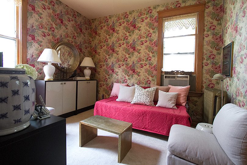
The shell of the room (read: white carpeting and wallpapered walls) remains as it was when we bought the house. We kind of ignored this space for a long time, a luxury afforded to us by the rambling nature of our funny old Victorian. We have the larger tandem room off of our bedroom with our TV, and tablets make it possible to stream a show anywhere, so we didn’t bother with a television on the first floor for the first few years. We use the double parlor for reading, coloring and drawing, for playing games, making music, and entertaining. I feel like the second you put a show on, the kids are all drawn to it, and there go any other activities! I have to admit though, it is nice to be able to have the kids watch something nearby at times while we’re busy, and there’s less fighting when it’s on a TV vs. a handheld tablet.
The back room sort of feels like a modern house’s family room, tucked away at the back of the house behind the kitchen, except ours is much smaller and definitely not modern. I was eager to get moving on this quickly because as one of the few rooms here with air conditioning, it’s kind of our retreat from the heat. Rather than fight the wallpaper, I embraced it and looked for more traditional pieces.
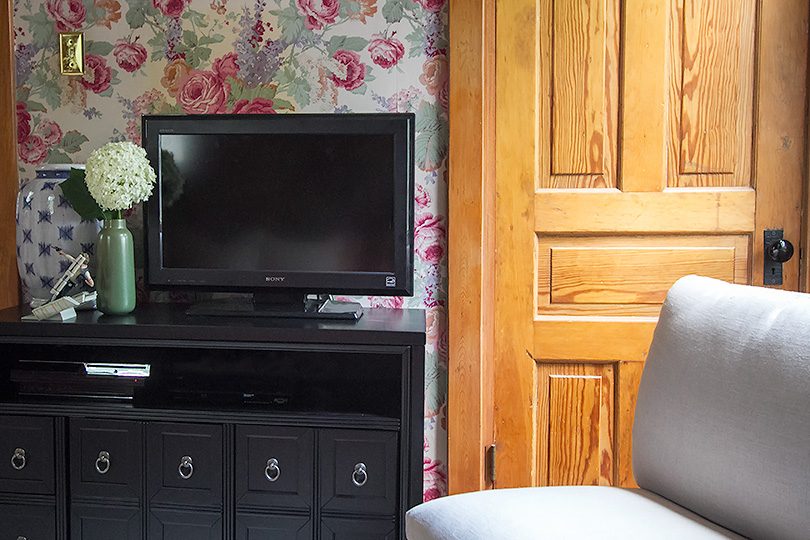
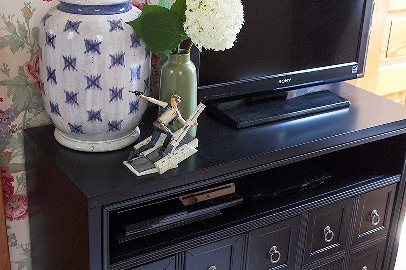
Overstock has an amazing selection in tons of styles, making it easy to get your home ready for the summer at affordable prices. I had a couple of things in the room already that would be staying, so I started by looking for a great media center. Those apothecary drawer fronts on the TV stand are nice, right? Total fakes! The two on the very left to open to small drawers, but the rest are actually door fronts that open to reveal a shelf inside.
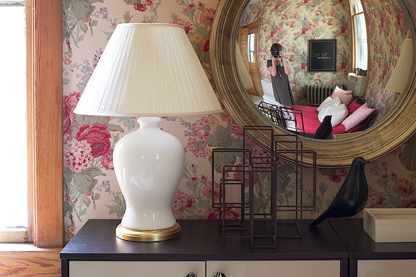
There’s more storage along the wall with a couple of our old bookcases. Doors keep everything out of sight, so we can fill them with the kids’ toys, or more movie and game storage for Brandon. I added a couple of granny-ish lamps on top, and I’m kind of into the effect with the cabbage rose wallpaper.
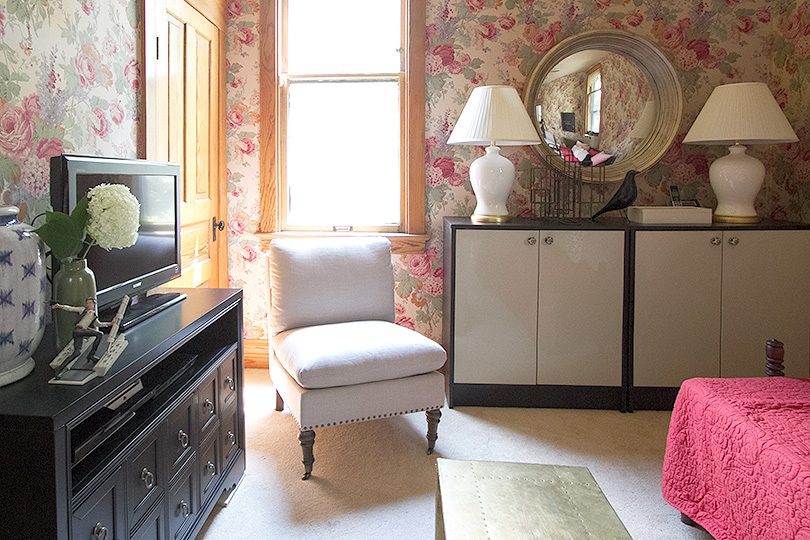
A large round mirror above turns this area into the room’s focal point. The finish on the frame is more of a mix of gold and silver than I had expected, but the depth is really pretty. And since this is a room for relaxing and vegging out a little (not worrying about your vanity), I like that it’s a convex mirror! It distorts the reflection just enough that you aren’t compelled to check yourself out in it as you enter to sit down.
The room is definitely small (snug!), so I chose armless slipper chairs to bring in a little more seating. I also brought in a vintage brass table, grabbed from another room, and a ceramic garden stool to give us a place to set down a drink or some snacks. I also hung a favorite old print of mine (non, je ne regrette rien) in a black frame to better stand out against the floral paper.
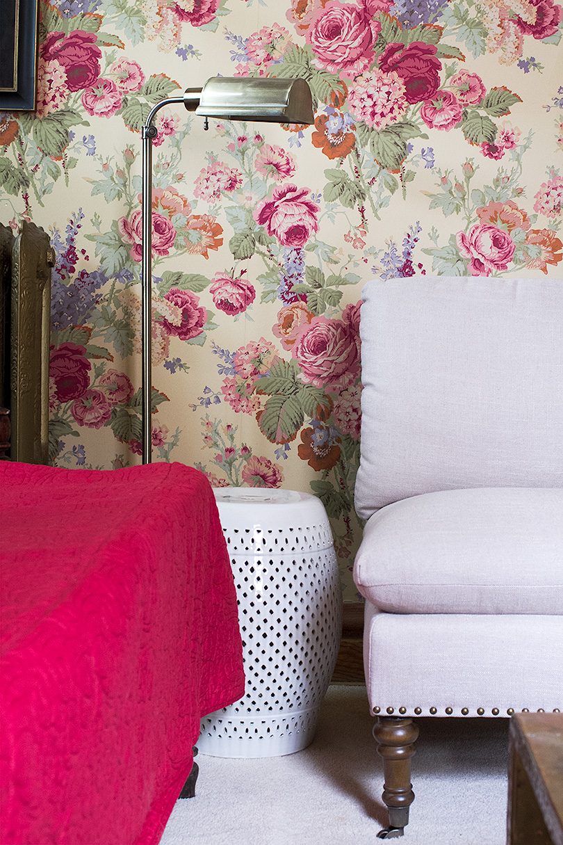
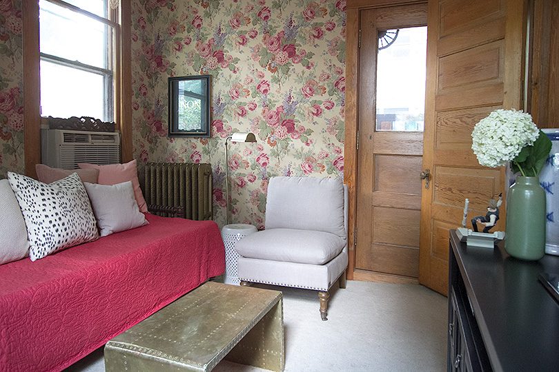
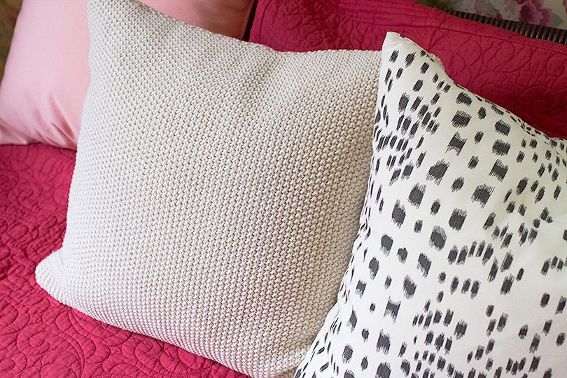
I brought in tons of pillows, mostly stolen from other rooms plus one new one with a pretty texture. The daybed cover fits so nicely and gives it a more tailored look, but I think that if I have one regret about the room it’s that none of the seating has arms. I still stand by my choice of armless slipper chairs because of the layout; it’s the antique daybed I’d replace.
This is one of the only rooms that ever gets truly cool when it’s hot out! Our house is heated by radiators, so adding central air is a much trickier and more expensive project than in a house with existing ductwork. The window unit is a bit of an eyesore, but when it’s 90 degrees inside and out, we definitely appreciate having it. Placing the daybed in front of that window isn’t ideal, but it’s not so terrible either.
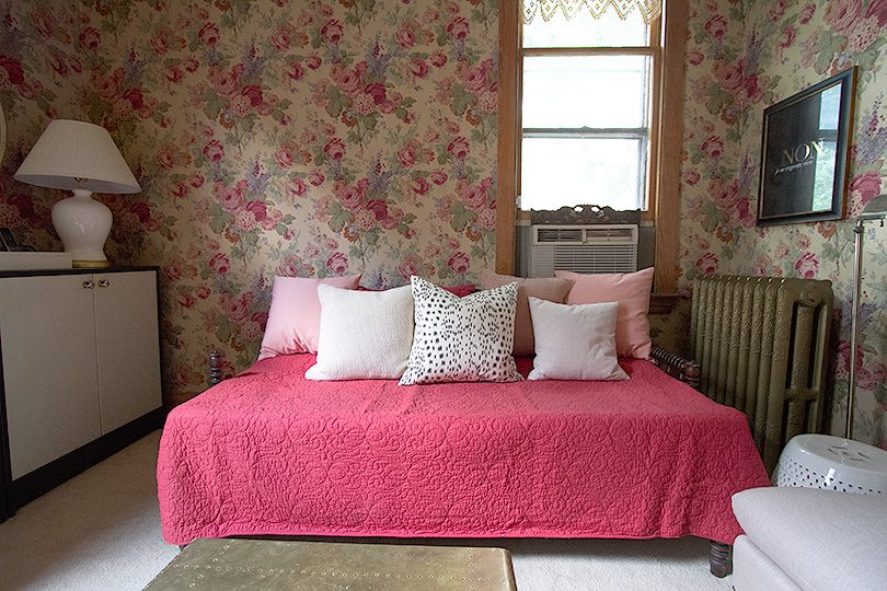
A perfect little snug. I’m so excited to have this extra living space to a point where we’re finally happy with it! It was silly to ignore it for as long as we had.


Jojo
July 12, 2017 at 12:10 pmFirst to say i LOVE it! Respite from the heat and a place to cuddle when it is cold – perfect little snug. I get the regret about lack of arms but I know if it really is a comfort issue you will find a solution. I want to pull over the garden stool, turn on the light and read while my kiddies play quietly in front of me. It could happen!
Making it Lovely
July 13, 2017 at 1:42 pmIt could happen! And yeah, I think I thought the daybed would work better than it does. It’s comfortable, but not curl up and stay a while comfortable.
joanna // jojotastic
July 12, 2017 at 12:41 pmthat wallpaper is just SO good. i’m glad you kept it :)
Making it Lovely
July 13, 2017 at 1:43 pmI’m kind of into it! I wouldn’t have installed it, but I do love a good floral.
Mary
July 12, 2017 at 12:57 pmI love that term…Snug! I personally prefer smaller spaces compared to grand over-sized rooms. I appreciate the cozy factor.
I think you did a great job working with the wallpaper. The room looks adorable. But I agree…I need arms on my seating. Even my dining chairs have arms.
Making it Lovely
July 13, 2017 at 1:44 pmI like arms too. The daybed was a bit of a miss, unfortunately. It was something that we already had and I thought I could make it work.
gigi
July 12, 2017 at 4:50 pmYou have modernized a space that could have looked very stale. Amazing your ability to improve a style a room
Making it Lovely
July 13, 2017 at 1:44 pmThank you so much!
thehaphazardhousewifeblog
July 12, 2017 at 10:25 pmThe decor definitely tones down the wallpaper and makes it look even better!! Looks great! :)
Making it Lovely
July 13, 2017 at 1:47 pmThanks, that was the goal!
goosefairy
July 13, 2017 at 9:40 amHow would that room look with deep rose carpet instead of white? I actually love what you’ve got going on there.
Making it Lovely
July 13, 2017 at 1:46 pmThank you! I’m sure it would work — that’s why I brought in that color on the daybed — it’s not really the look I would want though.
Celeste
July 13, 2017 at 12:08 pmI love that wallpaper! I agree about the arms, though that daybed is pretty fantastic. And way to work in maximum storage in a little room without it. Very cute.
Making it Lovely
July 13, 2017 at 1:46 pmLots of storage in a small space! Those bookshelves came with us from the old house and they’re so useful.
Sheree
July 13, 2017 at 3:26 pmThe room is super cute! We live in a older home that made central air cost prohibitive as well so the window unit is a necessary evil right now. I am trying to convince my husband that we should look into getting one of those nicer looking ductless wall AC Units. That might also be an option for you all.
LS
July 13, 2017 at 8:20 pmI love a lot of your rooms but I’m honestly not quite feeling this room. It feels cluttered, like maybe one less chair would help? But somehow the proportions are off or something. Although this might be due to how hard it is to photograph small rooms.
mribaro
July 14, 2017 at 6:40 amWhat a lovely room! You, doing your magic as always :)
Thinking about the situation with the A/C behind one’s neck – although the two bookcases with the white lamps and the mirror make a great looking wall, I think if you gave them up (to some other room), the daybed could be shifted a few feet so it’s centered on the wall, and is not in front of the A/C any longer. You could still put that mirror above the daybed.
Laura
July 14, 2017 at 8:44 amWOW! This is good. Really, really good.
I love how you shopped your own house to bring pieces in. These blank rooms with no clear purpose for our families can be difficult to tackle (we had a few in our old Victorian that we sold this year–which made it a little difficult to stage), but I think this is nice! Feels quaint and you made that wallpaper work FOR you, not against you. Own it, girl!
Peggi
July 17, 2017 at 11:01 amStill firmly on Team Wallpaper. Love how the slipper chairs pick up the lavender! Arms & AC, necessities both. Nice work!
mimzy
July 20, 2017 at 1:22 amtotally love this space…well done keeping the wallpaper. spot on with your choices for decor considering the ultra feminine floral wallpaper. It really looks great…brings me back to my childhood…my mom used a lot of Laura Ashley paper just like this.
One Room Challenge: Week 1 (Hello, Office!) – Making it Lovely
October 4, 2017 at 9:44 am[…] The Snug […]
One Room Challenge: Week 7 (The Office Reveal!) - Making it Lovely
November 15, 2017 at 9:00 am[…] traditional but cool blue and white planter! And hey there, cool convex mirror that I grabbed from another room! I’m very much disliking that the pendant is just hanging there in the reflection, but […]
Boosting Our Wi-Fi Signal - Making it Lovely
December 12, 2017 at 12:52 pm[…] same time. Our house is just over 3000 square feet, but the modem is at the back of the house in the snug. Meanwhile, I work on the top floor, completely on the other side of the house, and we have plaster […]