Let’s talk about the rainbow room. (Yes, I know that’s a silly name! My kids named it and it has stuck.)
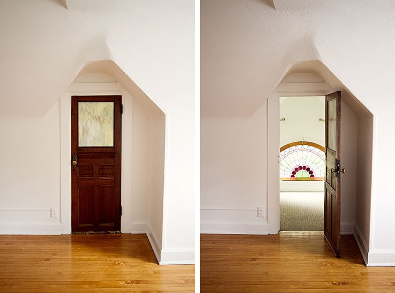
The office is painted the palest blush pink (White Blush, Benjamin Moore), with white trim and black doors with brass hardware. White trim is classic and lovely as an intentional choice, but when it’s done by default it can be a missed opportunity. The rainbow room (glorified closet) will be made even more special with its Ornithology wallpaper, and I think white on the woodwork would miss the mark.
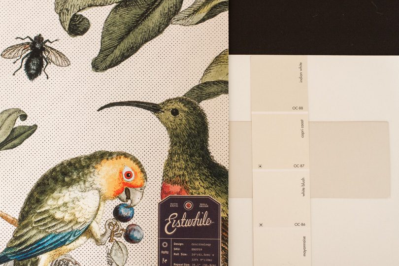
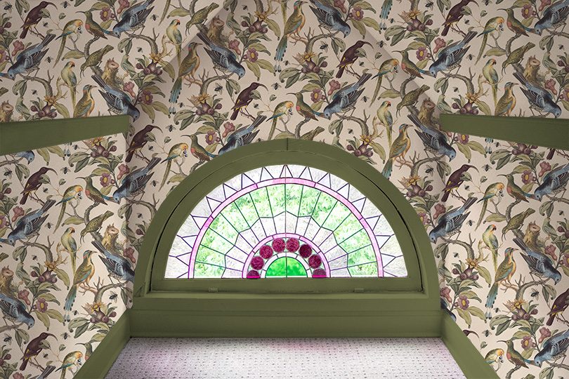
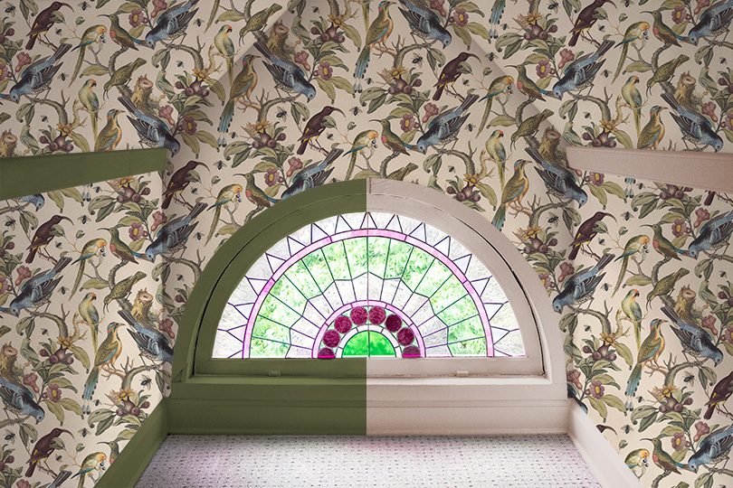
If I go with a dusty pink/beige color to play off of the office walls and the wallpaper background, the trim would recede and let both the wallpaper and stained glass window shine.
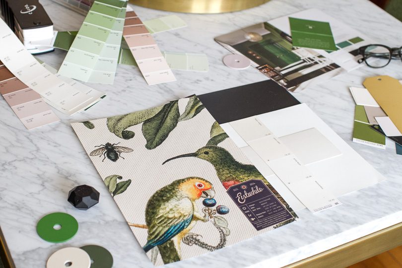
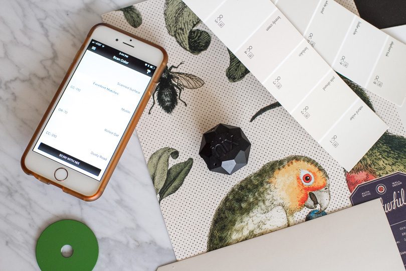
I was recently sent a Nix Mini Color Sensor (such a fun little tool!) and I used it to find a match for the wallpaper’s background color. I placed my sensor on a sample of the print to scan, and the Nix Paints app gives matches from all the major paint brands. A few of the colors it recommended were Joa’s White by Farrow & Ball, and Brandy Cream or Muslin, both by Benjamin Moore.
I like the idea of muting the trim because there’s already a lot going on in a tiny space. It would look something like this.

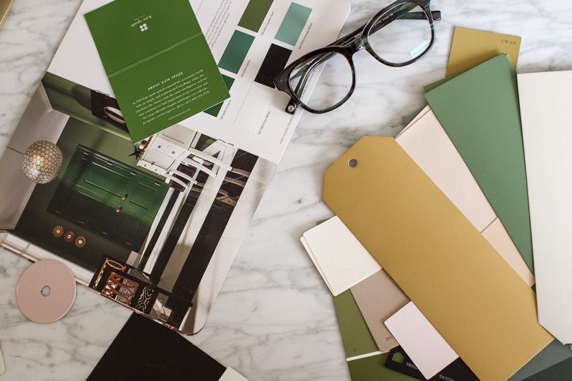
There are a bunch of other colors to pull from in the wallpaper. Blue, purple/plum, or mustard yellow would look great, but if I’m going to go with a bolder color here, it’s going to be green.
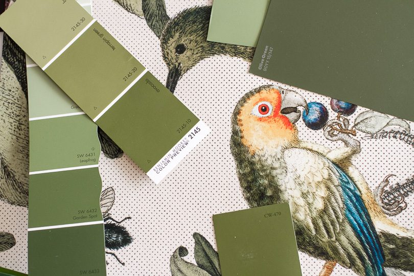
There’s a lot of green in the print’s foliage, and there are also green chairs directly outside the little nook that would play off of the color when the door was open. Maybe I don’t want to highlight the trim this much though? It’s not as special as the window and wallpaper, and I worry it’s competing rather than complementing.
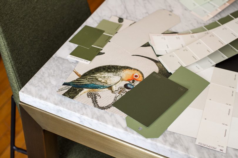
Here’s how the swatches look near those green chairs. A nice nod to the rest of the design, but not a necessary one.
Green or pink? What say you?
Follow along with the One Room Challenge participants!
 • Boxwood Avenue • Coco & Jack • Design Manifest • Dwell with Dignity • The House That Lars Built • Little Green Notebook • The Makerista • Making it Lovely • Old Brand New • Old Home Love • The Painted House • Megan Pflug Designs • Pink Pagoda • Erica Reitman • Sacramento Street • Simply Grove • Jill Sorensen • Sugar & Cloth • Vintage Rug Shop • Waiting on Martha • Media Partner House Beautiful • TM by ORC
My One Room Challenge Posts
Follow along from the beginning!
• Week 1: Hello, Office • Week 2: Design and Layout • Week 3: It’s Curtains • Week 4: Putting it Together• Week 5: What Trim Color?
And check out my previous One Room Challenges!
• Spring ’16: Our Bedroom and Den • Fall ’16: Front and Back Entry, Stairs, and Hallways


Christina
November 1, 2017 at 10:16 amGreen, for sure! I really makes the pattern of the wallpaper pop.
Jen
November 1, 2017 at 10:20 amI like green as well! Have you considered not wallpapering the wall with the window? Perhaps it’s just the mock up, but it looks like the shape of the room gets lost in the design.
Making it Lovely
November 1, 2017 at 10:24 amSometimes I’ll adjust the scale of a pattern to take into account angles and perspective, but I didn’t do that here. So it’s a 2D print on a 3D space.
Kimberly Westby
November 1, 2017 at 10:23 amDefinitely green, besides it’s only paint if you do have colour remorse. LOL, spell check is telling me colour is spelled wrong, not in Canada, eh?
Making it Lovely
November 1, 2017 at 11:09 amHa! Chicago here. All da colors. :)
Anne
November 1, 2017 at 10:25 amGreen!! I think it really helps to highlight the window. The pink kind of matches the window so it all blends together where the green separates the wallpaper and window to make both stand out. Just my two cents!
Megan
November 1, 2017 at 10:29 amPlease, please the green! That little rainbow room is such a special little nook in your home and its not something that most people will get to see…the perfect spot for something bold and brave. Most of us won’t ever get to do something as special as a ornithology covered, green trimmed room…do it for the little people ;)
Molly
November 1, 2017 at 10:29 amI love the green!
One Room Challenge: Week 4 (Putting it Together) – Making it Lovely
November 1, 2017 at 10:30 am[…] One Room Challenge: Week 5 (What Trim Color?) – Making it Lovely […]
Lauren O
November 1, 2017 at 10:37 amI would choose the green, personally. I don’t think it competes at all. If fact, I think it makes the window and wallpaper look even more special. Love the way it’s all coming together!!
Christine
November 1, 2017 at 10:38 amI actually really like the green in the side-by-side picture. I think it adds a little bit more to the special and different feeling to the Rainbow Room.
Jessica
November 1, 2017 at 10:44 amI am the only one thus far, but I like the pink. I agree it makes the wallpaper the star of the show.
Making it Lovely
November 1, 2017 at 10:48 amI know, I’m surprised it has gone so heavily in one direction so far!
Van Winkle Home
November 1, 2017 at 2:57 pmI really prefer the pink also. You’re going to be putting other pretty elements into this space that will give contrast and interest- I think the green will make it all get lost whereas the pink will allow them to shine. If it was a wall with intricate molding on the bottom and that wallpaper on the top, I could see green working, but it makes it seem cramped rather than cozy to me in this space. BUT I’m not a huge green fan AND you do you, lol!
Jennifer
November 1, 2017 at 10:46 amIf you are planning on removing the trim on the upper walls now that you aren’t using it for hooks, I would go for green. If you are planning on keeping the trim on the upper walls, I would go for pink. I find it too jarring to have the green mid-wall, but otherwise prefer the green.
Making it Lovely
November 1, 2017 at 10:48 amI was thinking of keeping it and putting in new hooks (I’ve already removed the old ones).
Caroline M Elliot
November 1, 2017 at 10:50 amDefinitely pink! I think the green is way too overpowering. It steals the spotlight when it should the wallpaper standing out.
Mary
November 1, 2017 at 10:50 amNot the popular opinion, but I like the pink! I think the green is competing with the wallpaper and window, where the pink lets the paper and window shine. I actually was excited when you started mentioning the plum in the paper and am curious how that would look in a mock-up :)
Making it Lovely
November 1, 2017 at 11:13 amPlum is really pretty! And it references the trim on the exterior of the house. It doesn’t go with anything else inside my house though.

Arli
November 1, 2017 at 11:44 amDefinitely the plum. Very grounding. The pink is too light.
Alisha
November 1, 2017 at 10:11 pmOh dear, just saw the plum option- it’s perfect!
Jennifer
November 3, 2017 at 12:37 pmI am changing my vote. The plum is perfect, even if you don’t think it matches anything else (right now).
Sarah
November 1, 2017 at 10:55 amI think pink, but I also think that the trim in the middle of the wall should be removed entirely to make the window and the wallpaper the star- the trim in the middle cuts up the space and draws the eye away from the window (at least in photos).
Making it Lovely
November 1, 2017 at 11:20 amI could! I think I’m going to add hooks back on to them, but even if I did remove those pieces, there will have to be a strip of trim along the top where the two sides meet in the middle.
Tiffany
November 1, 2017 at 10:56 amOoooh plum is an interesting option, now I’m curious about that, too! I think the green makes the window pop in a really nice way. For me, the pink doesn’t provide enough of a contrast or enough of a blend with the wallpaper. Team Green, with an interest in seeing plum!
Making it Lovely
November 1, 2017 at 11:20 amThere’s a picture in the reply to a comment above yours!
Ursula Ellis
November 1, 2017 at 10:57 amI’m going to jump on the green bandwagon. It makes the window pop more and seems to differentiate better the window and wallpaper. (Not sure if differentiation is the word I’m looking for, but the pink makes me think there’s too much going on and the green just pulls it all together so nicely for me. And since I’m not a designer, take this all with a grain of salt.
Loanna Overcash
November 1, 2017 at 11:10 amgreen really makes the whole thing pop!
Chel
November 1, 2017 at 11:21 amI would do the cream on most of the trim and highlight the window by doing green on that inner trim piece. From the pictures it looks like there is the window frame and then a more recessed trim on the window. I think having the color just there draws your eye towards the window even more since that (and the wallpaper) are the special parts, not the side trim.
Bridget P.
November 1, 2017 at 11:29 amI like the plum! Although, the green is also good.
Nicole M.
November 1, 2017 at 11:31 amWhat if you just painted the window trim green and painted the baseboards and upper trim the pink? That would really make the window pop and the remainder of the trim would fade to the background …
Brie
November 1, 2017 at 11:38 amGreen! It almost recedes and makes the window and wallpaper pop!
Allison
November 1, 2017 at 11:59 amI like the green and plum options. The fact that the plum matches the outside of the house and is hidden in this little nook feels very special to me.
Lisa
November 1, 2017 at 12:03 pmI really like the green, but they are both lovely. No wrong choice.
Tineke
November 1, 2017 at 12:24 pmThe plum! I agree with an earlier comment that it reference the trim color for the outside of the house. I like the green, but the contrast of the plum is wonderful, imho.
Rebecca M.
November 1, 2017 at 12:27 pmI love the plum!
I also love the idea (by Nicole M.) of green on the window and pink everywhere else.
Bethany Suckrow
November 1, 2017 at 12:29 pmI think I would like the green more if you left the wood trim on the actual window unpainted. Something about painting that inner trim and its hardware is throwing me off. I’m no interior designer, but if it were me I’d experiment with leaving that part untouched to see how it looks. I also second whoever commented about not wallpapering the wall that the window is on. I like the wallpaper pattern, but it looks overwhelming in such a small space.
amanda
November 1, 2017 at 12:30 pmI think that the green is gorgeous but too bold. Could you do a more muted shade of green? Then you would have the lovely color compliment but not the high contrast that draws your eye away from the window and pattern.
Kim Burdett
November 1, 2017 at 12:51 pmGreen fo sho!
Monica
November 1, 2017 at 12:54 pmthe green really makes the light from the window stand out. But green on the sides distracts from the wallpaper. I agree with Chel above; green on the window itself and then creamy pink on the window trim, baseboards, etc.
Leigh
November 1, 2017 at 1:14 pmoooh! Plum is perfict!
Jennifer
November 1, 2017 at 1:21 pmI was going to say pink definitely…..until I saw the plum. I think I still like the pink a little more. Also think a more muted green might be nice.
karen
November 1, 2017 at 1:27 pmGreen. Pink is too washed out for me.
Katie
November 1, 2017 at 1:33 pmI like the richness of the green and plum, but there is something about that pink. What about a dusky pink picked up from the flowers in the paper?
Making it Lovely
November 1, 2017 at 1:50 pmI think just a shade darker would be nice. Not more intense, definitely not a brighter pink, but something to avoid going too pastel.
Joanna
November 1, 2017 at 1:37 pmPlum for the win. Ties to the glass color, the wallpaper, and the outside? A trifecta of awesome cannot be avoided.
Kate
November 1, 2017 at 1:42 pmI was thinking black would look amazing, but since you mentioned plum…why not do plum? It doesn’t have to coordinate exactly with the other rooms; the style of wallpaper relates nicely to what you’ve done elsewhere.
Making it Lovely
November 1, 2017 at 1:46 pmSo many votes for plum! The why not is just that purple doesn’t make me happy. It looks good with the wallpaper, I know, but I’m not a fan of the color for my home.
Victoria
November 1, 2017 at 2:03 pmPink. Green too distracting for my liking, nothing looks properly special when they all compete.
Libbey
November 1, 2017 at 2:05 pmI wouldn’t have thought it, but I like the green much better. It’s earthiness grounds the wallpaper and makes it feel more organic. The pink feels too tentative.
Claudine
November 1, 2017 at 2:08 pmIn terms of the look, the plum is by far the best, for me. If not the plum then the green. I find the lighter color just lets everything sort of float around. The dark trim grounds the wallpaper and really focuses attention on it and on the window. Any chance plum will grow on you? :)
MoeWest
November 1, 2017 at 2:17 pmI think green makes the green in the stained glass pop.
Missy
November 1, 2017 at 2:20 pmI prefer the pink. I agree the green competes rather than complements. I also kind of think the wallpaper competes with the gorgeous stained glass, but perhaps that’s why I’m not the fancy design blogger! ;)
Emily @ Go Haus Go
November 1, 2017 at 2:20 pmGreen!
Sheri Lee Johnson
November 1, 2017 at 2:27 pmwait, why are you painting the trim at all? I love how you keep the original wood in much or your house and I think it would look the best in this room anyway. Don’t paint!!
Making it Lovely
November 1, 2017 at 2:28 pmThis is on the third floor. All of the trim is already painted!
Natasha
November 1, 2017 at 2:55 pmI definitely say the green. I think it makes the wallpaper pop more, whereas the pink makes it look more washed out. I have few weird little spaces in my 1920s home and I’ve learned that going bold in those quirky spots is always the best choice.
Jennifer
November 1, 2017 at 3:01 pmI like all of those colors (the plum best of all, surprisingly), but am wondering if you’ve considered just wallpapering below the trim on the wall? Or maybe just wallpapering the end wall with the window? I’m all for pattern, etc, but for me it’s just too much – plus it’s competing with the window and the angled shape of the room. Just my two cents.
kelly whited-ford
November 1, 2017 at 3:01 pmGreen for around the window and maybe the mop boards but pink for the wall trim…so that the wallpaper and the window are the stars of the show.
Janis
November 1, 2017 at 3:09 pmI think the plum looks the best, but the green is a close second. Either way I don’t think I would paint the trim on the walls the same color…maybe go with the color that best matches the background of the wallpaper so that these trim pieces are not drawn out but instead blend in to the walls.
Jess
November 1, 2017 at 3:28 pmPink, but if you had to do color, the plum. Honestly, the green is just ugly.
Susan
November 1, 2017 at 3:49 pmPink!
Suzanne Fortescue
November 1, 2017 at 3:52 pmI like both but would ultimately vote for the light pink. It is lighter and you may tire of it less over time. More “light” in an upstairs room might feel nice, too.
Melissa
November 1, 2017 at 4:45 pmThe plum is so nice because it’s dark but if it’s not your colour, a nice dark brown or even the same black as the door would be so striking!
Janet
November 1, 2017 at 5:02 pm100% green!! Ok, Maybe 90% green and 10% plum. But for sure a big 0 for the pink. It looks like it used to be there and you were too busy to bother painting over it. Green or plum bring out the richness of the beautiful paper and the pink looks pale and lifeless. What a great window and I look forward to seeing the finished project! Well done!
Wilma
November 1, 2017 at 5:14 pmdef pink
patricia blaettler
November 1, 2017 at 5:40 pmGreen. It’s got more of an “old house” vibe to it. And it’s such a nice green!
elizabeth
November 1, 2017 at 6:06 pmdefinitely green!
eydie campbell
November 1, 2017 at 6:36 pmWhich way is the window facing? The two colors are polar opposites for Northern and Southern light coming in especially in the winter months…
Sandra McManus
November 1, 2017 at 6:37 pmGreen please…the green ties it all together!
Meg C
November 1, 2017 at 6:46 pmI’m a huge fan of the green! It complements, not competes! I once lived in a 1919 double & other people had painted over the original (gorgeous) woodwork (yikes!) and we ended up painting it jade green because, why not? Anyhoo, it was fab! & in your space with that amazing wallpaper and that window? I really believe the green would just totally make the space perfect!
Celeste
November 1, 2017 at 7:01 pmI vote Green, the pink just seems so bland against the strong wallpaper and window.
Theresa B.
November 1, 2017 at 7:10 pmPink! The wallpaper and stain glass are the stars!
LMN
November 1, 2017 at 7:27 pmGreen actually brings out the wallpaper and window more. So fantastic
Jennyg
November 1, 2017 at 7:35 pmThe green is soothing and unexpected.
Elle
November 1, 2017 at 7:51 pmDoes that upper trim need to be there at all? If it was just the lower trim I’d definitely go with the green but the higher-up pieces do seem a little compete-y with the beautiful wallpaper.
BethC
November 2, 2017 at 6:17 amI was wondering that myself. I would have removed it, but it’s probably too late now that the paper is up. BTW, green all the way!
Sara Vaughn
November 1, 2017 at 8:14 pmPink! Green seems way too busy. My mind can’t relax with it AND the wallpaper… but the wallpaper is perfect so definitely pink.
theveryflowers
November 1, 2017 at 9:28 pmThe green is so much more interesting! This little space deserves to stand out a little bit. I think the green also adds so much more definition which in turn actually highlights the beautiful paper.
Audrey
November 1, 2017 at 10:15 pmDARK green! Rich and unexpected with the bright white team in the office room. Will match the whimsy of the window and complement the wallpaper.
Jennifer
November 2, 2017 at 1:44 amGreen around the window, pink against the walls. Perfect frame around the window but doesn’t compete with the wallpaper.
Lindsey
November 2, 2017 at 2:05 amPink shows the window to perfection.
Ally
November 2, 2017 at 2:17 amDefinitely the pink! The wallpaper and window are so classic, the pink keeps it more fresh and modern while not being white, which would wash it out, save the green for elsewhere- kitchen?! : )
Pamela
November 2, 2017 at 7:19 amI have used Brandy Cream and absolutely love the purple/plum undertones and depth. I hated it on the first coat but so thankful I kept going. I like it very much with this paper and the stained glass.
Karen
November 2, 2017 at 7:33 amI love the green but can’t help but wonder what a dull/matte/darkish gold would look like.
Geraldine
November 2, 2017 at 8:31 amPink here! Even though green is my favourite colour ^^
infinitequery
November 2, 2017 at 8:53 amI had a window like this except,just the shape,not the beautiful glass and I am wondering if the woodwork might be a choice or has it always been painted? I think both colors seem to cheapen the effect of the glass-almost like the plastic things one applies with water? But knowing how talented you are with color and design(I miss your watercolors) on second thought I must be wrong. You definitely don’t do cheap……!
goosefairy
November 2, 2017 at 9:42 amGreen!
Jennifer R
November 2, 2017 at 10:15 amGreen! The pink just seems to wash everything out.
Jenna
November 2, 2017 at 10:21 amBefore I saw the picture, I thought the green would be competing too much, but now…the green is the winner for me! The pink looked kind of washed out, and I think the strong wallpaper needs the bold border. Beautiful window! :)
Caitlin
November 2, 2017 at 10:26 amGreen!
Carrie
November 2, 2017 at 10:35 amI love the green, but I vote pink here because with the green, my eye goes straight to that rather than the wallpaper or window, which are so much more interesting. My preference would be for the trim to recede.
Kim R
November 3, 2017 at 6:58 pmDitto this comment although I would love to see the green just on the inner arched trim around the window.
Nicola O.
November 2, 2017 at 10:37 amI like the pink better but maybe jusssssst a smidge darker. And this is a little odd, but what about covering that chair-rail height bit with the wallpaper? or taking it down? I think it really distracts the eye, especially since it doesn’t continue around the window wall.
Melissa Stuk
November 2, 2017 at 11:07 amI love the pink. With the green I just see the trim not the wallpaper. I think the green is competing too much with the pretty wallpaper
Kristina
November 2, 2017 at 11:35 amThe green makes the space feel more special than the pink. I know it’s not in the ORC plan, but is there any chance of removing the carpet?
Mary B
November 2, 2017 at 12:50 pmI like the green…but would like to see it in a in a lighter shade. Maybe halfway between the one you have and the pink? There is a light toned green leaf that is very prevalent in your pattern and which is also close to the green chested birds. I think a mid-tone would bring out your pattern better than the dark green which does seem to be competing with the wallpaper or the pink which I think looks a little…generic. I think a mid-toned green would also help bring out the pink in the sunburst window as it is opposite on the color wheel. Just my two cents.
Mary
November 2, 2017 at 1:28 pmNeither of these float my boat. I’d like to see a lighter green or a darker pink for comparison. And maybe a blue to tie in with the chairs in the main room.
Amyks
November 2, 2017 at 1:37 pmin a word, Pink.
RachelA
November 2, 2017 at 1:40 pmGreen!
i actually think it’s easier on the eyes, giving the eye a place to land. the pink doesn’t have enough competing weight.
Kimberly
November 2, 2017 at 1:53 pmPink! I can’t wait to see the Rainbow room all done! :)
Emily
November 2, 2017 at 1:53 pmGreen! I think it draws the eye even more to the window.
piia
November 2, 2017 at 2:34 pmPink, blue or a lighter shade of green!
Lyndsey
November 2, 2017 at 2:46 pmGreen! Although they are both nice.
Emily
November 2, 2017 at 3:28 pmFor sure the green! I have the sweetest old bird painting in my Etsy shop. I think it would look great somewhere in your area!
https://www.etsy.com/listing/554810784/vintage-paint-by-number-with-birds-and?ref=shop_home_active_4
S.Shaw
November 2, 2017 at 3:40 pmI love the green! It’s great that your able to mock it up so you have a good idea what it will look like beforehand.
Sally
November 2, 2017 at 6:24 pmPink
Jennifer B
November 2, 2017 at 11:23 pmGreen!
Celeste
November 3, 2017 at 10:10 am#TeamGreen
It’s just so lovely!
Kate Sawyer
November 3, 2017 at 10:57 amDefinitely the green! The beige is too bland and it makes the room look incomplete.
Honor Roll – Making it Lovely
November 3, 2017 at 11:26 am[…] May 21, 2011 Previous Post One Room Challenge: Week 5 (What Trim Color?) […]
Jeannine
November 3, 2017 at 12:16 pmI think the window actually looks prettiest trimmed in green.
lsaspacey
November 4, 2017 at 3:03 amI say the green but at 50-70%, to lessen the contrast.
Murgatroyd
November 4, 2017 at 10:24 pmpink i think. the green looks great next to the single bird, but with the whole room wallpapered its a bit intense.
deb
November 5, 2017 at 11:56 amGREEN….It is sooo good on the eyes!
Caroline Milyard
November 6, 2017 at 10:57 amGreen! It is much more soothing than the pink!