Thank you to The Shade Store for sponsoring this post.
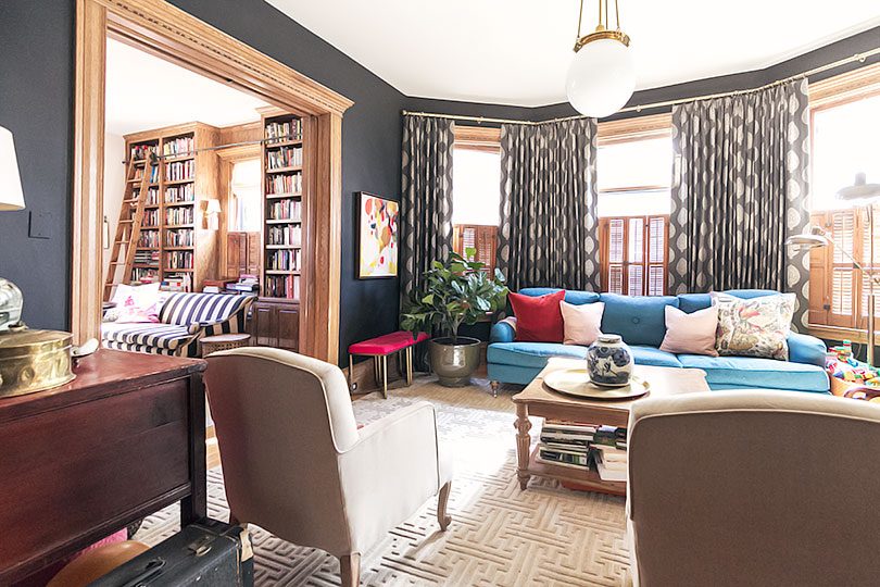
The Victorian is definitely a bit lovelier these days with the addition of custom window treatments in the double parlor!
We’ve been here for 4.5 years, and I’ve liked the look of the house with bare windows. I started to realize I wanted to change them last year though. Visually, I knew the extra layer would look nice, and I also wanted the heating and cooling benefits of quality curtains (because 125-year-old windows can be drafty). They arrived a couple of months ago and are indeed everything this home needed! Beauty and function combined.
You likely know that there’s a lot of unpainted wood trim in this house (like, A WHOLE LOT). Curtains help soften things up.
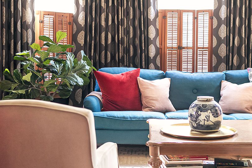
There’s a radiator behind the teal sofa in the bay window. It made hanging curtains there a bit tricky, but I came up with a clever solution! If you’ve ever encountered a similar obstacle, scroll down to the end of the post for ideas on working around it.
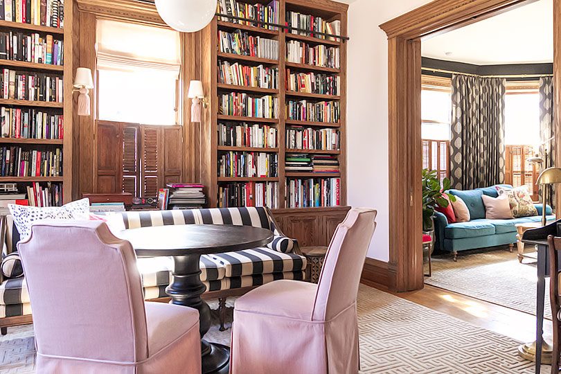
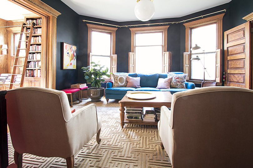
I’ve been focusing on style upgrades and finishing touches for the main floor. I chose matching rugs for the double parlor with a greek key pattern late last year, and I love the design continuity between the two spaces. I had thought about doing something similar for the windows — choosing the same fabric for all — but I’m glad I went in a different direction. The library got pale pink linen (“Cameo”) to match the wall color, and the black living room has an oversized paisley print on a warm charcoal background (“Asherton Granite”).
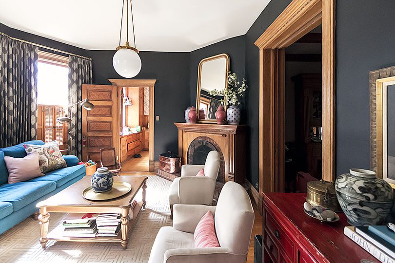
Another new addition to the living room is the giant mirror above the fireplace. The windows are so pretty in its reflection! The doorway to the dining room is a bit of a black hole in this photo — less so in real life, but the northern exposure and proximity to neighbors means it is always dark. The mirror helps bring a bit of lightness to the center of the house, and seeing the curtain fabric in it is much nicer than a reflection of more unpainted wood trim.
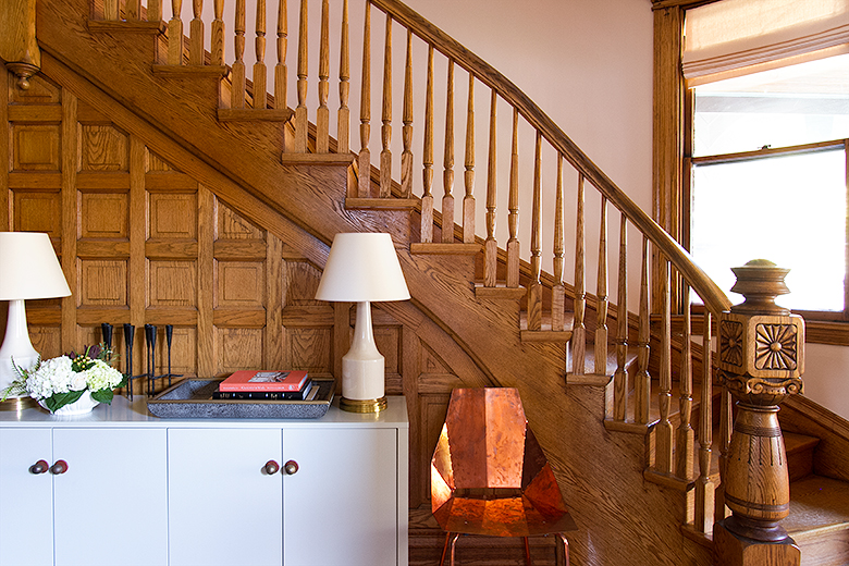
I worked with The Shade Store back when I did our entryway for the One Room Challenge. The entry window has a pale pink linen roman shade, and I wanted to continue with the same fabric into the adjacent library.
The window between the bookshelves we added got a matching roman shade, and the curved windows facing the street have tailored pleat curtains. Eventually, I would like to add a custom curtain rod that follows the curve of the wall.
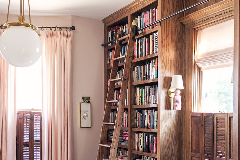
Before & After
I’m so glad I went with tonal variations for each space rather than a contrasting color or bold new pattern. The rooms still look like themselves — just better.
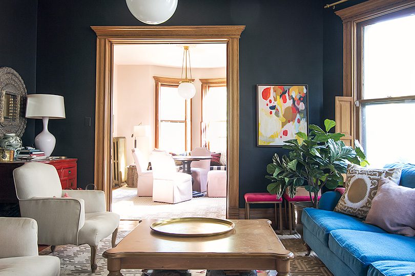
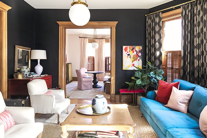
Tips & Tricks
The Shade Store can measure for you, make recommendations, and even handle the installation, but I do have some tips and tricks for you whether you’re hiring out for some, all, or none of the process.
You’ve probably heard to hang your curtains “high and wide,” right? That’s good advice if you want to make your room seem taller and your windows look larger, but it’s not always the right thing to do in every application. Our ceilings are 10′ high — I want to show off that height but I don’t need to make them look taller than they are. The bow and bay windows are contained within the architecture — no need to extend the curtains to make the windows look wider. Instead, I added about 6″ to the width and height for curtains that are nicely proportioned to the windows and room.
I like the traditional look of pinch pleat drapery, but chose a tailored pleat for our home. It keeps the fullness and luxe look of the pleating but takes it in a modern, slightly more casual direction. They have drapery hooks that hang from curtain rings, so they slide open and closed easily.
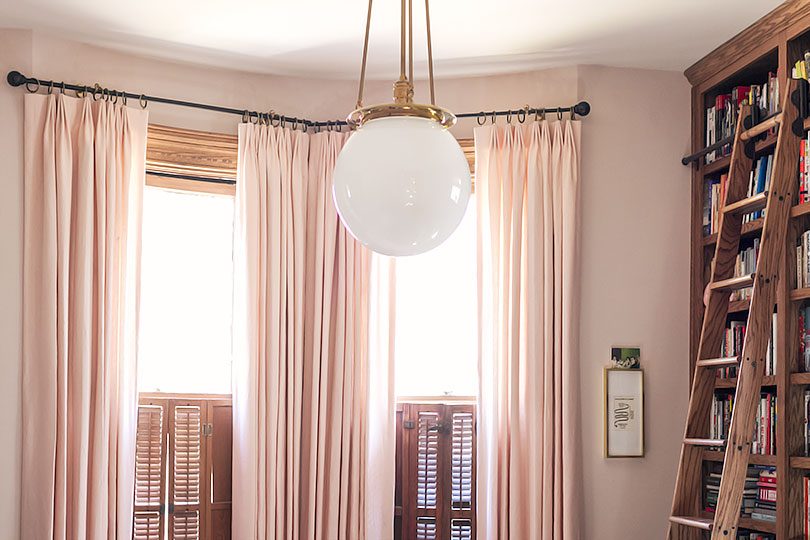
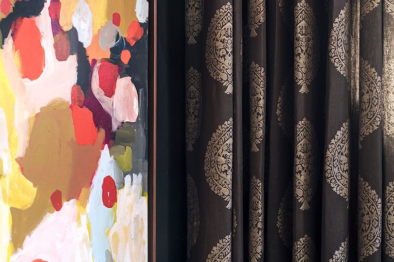
All of our curtains from The Shade Store are interlined, which has two benefits. Interlining adds weight and fullness to drapery, giving it a more beautiful hang, and it adds to the insulating properties of window treatments. Chicago offers up the worst of the temperature extremes with hot, humid summers and long, cold winters. We don’t have central air, so being able to close the curtains on the hottest days will keep our home cooler (both rooms get a lot of sun). We have interior storm windows for the kitchen to keep out cold winter drafts, but have relied on disposable plastic weatherproofing film for the drafty living room and library windows. We were able to skip that step this year by keeping the café shutters closed and drawing the curtains on particularly bad days.
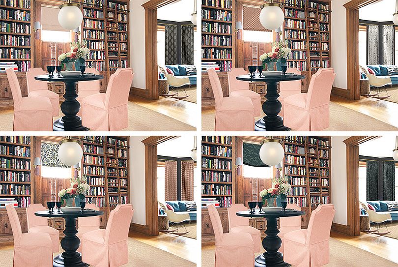
You can stop into any of The Shade Store’s locations (they just opened their second in Chicagoland this weekend!) to see samples in person and bring home swatches. Everything is online too, and they’ll send fabric swatches to you for free. Take advantage of this option! I had narrowed down my top choices and worked them into a Photoshop mockup, but I didn’t make any final decisions until I had the actual fabrics in my home. Even for something as straightforward as “simple white curtains” there are a lot of options with subtle differences, but of course there are a ton of colors and patterns to choose from too!
Curtain Solution for a Bay Window with Radiator
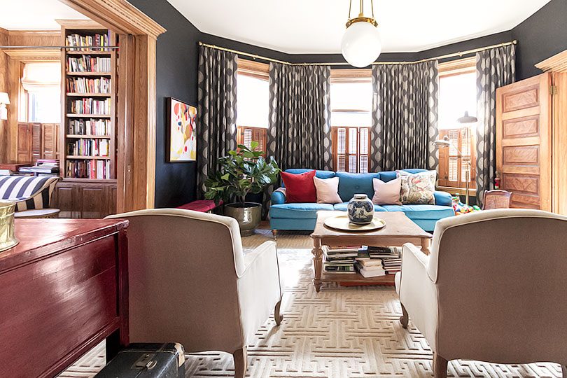
This old house of ours is filled with quirks and angles. Figuring out how to hang curtains in a bay window was easy enough. Many curtain rods are available with corner connectors, which is what I used to create one long, seemingly unbroken rod that fits the space perfectly. The area behind the sofa was particularly tricky though because of a long radiator in the center.
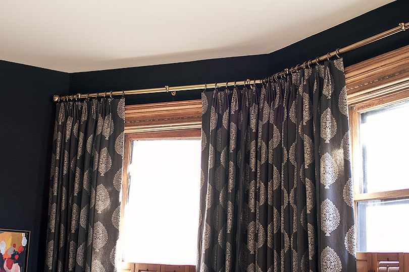
Custom curtains are less expensive in pairs (rather than individually priced panels), but if I had simply ordered three pairs of curtains sized for each of the three windows, there would have been a visible gap along the bottom where the shorter center panels met the corners.
Instead, I ordered the shortest center pair of curtains sized to the width of the radiator (not to the width of that wall). Then I ordered two pairs of curtains to be split between the outer windows. The skinnier pair went to the outermost edges, while the fuller pair was used to cover the the inner corners.
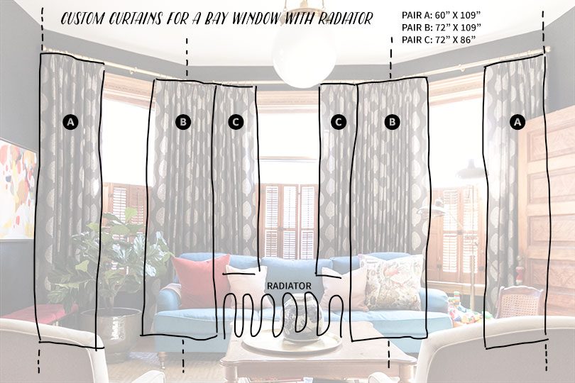
Here’s a shot of how the curtains perfectly fit over the radiator. You wouldn’t see this from a normal angle because the sofa hides it, but it does look tailored and clean.
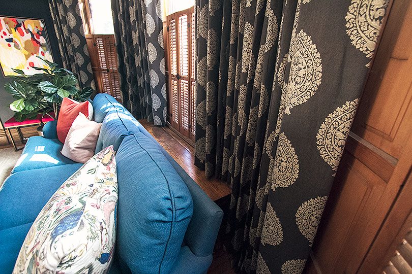
Bare Windows No More
I liked both the library and living room before, but adding window treatments from The Shade Store definitely took them to the next level. The rooms look and feel so much better! Curtains and shades always make such an impact, don’t they?


Katia
March 5, 2018 at 3:36 pmare they offering any coupon code for your readers?
Making it Lovely
March 6, 2018 at 12:55 pmNo coupon to share, sorry.
Tanja
March 7, 2018 at 11:33 amKatia, I was just about to ask the same question as often when influencers post it comes with a discount and I need new window coverings.
Matty
March 5, 2018 at 5:53 pmThis is a great post, and what a lovely, layered, finished look the curtains give each room. I am trying to convince my cousin her rooms will never look a finished as she desires without breaking up all of her wood with soft, tailored curtains. I shall use your post to draw some inspiration!
Meanwhile I have a question on your radiators. We live in a 100 year old row home with radiator heat + central AC, however the house has hot and cold pockets no matter where the thermostat is set. A plumbing company said we have a super inefficient system, and short of investing loads, they suggested a few things at no cost to help: 1) never putting furniture in front of the radiator, and 2) not having radiator covers installed. My couch is currently placed in front of the living room radiator and I was scheming a cover install to give a more finished look as well as a flat surface for decorating. I would love any thoughts you want to share on where form meet function and any downsides to consider in older homes. Thanks!
Making it Lovely
March 6, 2018 at 1:07 pmThank you! Yes – curtains are a friend to those of us with unpainted wood to tone done for sure.
OK, the radiator. Technically, we should not have it blocked by the sofa, nor covered. That’s true! I make an exception for this one though (it’s the only one in the house with something in front of it). I’m willing to sacrifice peak efficiency for this particular spot in favor of a floor plan and design that works. We do pull the sofa out during extremely cold spells if the house is struggling to stay warm. And I like the cover (it’s only a top) because my kids play on the sofa with small toys that would otherwise fall down below the radiator and be a big pain to retrieve.
I wouldn’t start blocking and covering up radiators with abandon, but if making one exception solves more problems than the tradeoff of efficiency-loss and the room can handle it, I’d say it’s worth it.
Whitney
March 5, 2018 at 6:36 pmSo good!
Peggi
March 5, 2018 at 9:22 pmWow. Those look perfect! I especially love the paisley. I favor bare windows because I think of drapes as “serious”, but your before & afters are compelling!
Sara
March 5, 2018 at 9:26 pmThey really elevate the room. I never would have been on team pink window treatments before seeing those roman shades. Now, I love them. How would you handle a radiator without furniture blocking? My master has a bay window with three windows and the radiator runs the length of the middle window and then some. I’m thinking of getting natural shades and perhaps just hanging curtains on the outside windows?
Ellen
March 6, 2018 at 12:03 pmThank you so much for answering the very important question of how to hang curtains on a bay window with a radiator under the center window! Also, they look great.
Caroline
March 6, 2018 at 4:45 pmAbsolutely gorgeous! I used to think bare windows looked best, but I changed my mind on that as I grew older, and your beautiful rooms illustrate what curtains or drapery can do!
Eileen
March 6, 2018 at 8:28 pmSuper clever solution for the radiator!
JUDITH
March 6, 2018 at 10:11 pmI really didn’t think your home could be more polished elegant and beautiful but your design skills are nonpareil,and how it looks so pristene with small children is another miracle
celeste
March 7, 2018 at 12:04 amSo, so good. These curtains soften all that lovely (but hard!) wood in the rooms and make the spaces feel even more inviting and cozy than they already were. I love the pink and the paisley patterns! The gray is really doing it for me with the other colors in your parlor. Perfection, Nicole!
Jessibee
March 7, 2018 at 12:51 amIt does look even better than before and before was so good. Such a family home. I love your house.
Julie @ Houzz Mag
March 9, 2018 at 6:35 amYou have dressed up your windows very wisely. These blackout curtains enhance your home’s ambience. And giving each room a pretty, complete look. Thanks for sharing!!
I Love the Internet | The Sweet Beast
March 9, 2018 at 6:35 pm[…] and unpainted woodwork – I really can’t get enough of her Victorian home. And now she has me wanting curtains. I just have to figure out how not to burn our house down with curtains + baseboard […]
A Louis-Philippe Mirror - Making it Lovely
March 27, 2018 at 12:07 pm[…] you catch the new mirror above the fireplace when I shared photos of the living room with its new drapery? Let’s take a better […]