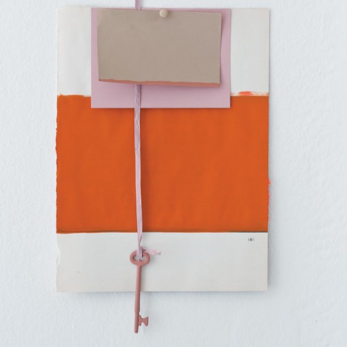
Orange is a tricky color to get right in paint. This new shade from Farrow & Ball pretty much nails it though. And paired with pink? Perfect.
'D' for Decorating• Filing Cabinet
Charlotte’s Locks
Previous Post
Style: April '11
Next Post
Maps by Lena Corwin


colleen [there comes a yes]
April 5, 2011 at 5:57 pmI love that color combination! Always feels zesty but still reasonably subdued.
Katie @ explanationrequired
April 5, 2011 at 8:25 pmThat is a beautiful shade of orange. And I can’t help but love the color, since I have a Charlotte of my own.
jenn
April 5, 2011 at 8:51 pmi love orange, and yes, it’s difficult to get the perfect shade
skippee
April 5, 2011 at 10:36 pmi love this color combination! can’t wait to see what you do with this. =)
simplygrove
April 6, 2011 at 12:06 amWhy yes, that is PERFECT!!!
Amy
April 6, 2011 at 3:40 pmoooh, orange and pink! i’m surprised at how much i like this combo. fun fun.
Nikki
May 26, 2011 at 8:45 pmI attended a Bunny Williams book signing in march. It was at the Farrow and Ball Soho showroom and their new paint colors were also introduced. By coincidence I wore a dress the same color as Charlotte’s Locks and found it the perfect conversation starter as I worked the room (Im usually the new yorker in bright pink in a sea of black) Here’s nice little tib bit: I was told that there is an employee in Farrow and Balls headquaters that is named Charlotte and her hair is bright red! Ever wonder where the poets get there inspiration? That would be a huge compliment!