Thank you COOL WHIP for sponsoring this post.
Join us on Facebook for inspiration and recipes for everyday treats. What you add makes it.
#coolwhipmoms
![]()
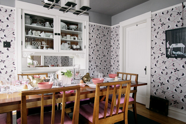
As I mentioned, I spent the weekend painting the ceiling in the dining room. I had intended to do so years ago, but I’d never gotten around to it until now. I chose a dark color to bring the ceiling down a bit, and the effect contrasts nicely with the living room’s higher ceiling and lighter paint color. It’s a trick that Frank Lloyd Wright used a lot; I just borrowed it.
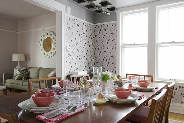
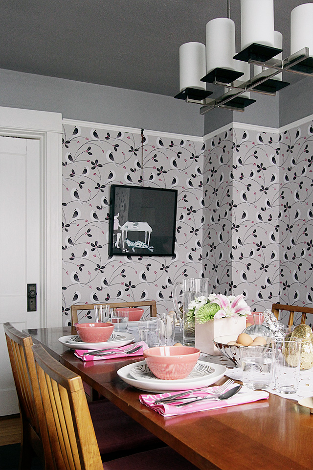
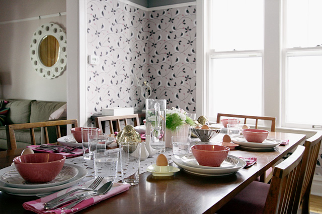
Everything in Chicago is greening up and Easter is almost here, so I set the table with a nod to spring. Corals and pinks, plus the requisite eggs, chicks, and bunnies.
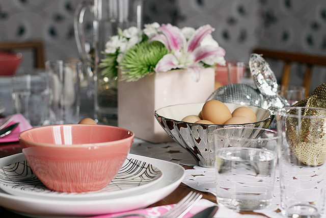
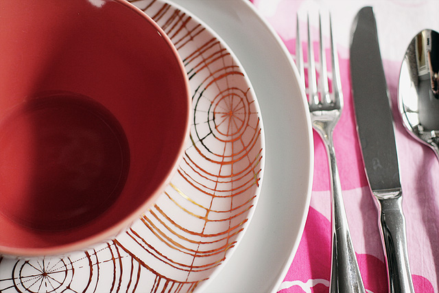
The sequined animals were from west elm, several Christmases ago (they were part of a line to benefit St. Jude’s Children’s Research Hospital). The dishes and bowls were also from west elm, the napkins and silverware from Crate & Barrel (from nearly eight years ago when Brandon and I got married), the glasses from CB2, and the runner by Chilewich. It reminded me of eggs. And speaking of eggs, the egg cups are vintage melamine.
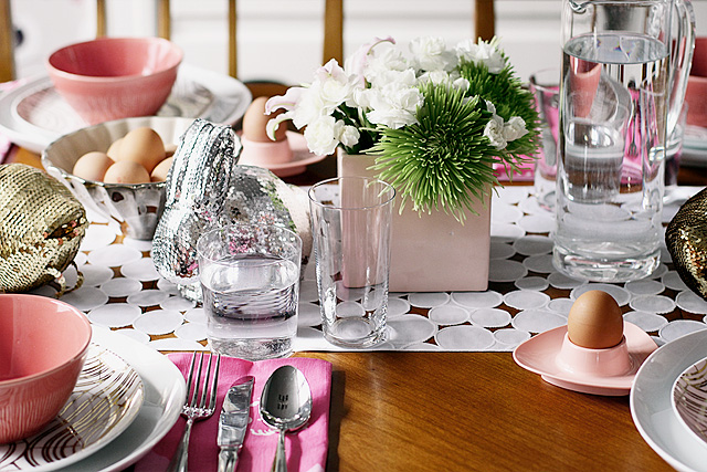
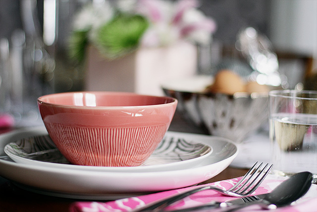
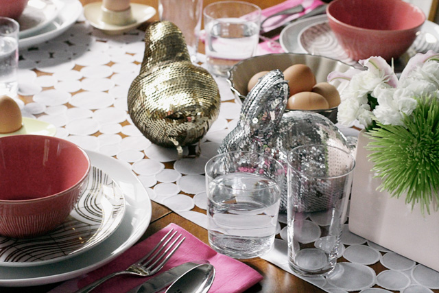
I usually stick to white for dinnerware, and I still do like it as a foundation, but those coral bowls are so cheery.
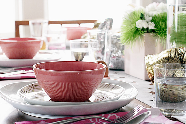
Cute place settings, colorful dinnerware, and a little fresh paint. The dining room is feeling good, and all set for spring. Have you done anything to freshen up your dining room lately too?
![]()
Sponsored posts are purely editorial content that we are pleased to have presented by a participating sponsor. Advertisers do not produce the content.


Elena
April 3, 2012 at 8:52 amNicole it looks so nice and fresh. I like the ceiling trick.
Alison @ Deuce Cities Henhouse
April 3, 2012 at 9:20 amI love it! The gray really finishes off the room nicely.
Your table looks so cute and fresh. Those pinky coral bowls are the best, the look great on the table.
Rebecca S.
April 3, 2012 at 9:29 amI LOVE the egg cups.
Izabela
April 3, 2012 at 9:35 amThe table setting is lovely and I LOVE how the trim and the new ceiling paint just made the whole room so much brighter, fresher and more modern.
Nuit
April 3, 2012 at 9:35 amLOVE the bunnies!!!! and the ceiling looks like a million bucks, you did really good :D
b.a.
April 3, 2012 at 10:00 ami have to admit, when you first decided to paint all the trim–i was a little nervous. (my husband’s a carpenter and his love of natural wood has started to have an affect on me ;) BUT, it just looks gorgeous. you’ve done a beautiful job with it and it has really lightened up your home. love the table setting & entire room.
Making it Lovely
April 3, 2012 at 2:42 pmI’m really happy with the white trim. It was a little scary at times, jumping in and deciding to go for it, but the whole house feels lighter now.
jessibee
April 3, 2012 at 10:03 amLove it! Wow, yeah…awesome.
jessibee
April 3, 2012 at 10:08 amSorry…what are your paint colors in the dining room. I just love the grays!
Making it Lovely
April 3, 2012 at 2:43 pmThe ceiling is Fusion, by Benjamin Moore.
Megan
April 3, 2012 at 10:38 amThe new paint looks phenominal! What a difference it makes to the whole aesthetic of the room!
Jen @ RamblingRenovators
April 3, 2012 at 11:16 amThat looks so inviting. I like how the coral bowls work with the wallpaper.
houseofearnest
April 3, 2012 at 11:17 amso pretty! I love those west elm salad plates!
Brenda
April 3, 2012 at 11:22 amI LOVE how all your hard work has paid off, it looks gorgeous!
Christina W.
April 3, 2012 at 11:26 amYour dining room has been my least favorite room in the house ever since I started following your blog, and I couldn’t put my finger on why. Not that I thought it was ugly or anything (far from it) but it just felt like the black sheep of all your lovely rooms. Now it’s moving to the top of my favorites! You did an AWESOME job, and it feels to me like it finally fits in with your overall scheme!
Making it Lovely
April 3, 2012 at 2:43 pmI’m glad you’re liking it now then, I suppose!
georgia
April 3, 2012 at 11:34 amBrilliant, fantastic and amazing!!!
georgia
April 3, 2012 at 11:39 amOh, do you think you could do a ‘progress’ post, i.e. dining room with wallpaper, dining room with wallpaper and white trim and the final one? I also really liked your comment about different colour ceilings in adjacent rooms. It’s little things like that, that often take a room from really nice to excellent. Thanks, g
Making it Lovely
April 3, 2012 at 2:41 pmIf you go back through dining room archives, you can see how it evolved over time.
Lucy
April 3, 2012 at 11:40 amLove it with a capital LOVE!
casacaudill
April 3, 2012 at 11:49 amThe room looks great! I’m reminded again of how fantastic your white built-in is.
Tiffany
April 3, 2012 at 11:55 amI just love this room!!!
Erin
April 3, 2012 at 12:19 pmI love the grey ceiling. It really brings so much to the room.
Jerith
April 3, 2012 at 12:48 pmNicole, your dining room ceiling is perfect! That grey is spot on with the crisp white molding and the wallpaper. Is it just shadows or does your dining table have a lighter toned inset in the center?
Making it Lovely
April 3, 2012 at 2:49 pmNo, must just be the lighting. There is a border detail around the edge of the table and the wood grain changes direction, but it’s all the same tone.
Marianne
April 3, 2012 at 1:25 pmGorgeous!! I love the ceiling and the white trim and the wallpaper and the light fixture! It’s all perfect!!!
Mona
April 3, 2012 at 2:15 pmThe white trim, grey wall and ceiling pull the whole look together. I loved your dining room before, but now that I see the wallpaper and the grey – wow. It is very chic and fabulous!
You have a real talent for using traditional style in a modern way, so it’s warm and inviting, not cold and stark. I really admire that.
Making it Lovely
April 3, 2012 at 2:52 pmThank you.
Molly the Waffler
April 3, 2012 at 2:16 pmGray + coral = happy
Danielle
April 3, 2012 at 2:20 pmIt’s amazing what paint can do!! The room looks so different and I love how the gray brings out the pink in the room!
Amie
April 3, 2012 at 2:32 pmI used to have my tableset, all the time. It made sense. I don’t know why I don’t do it anymore.
But this tablesetting, and the room, are gorgeous. Well done.
Making it Lovely
April 3, 2012 at 2:52 pmOh, we don’t have our table set all the time. Our table isn’t even cleared off all the time!
Jessica@VintageMauve.com
April 3, 2012 at 4:56 pmI absolutely adore your how you have the wallpaper, molding, and paint. I would be the happiest person on the planet if my ceiling was higher in my house so I could do the same type of wall treatment. Ah, forever jealous.
Cheers,
Jessica
Nichole@40daysof
April 3, 2012 at 9:26 pmI really love the darker ceiling. My most recent update just happens hot be to my dining room – a new chandelier.
http://40daysof.wordpress.com/2012/03/30/my-precious/
Making it Lovely
April 4, 2012 at 10:30 pmIt looks fantastic.
K
April 3, 2012 at 9:59 pmI love the sequined animals on the table top! How clever! I have the rabbit one (I’m obsessed with bunnies) that, even though it’s technically a Christmas decoration, I keep it out all year.
Carla
April 3, 2012 at 10:42 pmI love me a painted ceiling! The gray turned out perfect! Cute table top too.
Bunny
April 4, 2012 at 7:50 amYour dining room/table look amazeble (that’s a cross between amazing and adorable). You may have addressed this in some previous post, but is there a reason why you chose to hang the chandelier at that height?
Making it Lovely
April 4, 2012 at 10:32 pmThe rods that it hangs from only came in 18 inch lengths, and they screwed together so I couldn’t customize them but chopping any shorter. I wish it were about 6-12 inches lower, but the full foot and a half more was too much.
An Easter Table With a Neon Twist | Making it Lovely
April 4, 2012 at 8:00 am[…] Camp Mighty last year, and I know you’re going to adore her as much as I do.Yesterday, we saw my take on an Easter table. Andrea has been celebrating neon for the past week over on her style blog, For the Love of…, and […]
Nicole
April 4, 2012 at 11:14 amGorgeous – painting ceilings makes me nervous (or maybe it just seems like too much work?! :) but this makes me wonder why I ever felt that way!
Erin @ The Great Indoors
April 4, 2012 at 7:37 pmI LOVE the gray ceiling. I’m trying to pinpoint the best gray for our guest bathroom vanity and I’m a little nervous about pulling the trigger. Wish me luck!
kate
April 4, 2012 at 7:59 pmI love the gray ceiling! Not a criticism, but have you ever considered dropping the light fixture a tad lower?
Making it Lovely
April 4, 2012 at 10:34 pmI do wish it were lower (although it looks higher in these photos than it does in real life). I answered this in a previous comment too, but basically we had to choose between too high or too low because the threaded rods that it hangs from only came in certain lengths. So we erred on the side of too high, rather than having the light so low that you could see into it from a standing angle.
Isabel Alvarez
April 5, 2012 at 6:14 amGreat job! I love the eggs and the pink bowls are amazing, and the bunnies are such a sweet detail :)
Adorable style. Congratulations!
Cheltz
April 5, 2012 at 2:09 pmBeautiful!
High Five for Friday! | The Hoot Eats
April 6, 2012 at 4:33 pm[…] [Source] […]
jj
April 6, 2012 at 9:24 pmplease have healthy products sponsor you….cool whip is plastic :-/
Becca
April 7, 2012 at 4:47 pmI’m so glad someone else said this! Some indulgence is part of a healthy life, but accepting sponsorship from weird, chemical non-foods seems like a departure from the message of an otherwise gorgeous site.
Easter Table Setting + Styling Coffee Tables + more | Front & Main
April 8, 2012 at 8:02 am[…] + Styling Coffee Tables + more by Aaron on Apr 8, 2012 • 9:00 am No Comments Tweet The Dining Room, Set for Easter — Making It Lovely How To Style a Coffee Table — The Everygirl Daybeds, Futons & Sleeper […]
Sara of Lilly Queen Vintage
May 20, 2012 at 9:59 amLoving the coral bowls as well as the sequined bunny!
High Five for Friday! | The Hoot Eats
March 27, 2014 at 12:27 am[…] […]