Brandon and I have taken on a lot of projects since moving into our home in 2007, and last year was no exception. Here’s what we tackled around the house in 2010.
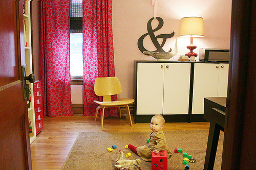
I rearranged my office. Then I added a new mirror above my desk, and a groovy zigzag rug. Then I neglected to do anything else and haven’t shown you the space since. I shall rectify this in 2011.
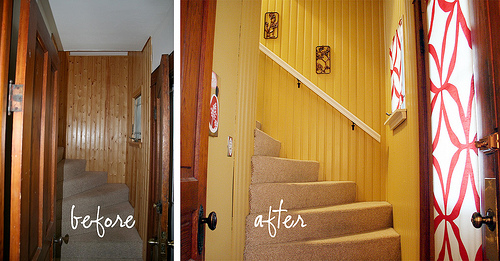
The front entryway got a makeover. I later made airy new curtains to let more light in to the space.
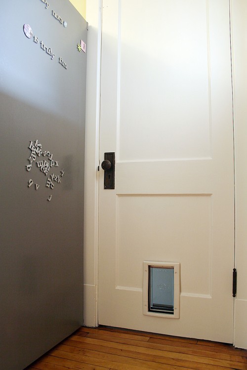
We cut a hole in our hundred-year-old door to allow our cats access to the basement. We should have done it sooner.
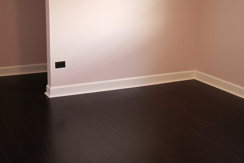
I put together a comprehensive DIY Painting Tips and Tricks Guide.
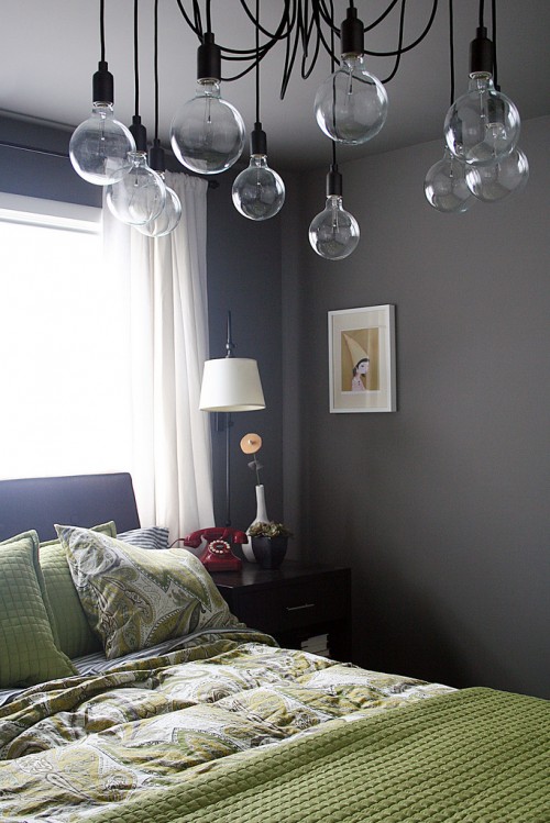
The bedroom was redone in greens and grays, and it now features the most awesome chandelier ever.
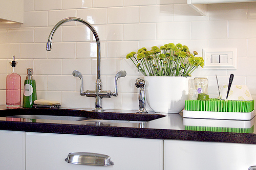
Who knew a dish rack and a $5 glass bottle could make a kitchen sink so much cuter?
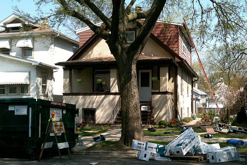
Our roof sprung a leak, so we had to spring for a new roof. We made the most of a bad situation by addressing our second floor’s heating issues and chose a white roof to reflect the sun.
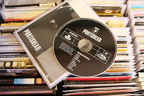
We solved one of our biggest storage dilemmas and organized our stacks of CDs.
I showed you how to make inexpensive custom-sized roller shades for your windows.
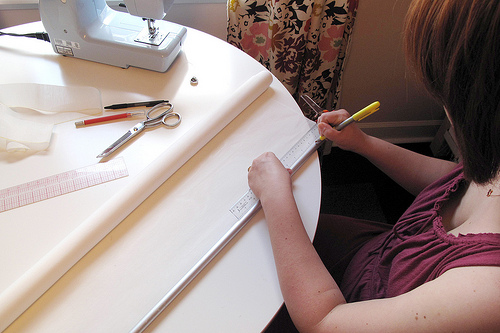
I explained why I’m painting the wood trim in my home. Then I took forever but finally finished painting the trim white in the dining room. I still have to paint the ceiling in there, and paint the trim in the living room and my office though.
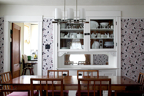
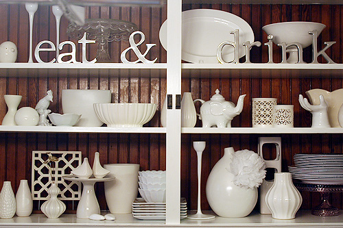
I also showed you how I arranged my white ceramics collection with step-by-step photos.
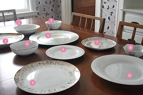
I mixed white plates with fun metallic options to show you how to set a holiday table with a several variations.
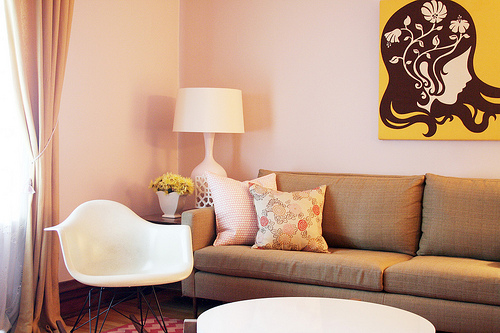
Pantone’s color of the year totally validated my living room.

We started remodeling our unfinished basement to make room for my studio, along with a laundry room, half-bathroom, play space, and storage area. Finishing the basement will also allow us to turn the current studio into Eleanor’s new bedroom, and then update Eleanor’s nursery for the new baby.
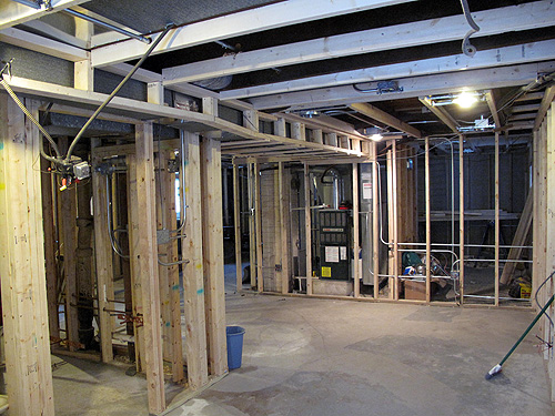
So that’s what was happening around the house in 2010, and I have a lot more in store for 2011! C’mon already basement. I’m ready for you.




Mandy Ford
January 5, 2011 at 9:41 amLove seeing all of the updates and decorating ideas. Very inspiring!
Jessica
January 5, 2011 at 9:45 amwow, you are amazing (have any free time to come to my house?? ;))
Absolutely gorgeous & unique while still maintaining a “home-y” feel…btw, that wallpaper is fabulous!
Van
January 5, 2011 at 9:52 amYour home is LOVELY indeed, love this recap, and I look forward to reading and being inspired by your progress into 2011.
Your clear photos also inspire me to take better pictures :)
Kate
January 5, 2011 at 9:56 amLooks great! I love those curtains in the first image.
Suburbansider
January 5, 2011 at 10:00 amI have just discovered your blog and I Love it, Love it!!
I am back tracking through all of you pages at every chance I get.
I think what you have done with your home is absolutely beautiful, colours especially, and inspiring and the fact that you guys do it all your selves.
Thank you!
p.s i love portishead too
Cynthia
January 5, 2011 at 10:11 amI love your house! I recently made a window bench in my family room area and had a seat cushion made. I just need to add a bunch of pillows and I love the two pillows you have in your living room shown in this post. Would you be able to tell me where you got them? Thanks!
Making it Lovely
January 5, 2011 at 2:34 pmThe polka dot pillow is from Hable Construction, and the floral one was an old Thomas Paul design.
CJ
January 5, 2011 at 10:17 amI can’t wait to see more pictures of your office! By far my favorite room! Well.. maybe until the basement is done!
Rebecca
January 5, 2011 at 11:01 amCan’t wait to see your home continue to evolve in 2011. Happy New Year!
Tanya
January 5, 2011 at 11:41 amI’m a relatively new follower of your blog. I just love your home because it looks so cheery and cozy. I’m really looking forward to seeing what you do in 2011!
~Tanya
dans-le-townhouse.blogspot.com
Jana
January 5, 2011 at 12:48 pmAbsolutely LOVE your home. It is beautiful and fun. I fantasize about the day we purchase our first home and I can go to work making it my own. In the meantime I will live vicariously through all the great homes in the blogosphere….including yours!
emily
January 5, 2011 at 1:54 pmNicole – where did you get the bedside lamps in your bedroom? Thanks!
Making it Lovely
January 5, 2011 at 2:34 pmPottery Barn.
Brandi
January 5, 2011 at 2:20 pmYou have a beautiful home and I love your living room! You got so much done in 2010!
hayley blease
January 5, 2011 at 2:46 pmhello nicole, I read your blog through my reader and I now have to take the time to come and say hi. What you achieved last year is awesome, and your home is beautiful! I cannot wait to see what you do with your new studio space. x
adrianne
January 5, 2011 at 3:05 pmAmazing! Such an inspiration!
Just Live Simply
January 5, 2011 at 4:03 pmI really adore your unique style. It’s always refreshing to see it! Thanks for sharing all you do, looking forward to following you in 2011.
Kristen
Dottie
January 5, 2011 at 4:30 pmThat is such an amazing list. You should be so very very proud of yourself. Oh, and you did it all with a baby in tow and for more than half of the year, pregnant to boot!
Well done, lady! Well done!
PS: Indoor cat door ROCK! We did that one too and we love love love it!
Wendy
January 5, 2011 at 5:36 pmall things beautiful!! looking forward to reading all about your 2011! Happy New Year!
Jacinta @ modelmumma
January 5, 2011 at 5:48 pmIt’s been so fun to watch you transform your house! I have been inspired so many times but finally I did something about it (thanks for the motivation of a new year too) and started paiting the timber door frames and skirtings throughout my house. I’m only up to the primer but it looks so much better already!
Can’t wait to watch the rest of your place transform and tackle my own too!
Making it Lovely
January 6, 2011 at 9:00 amAwesome! I’m glad you’re liking the result so far.
Laura Gaskill
January 5, 2011 at 5:53 pmHappy New Year Nicole!! I love seeing all of the projects from the year together like this, what a great idea :) You (and Brandon) deserve a big pat on the back – or maybe a massage is more like it after all of that paint-scraping and painting? Cheers to another year of Making It Lovely, and to your growing family! xoxo Laura
PriscilaPetersDecor
January 5, 2011 at 6:00 pmThe dark hard wood floor is my dream floor! Stunning
misshotcakes
January 5, 2011 at 7:38 pmyour house is amazing.
for some reason, in your room, the piece I love the most is the red phone! :)
gorgeous job Nicole :)someday I’ll get my act together and paint using your guide.
laura @ the shorehouse
January 5, 2011 at 10:42 pmAwesome recap! Even if it does make me feel like a total slacker. :-)
Sarah
January 6, 2011 at 5:45 amI love it! Where did you get the red and white fabric that’s at your front door?
Making it Lovely
January 6, 2011 at 8:59 amFrom IKEA (and it’s actually orange and white).
Caroline @ The Feminist Housewife
January 6, 2011 at 8:46 amI love all that you’ve done! I can’t wait to see what you are up to in 2011!
2010 Recap: The Blog | Making it Lovely
January 6, 2011 at 8:53 am[…] already showed you what I was up to around the house in 2010, but of course that’s not all I write about here on Making it Lovely. Here are some of my […]
HollyP
January 6, 2011 at 8:58 amYou’ve done amazing work at your house. I still flip every time I see the dining room wallpaper!
I wish PB made a smaller scale Edison lamp. After seeing it again on your blog I’m thinking about it for my dining room, but 10 bulbs in an 11 x 11 room might be overkill.
Making it Lovely
January 6, 2011 at 8:59 amMy bedroom is only 12×12, and if you subtract the freestanding closet, it’s more like 10×12!
HollyP
January 6, 2011 at 10:46 amReally? I guess MrP and I will be checking out PB online tonight…
Janice
January 6, 2011 at 10:34 amHi,I really love ur works. inspiring and impressive! how do u ever go about managing your work and the babies? Just by reading ur updates render me breathless! U sure have loads of energy! on an another note, I would like to know where u got your ampersand display and the “eat and drink” standing with your ceramic collection? Do share :) n keep up the good work!
Making it Lovely
January 9, 2011 at 2:44 pmI did a Day in the Life post a while back that you might enjoy. Things have changed a lot since then though — It’s amazing how fast babies grow into toddlers, and our day is pretty different now!
The huge ampersand in my office was from Pottery Barn, and the ‘eat and drink’ letters were a gift from my mother-in-law (from a shop in Des Moines).
Katherine
January 6, 2011 at 1:22 pmYour house is beautiful! I wish I had an excuse to buy that chandelier. Serious interior design lust.
2010 Recap « Adventures on C Street
January 6, 2011 at 7:46 pm[…] the spirit of other bloggers I am obsessed with follow, I’ve devised a summary of the biggest changes to C Street in […]
2010 Recap: The Personal | Making it Lovely
January 7, 2011 at 1:24 am[…] already done a 2010 recap of the house and the blog, so now let’s get personal. Eleanor grew from a baby to a toddler, and our […]
bonjouryall
January 7, 2011 at 5:43 amThe video…. the first years.
Love it. Just absolutely love it.
Beautiful blog. Fresh ideas.
Nice.
-Wendy
Jacquelyn
January 9, 2011 at 11:44 pmLove seeing the updates all in one spot! AND the Edison Chandelier – I want one too!
gwen
January 17, 2011 at 11:52 pmi love your home!
btw, where did you get your alphamagnets?
Annie
January 25, 2011 at 6:20 amThe living room colors are great. The print on the wall, however, overpowers the room. Its colors are both much more vibrant (yellow) and light-sucking (black) than any other colors in the room, and on top of that, its graphic has a scale that is much larger than other prints in the room. You have a tendency to over-tinker with your designs. You get a room just right, but then start fussing around and go a step too far. I’d find another print–actually a set of prints–for that wall. And paint the dining room’s ceiling and area above the chair rail. The white is too, too much!
Lâmpada estilo retrô | Patricia Martino | Arquitetura e Decoração
May 24, 2013 at 10:12 am[…] Moda | Britta Nickel | CASA | DCoração | Making to Lovely | Priscila SP | Shelterness […]