

Scientific Botanical Prints
Would it really be surprising that someone as fond of pink as I am would also be fond of flowers?…June 4, 2012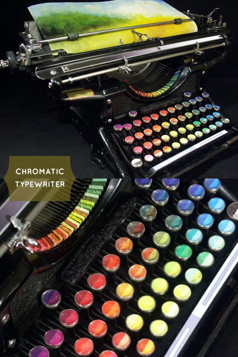
Chromatic Typewriter
Amazing! This is a conceptual piece by artist. Tyree Callahan, who modified a typewriter by replacing the keys with pads…January 16, 2012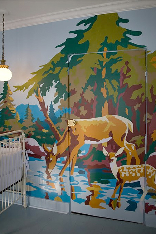
Paint-by-Numbers, Giant Wall Mural Inspiration
I've painted original murals before for my nephews, but it's been a while. These giant paint-by-numbers murals have me inspired…September 15, 2011
Batanica Caps Poster
Beautiful. Illustrator Sasha Prood has launched a new print shop, which includes the hand-lettered Batanica Caps Poster you see above.…August 1, 2011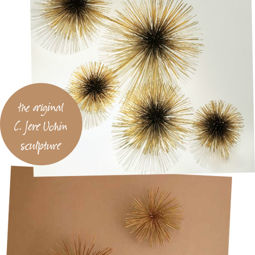
Jere Urchin vs. Nova Starburst
What do you think about these? The original C. Jere Urchin sculpture has been reissued and is available through Jonathan…July 20, 2011
Will We Have Rainbows, Day After Day? (Free Printable)
My Grandma Rose sang when she was happy, and it wasn't until years later that I realized most of the…May 23, 2011
Scientific Botanical Prints
Would it really be surprising that someone as fond of pink as I am would also be fond of flowers? Even the less girly among…
Chromatic Typewriter
Amazing! This is a conceptual piece by artist. Tyree Callahan, who modified a typewriter by replacing the keys with pads of color. p.s. Check out…
- Camp Wandawega Paint-by-Numbers, Giant Wall Mural Inspiration
I’ve painted original murals before for my nephews, but it’s been a while. These giant paint-by-numbers murals have me inspired though, maybe enough to actually…
Batanica Caps Poster
Beautiful. Illustrator Sasha Prood has launched a new print shop, which includes the hand-lettered Batanica Caps Poster you see above. The letters are also available…
Jere Urchin vs. Nova Starburst
What do you think about these? The original C. Jere Urchin sculpture has been reissued and is available through Jonathan Adler. The other is called…
Will We Have Rainbows, Day After Day? (Free Printable)
My Grandma Rose sang when she was happy, and it wasn’t until years later that I realized most of the songs she sang were by…