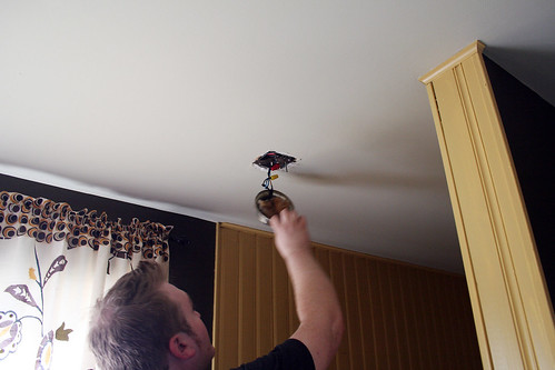
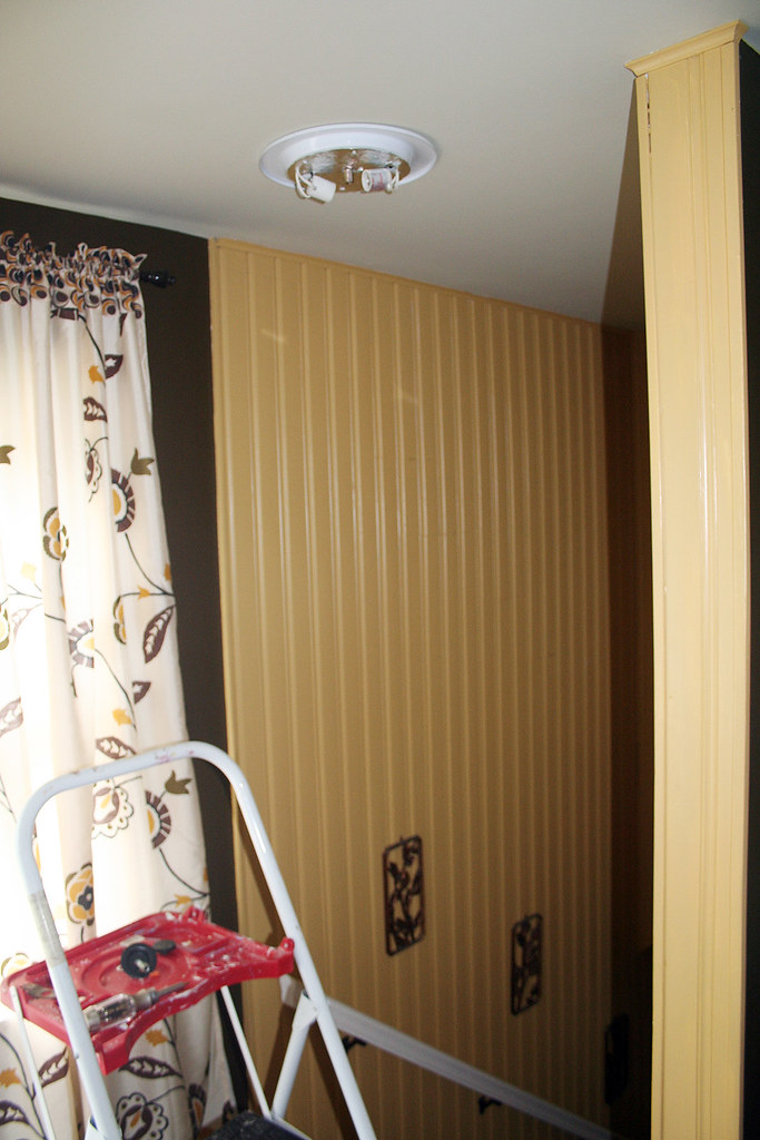
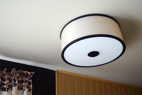
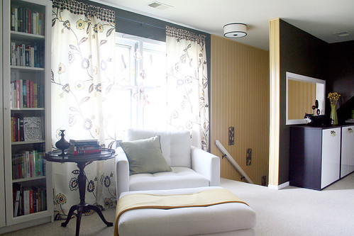
We finally got our hands on the Chase Ceiling Mount I had wanted for the library, and we’ve already installed it! Brandon did most of the work while I held Eleanor and read the instructions to him.
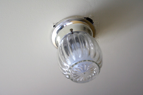
It’s so much better than the light that was there before.
It’s understated, but it’s a perfect compliment to the room.



Zoe
June 25, 2009 at 3:54 amVery pretty! And just a bit different :)
Sara@ Be Still and Know
June 25, 2009 at 6:26 amooohh its the perfect compliment to the black and white square interior window right there….GREAT choice!!:)
Danielle
June 25, 2009 at 6:59 amWOW! It looks even better than I thought!! Btw, I have that same step stool! I love that thing.
Risa
June 25, 2009 at 7:10 amSuper cute!!
I love it.
Laurie
June 25, 2009 at 7:20 amOh it looks fantastic! Great choice!
Jesselyn
June 25, 2009 at 7:38 amVery nice! Goes great with the room.
Elaine Matsushita
June 25, 2009 at 7:46 amnicole, a really lovely find and perfect for the room! what a difference a little light fixture makes!
Natalie
June 25, 2009 at 7:46 amOh I agree – its’ perfect! Where did you buy your curtains from? They are fabulous!
Kalee
June 25, 2009 at 7:48 amOooh, I like it! Very fitting.
Heidi
June 25, 2009 at 8:05 amIt looks great in that space! Perfect fit!
Becky @ Farmgirl Paints
June 25, 2009 at 8:07 amMuch better. I bet you are so glad the other eyesore is gone!
jenn
June 25, 2009 at 8:32 amI really like that – it looks great in the room
Beth
June 25, 2009 at 8:33 amOh…it looks so great!
kribss
June 25, 2009 at 8:33 ami want those curtains.
Laura
June 25, 2009 at 8:57 amVery nice! Question for you — how comfortable is the CB chair? I was considering saving for the couch and maybe the chair as well — was it worth the money? It’s absolutely gorgeous!
Amy
June 25, 2009 at 9:02 amThat is nice! I have been looking for a new flush mount light..will have to add this one to the list!
Cindy
June 25, 2009 at 9:04 amVery lovely! It goes nicely w/ the rest of the room.
Jennifer
June 25, 2009 at 9:52 amOh it’s just lovely! Consider me a jealous renter — I wish I could do little upgrades like this in place.
Meggan
June 25, 2009 at 10:07 amUnderstated but FANTASTIC. That fixture is so pretty!
Laurie
June 25, 2009 at 10:20 amI love how a simple light fixture can make all the difference. Looks beautiful!
shutters
June 25, 2009 at 10:43 amLovely, I think it finishes the room off. I am not sure all that white and an eight week old baby are a match made in heaven mind. :)
shutters
June 25, 2009 at 10:44 amWhere did you find the light? I would love something like that for my home office. Wonder if you can get them in the UK.
camila
June 25, 2009 at 10:44 amI love it. It fits perfectly. I have a light like your old fixture in our upstairs hallways. Its one of those things that we never got to around to, but now that the majoy projects in the house are done It kills me everytime I see it when I walk up the stairs!
Cristina
June 25, 2009 at 10:53 amThe way it looks on you ceiling is MUCH BETTER than how it is portrayed on the web site. Now that I see how crisp it looks in your room I love it!
ib73
June 25, 2009 at 11:06 amThe library is truly lovely and the light fixture just sets it all off. Do tell me where you got your drapes. I would love to get me a pair or two.
Christina
June 25, 2009 at 11:57 amThat looks absolutely amazing! I wish I had some of your talent.
jbhat
June 25, 2009 at 12:11 pmI love it too. So clean and crisp. It really does look perfect in the room.
Jessibee
June 25, 2009 at 12:19 pmIt looks so good! I love the library and can’t wait to see it if you get your hands on Orla Kiely fabric for curtains or whatever else you come up with. Everything looks so nice!
Karolina
June 25, 2009 at 12:45 pmhmmmm… Looks very nice!! I like your house :) and Eleanor is super cute!! :*
Jpoo
June 25, 2009 at 1:26 pmLove the new light and the pics of Eleanor…she’s getting more cute by the week (if that’s even possible). Still think she’s keeping those blue eyes…like her daddy.
grace
June 25, 2009 at 1:27 pmI have that chair and I ADORE it. I cannot say it enough – btw to the person who asked if it is worth it? Yes yes yes. It rocks. Nicole, my question is this – I have that exact chair in that color with a simliar style table next to it only it is cherry wood finish. Across from this I have the Macy’s Corono sofa which is basically their knock off of the Petrie sofa – in a very dark brown. Recently I acquired some heywood-wakefield endtables also in cherry but I’m not loving them next to the chocolate brown. Any advice on a way to make that color combo work?
THanks, I realize you may not have time to answer this one.
-Grace
susan
June 25, 2009 at 1:47 pmthat light is perfection. may I also say how much I yearn for a library like your landing library. it is swoon worthy.
Diana
June 25, 2009 at 1:57 pmWow, looks great!
luuvely
June 25, 2009 at 1:59 pmcute :)
CapreeK
June 25, 2009 at 2:30 pmOh, that light is just PERFECT for your room! Well done! Well done indeed.
Jess
June 25, 2009 at 2:49 pmI am just in *awe* of your decorating sense. Can you bottle it and sell it, please?
Lourdes @ The Higher Nest
June 25, 2009 at 3:26 pmWow. What a difference. I keep telling myself one day if we’re lucky we’ll have a place with as much style as yours.
Heather
June 25, 2009 at 3:56 pmThat’s a great idea! love it
Jen @ Primed4Design
June 25, 2009 at 3:57 pmMy parents had that “before” light also near a staircase, so outdated 70’s! :) I’m such a fan of big pendant lights for your “After”, great choice :)
ShocktheBourgeois
June 25, 2009 at 4:16 pmEven your CAT is a perfect compliment to the space! What a lovely, coordinated room- I am all envy.
Sherry @ This Young House
June 25, 2009 at 4:46 pmOoooh I love it. Awesome choice.
xo,
s
Jenny
June 25, 2009 at 5:00 pmLook great – the whole room I am totally envious of!!!
Keri
June 25, 2009 at 6:34 pmI love the light– it looks perfect there!
Georgia @ Yeah Hello
June 25, 2009 at 7:48 pmI LOVE IT!
Katie
June 25, 2009 at 9:10 pmI love that light in that room! Much better than the old light! I wish I had even a hint of your decorating style… My house is dreadfully boring..
yansy
June 25, 2009 at 10:13 pmWhat a transformation? It loos amazing Nicole, great choice.
Aimee
June 25, 2009 at 11:09 pmWhere is that cute white chair and ottoman from!?!? LOVE it!!! The whole room is perfect for sure!
jessie
June 26, 2009 at 6:43 am~perfect~!!!!! I love it. It just pops off the ceiling.
creative*type
June 26, 2009 at 9:25 amgreat addition.
Kim @ Yellow Brick Home
June 26, 2009 at 10:21 amLooks stunning. Absolutely perfect!
Kimbydee
June 26, 2009 at 10:17 pmLove it. The details definitely make a space…
Jen
June 27, 2009 at 5:00 pmWe have the exact same “before” light in our porch! I think it must been available in the 50s or something, because we have a lot of lights in our old house from that era. We might replace it, but that’s WAY at the bottom of the list.
Erin
June 28, 2009 at 7:59 pmOoh. Love it. It fits perfectly.
Jolie Musick
June 29, 2009 at 8:56 pmI love that light cover! It’s very film noir, something I would expect to find in Humprey Bogart’s room. However it also has a very simple & non-fussy feeling about it. Great choice!
Tommy Bahama Bedding
July 2, 2009 at 4:03 pmOoh…I LOVE the new fixture – really sleek & modern :) It is a lot better than the original.
Ryan
July 29, 2009 at 3:42 pmGosh, your new light fixture looks fantastic and just your style, but I absolutely LOVE your old one! I would kill to have it in my apartment :) I wonder if I can find one like that at a salvage place or something…
Mary
October 28, 2009 at 4:52 amOMG.
I have been looking for the “before” curtains (yellow floral) everywhere and not been able to find them, Could you please tell me where, or how to find them.
I would appreciate it so very much.
Oh, and LOVE your blog.
Love your style and your family is ADORABLE!! :)
Flushmount Lighting Fixtures | Making it Lovely
March 26, 2012 at 12:47 am[…] call too much attention to itself (but still looks good).I’ve used the second light here at the top of the stairs leading to the second floor, and I’ve used the third light in my office and in […]