The ceiling in the kitchen is 7’10” high. The light that’s in the room now has three fluorescent bulbs, hangs down 10″, and has a 15″ diameter. It’s the right size and has the right light output, but I never did like it all that much. Now that the kitchen has been updated a bit, I want to replace the semi-flush mount fixture with something prettier, but not lose too much light or headroom. Argh, I feel like I’ve been here before.
Lighting I Really Really Want to Work in the Kitchen
-
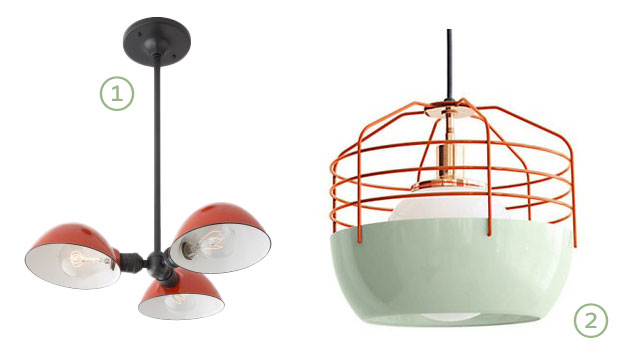
Factory Satellite 3
I don’t know if it would look funny hugging the ceiling, and I worry that the shades will block too much of the ambient light that we currently have bouncing off of the ceiling. Also, Edison bulbs look great but I would replace them with fluorescent bulbs for practicality, and even the round ones may throw the look off a little. -
Bluff City Pendant, Large, Mint/Red
It’s supposed to be a pendant, not a flush-mount fixture. It’s slightly too tall (13″), and I’m not sure it would provide enough light. But I love it. I would happily save up for this one.
Somebody please tell me that one of those two will suit my needs perfectly and we will be happy forever and ever. Except don’t if it isn’t true. I mustn’t allow my infatuation to get the best of me.
Here, we have some more options.
Lights I Like a Lot but Know Won’t Work and are Therefore Easier to Resist
-
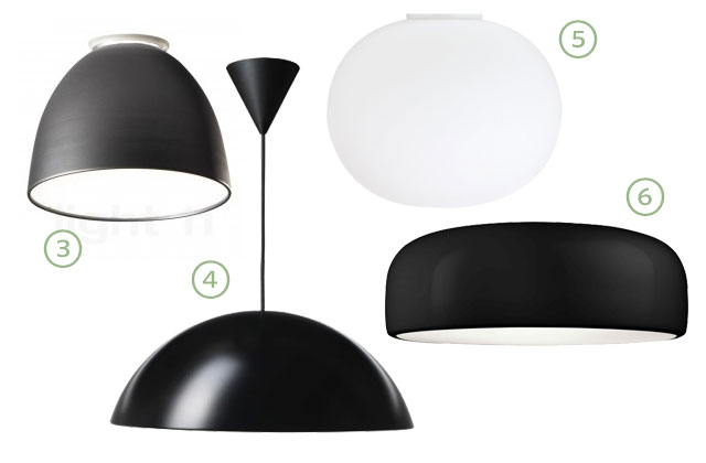
Artimede Nur Mini Ceiling Light
The “mini” version is still fairly large, and it’s a good size for our kitchen, but it focuses light downward and wouldn’t provide enough general illumination. -
IKEA 365+ Brasa Black Pendant Lamp
This looks much more expensive than it is, but again, it directs light downward. And it’s another pendant that I’m trying to force into a semi-flush mount, and that’s probably silly. -
FLOS Glo-Ball C Ceiling Light
If you haven’t seen this one in person, you’re probably thinking this is a really simple light with a really high price tag. I assure you it is organic and special and beautiful, and yes, the price tag is still high. I don’t love it enough to spend that much, and it only holds one bulb anyway. -
FLOS Smithfield Ceiling Lamp
I adore the shape, and there is even a 3-bulb option. Alas, it is directional, downward light.
I used a fancy-ish html trick to continuously label those bullet points with a break between the ordered lists, so hopefully the numbers correspond. If not, may the powers of deduction and common sense be your friend.
Moving on! This next collection has another catchy name.
Lighting That Will Work Just Fine but That I am Less Excited About Overall
-
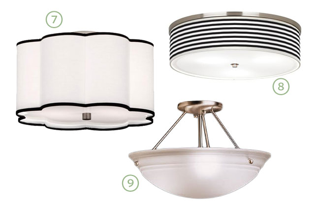
Robert Abbey Antique Nickel Ceiling Light
Cute. But is it too cute? Also, the shade is fabric and I wish it wasn’t. -
Black Horizontal Stripe Nickel Wide Ceiling Light
Black and white stripes would look good in the kitchen! But on the light? Dunno. And it’s fabric again. -
3-Bulb Semi-Flush Light
This is the stupid light we already have. It is passable. It’s biggest selling point is that it’s already in the room (no work, no money spent).
Can you tell I don’t have as much enthusiasm for this last set? There’s also this collection of flush mount lighting to look at from when I did my big ceiling light guide last year, and my whole lighting board on Pinterest.
What do you think? I’m tempted to try one of the first two out, and then Swiss cheese my ceiling to bits with recessed lighting. Kidding (sort of).


Christina W.
March 5, 2013 at 9:53 amI loooove the Bluff City pendant SO MUCH. My only problem with it is deciding on which one of the color combos I like best because they’re pretty much all amazing.
Making it Lovely
March 5, 2013 at 11:23 amI know. It’s an easy choice for me because I’ve been going with mint and orange/red anyway for the kitchen, but they’re all beautiful.
Kathryn
March 5, 2013 at 10:03 amGo swiss cheese! Why buy something you already don’t like?
Jenny B
March 5, 2013 at 10:03 amGet the one you love and then get recessed lighting. It is the only way to get the proper amount of light in the kitchen. This is from someone who lives in a 1923 bungalow and did a kitchen remodel and the heavens opened when I finally got proper lighting in the kitchen. During the remodel I was totally obsessed with not putting too many recessed lights in because of how it would look, now I’m kicking myself because we NEVER notice the recessed lights in the ceiling, only the gorgeous pendants we got off ebay, but I do notice when there is one tiny spot of not perfectly lighted kitchen and I wish we had more recessed lighting. It is life changing. It is impossible to get enough light from one ceiling pendant (it makes shadows on the counter where you are working because the light is up and behind you). Come enter the 21st century with me…
Making it Lovely
March 5, 2013 at 11:26 amI like your closing argument.
Bryony
March 5, 2013 at 1:27 pmI have to agree! We’re in a rental flat right now and can’t change out the hideous fluorescent strip light on our kitchen ceiling, but we *did* snag some little IKEA lights that my husband rigged as recessed under-cabinet lighting and that’s what makes the difference for us. (He hates overhead lighting anyway…) Recessed lighting will be functional but fade into the background and let you get whatever beautiful pendant you want without worrying too much about whether it has bright enough working light. Plus, I’m just a huge fan of that Bluff City pendant: I’ve pinned it myself just waiting for the day where I have a house I can hang it in!
Making it Lovely
March 5, 2013 at 8:59 pmWe did install under-cabinet lighting, and it makes a big difference. I’ll have to look into recessed and see how much that will cost.
Kristin
March 5, 2013 at 10:13 amRecessed lights are the way to go – don’t skimp. The cheap ones are really cheap and yellow over time. 4″ round are really nice and subtle, I love Lightolier. Organize them to properly light the room, then go for the pendant of your dreams. The ceiling height worries me a little, but I’m biased because my husband is 6′-6″ so he’d bump his head on anything hanging too low in there. I would make a quick mock up with a milk jug or other recycled scraps to get the actual size of the fixture, and hang it from some rope for a few days and see what you think.
Making it Lovely
March 5, 2013 at 11:28 amThe ceiling height worries me too. And this house is so weird — each of the rooms on the main floor has a different ceiling height. Making a mockup is a really good idea.
Kristin
March 5, 2013 at 11:47 amI can’t remember the connections to the rest of the space (what’s on the other side of each door or what views of the kitchen you get from other rooms), but the photo of the window with the open countertop below and the cool black and white print to the left of it – to me that seems like a great place to hang a cool pendant. If it were hanging over a countertop then you could maybe get by with a lower hanging height than if it were in the middle of the room. I think it would look gorgeous from the standpoint of where that picture was taken, but you’d have to evaluate how it would look from the adjacent room. Might also look awesome.
Making it Lovely
March 5, 2013 at 9:01 pmI was wondering about putting a pendant there too. It would look good from the angle you’re referencing, but it might look strange from the dining room doorway (to the left of the black and white print).
Shelley Torgerson
March 5, 2013 at 10:23 amThanks a lot, I am now officially obsessed with that Bluff City Pendant. :) It is way out of our price range right now though, so it will just get pinned for the time being I guess. I do really like #1 though too! I see your dilemma, those two are the best. Good luck! We ended up with an Ikea pendant in our kitchen because we really loved it and it didn’t give quite enough light by itself, so we hung another light above the sink, for now it works. Our kitchen is super tiny though.
Making it Lovely
March 5, 2013 at 9:06 pmIt is a gorgeous light, isn’t it? In a way, I’m glad I went with something inexpensive the first time around, even if I wasn’t crazy about it. Now, if I do replace it, I have a much better idea of what I would want to spend my money on so that I’d end up with something I love.
Megan @ Monroe Makeshift
March 5, 2013 at 10:54 amI vote for the black and white stripe one. The price is good and it’s striped! I love black and white stripes. It’s a sickness. Can’t wait to see what you go with!
Lisa
March 5, 2013 at 11:08 amI like 5 and 7. 9 is what I call a bug bowl!
Making it Lovely
March 5, 2013 at 11:09 amWe do have to clean bugs out of it! Blech.
Brandon
March 5, 2013 at 11:34 amA “bug bowl”, Lisa totally nailed it.
Amanda
March 5, 2013 at 11:13 amI had two pendant light fixtures above our kitchen table that we used Edison light bulbs and it turned out to not be enough light. I don’t think the Edison lights have a very high wattage. Just my two cents…
Making it Lovely
March 5, 2013 at 9:10 pmEdison bulbs are definitely not as bright. Here’s a conversion of their equivalent incandescent wattage.
maya
March 5, 2013 at 11:20 amLove number 8 with the B/W stripes!!! Gorgeous.
Jeanette
March 5, 2013 at 11:22 am#2 is my favorite, hands down! very inique and would give a fun pop of color! :)
Heidi S.
March 5, 2013 at 11:24 amI like #8 but it is a bummer that it is fabric. I suppose you have ruled out a ceiling mounted old schoolhouse type fixture with a glass striped bowl? I like this bowl with the gray stripes:
http://www.schoolhouseelectric.com/lighting-and-hardware/shades/hand-painted/hp-2250-11-6sh.html
I would vote for some downlights as well. We have several in our kitchen and I use them on dimmers quite a bit.
Making it Lovely
March 5, 2013 at 9:12 pmThose schoolhouse style fixtures almost always take just one bulb. If I was going to get a light that only takes one bulb, I’d rather just get the one I really want (#2)!
Olya
March 5, 2013 at 11:29 amQuestion – why dislike for fabric pendants? We have a whack-load of choices to make and I don’t mind them. Is it the matte texture or something else functionally/entirely?
I really like the Robert Abbey light! Looks like it’d provide a lot of diffused lighting as well, which is nice in a kitchen/functional room.
Making it Lovely
March 5, 2013 at 9:14 pmI wouldn’t mind as much if it wasn’t for the kitchen. It just seems like a bad idea to have a permanent fabric fixture in there that can’t be cleaned.
olya
March 6, 2013 at 2:21 amHmm, good point. :D Thanks for giving additional food for thought…. (oh god the choice paralysis during large renos is awful.)
Tanya from Dans le Townhouse
March 5, 2013 at 11:40 am#2 is AMAZING and you will love it forever. But, if it’s too tall, I actually think #8 is gorgeous and won’t hold you back if you decide to give the space another makeover in the future. It’s timeless, but modern, and the stripes will look perfect. Good luck!!
Monica
March 5, 2013 at 11:40 amI have this one and really love it: http://www.lampsplus.com/products/robert-abbey-anemone-23-and-one-half-inch-wide-ceiling-wall-light-fixture__19184.html
Making it Lovely
March 5, 2013 at 9:18 pmI like that, but not for my kitchen.
Adrienne B
March 5, 2013 at 11:41 amI do this for a living, and I hate, HATE having to pick out flush ceiling lights. There is so much ugly out there, and the lovely ones are often budget busters. Some places that have options that I DO like are Restoration Hardware (I kinda hate all the furniture they have now, but they still have some good lighting), Circa Lighting (some options won’t make you choke when you see the price!), and Hubbardton Forge for certain projects. I’m also a fan of Barnlight Electric for some pendants, Rejuvenation for lighting in traditional homes, as well as a company called Big Ship Salvage. A lot of my projects are right on the water and these are perfect (but not for everyone…). I agree with previous posters- you can never have too much lighting in the kitchen. Consider some can lights- Lightolier and Juno are good ones. Opt for a 4″ diameter and you won’t notice them much. You may fear that your ceiling is looking like swiss cheese, but you will get proper light and the other option (flush mounts or track lighting) will add more visual clutter than you probably want.
Making it Lovely
March 5, 2013 at 9:21 pmHubbardton Forge and Big Ship Salvage are new to me, thanks. I still haven’t seen anything else that I’m excited about though. I’m thinking about ditching the added lighting entirely and just going with recessed lights.
Kerry
March 5, 2013 at 12:54 pmYou are always working on the same room as me and we often seem to pick the same things! I saw your post on paint colors for the kitchen. The two paints I have also been deciding between are Moonlight White and November Rain. Now, I opened your blog today and saw one of the fixture I was looking at yesterday at the top of today’s post! So weird. Anyway, this post is timely for me. Yesterday, I spent hours trying to figure out lighting for our almost complete kitchen remodel. I buy most of our fixtures from Schoolhouse because they are such a great company and nice to work with. My kitchen is connected to my dining room where we installed the large scale Factory Light No. 9 pendant in black. It is huge! But, we love it. Now we need something for the kitchen end of the room, which is about 10 by 11 with 8 foot ceilings. I was looking at the factory satellite 3 (or 2) pendant, but quickly realized it would compete with the Factory Light No. 9 at the other side of the room. After talking to Schoolhouse Electric, I am resigned to the fact that I will have to install a basic fixture with an opal shade if I want to light the room. Otherwise, I may go with all canned lighting and a pendant over the sink and skip a fixture in the center of the room. For your space, have you considered the satellite 3? (same as factory satellite 3, but with large scale globe bulbs and no shades). This would allow light to bounce off the ceiling. You would get glare but could try the silver tipped bulbs to minimize that, which look cool anyway. You would probably still need some canned lighting, but maybe not too much. Hope this helps!
Making it Lovely
March 5, 2013 at 9:29 pmThe Factory Light No. 9 is huge! I like it a lot though. And I like Schoolhouse Electric a lot in general too.
I considered the Satellite 3, which is the same exact fixture with round bulbs and no shades, but it’s those shades that I like so much.
Megan @ Rappsody in Rooms
March 5, 2013 at 1:03 pmI LOVE #2 and then #7 and #8 are next on my list…both of which you aren’t really into. But the first two are definitely the most fun and interesting and I definitely think you should go for it!
Lizzy
March 5, 2013 at 1:09 pmI just got two of the Schoolhouse Electric Newbury 6″ Surface Mount Lights. I got the silver striped shade and the blue striped shade. I love them so much! Maybe not enough light output for your kitchen, though?
Making it Lovely
March 5, 2013 at 9:34 pmNo, probably not enough light.
jo ro
March 5, 2013 at 1:46 pmI have 8 in two bedrooms (but in other fabric, the giant one & the normal sized one) – they don’t collect bugs (they cannot seem to get into it) & you have to get special bulbs (but they give great light).
I really love 2.
Jessica
March 5, 2013 at 2:11 pmhttp://www.apartmenttherapy.com/20-flush-mount-lights-that-dont-suck-179038 check these flushmount lights (“that don’t suck”)out on Apartment Therapy!
Look at # 4,9,13,14,16 & 18!! I think those styles fit with your decor. #14 is my favourite, brass against white will look really good, and it’s sputnik, how can you not love it?!
I hear you though, my house is early ’80s and there are lights everywhere and no recessed lighting (not an option) and we struggled with lighting choices. We ended up putting 3 IKEA Alang 14″ drum shades in our basement, where there were uncessarily 4 lights in a 600sq.ft room.
Love these roundups of products! Thanks!
Making it Lovely
March 5, 2013 at 9:37 pmI like a lot of those, but maybe not for my kitchen. I’m being super picky, I know.
Lynell
March 5, 2013 at 2:27 pmI just replaced my kitchen light this last weekend. I had a flush mount 3-bulb light, and I really liked the schoolhouse light fixture look for my kitchen, but was worried that it wouldn’t be bright enough with only one bulb. But it uses up to a 100 watt bulb, (my last fixture was 3 60’s), and the glass cover really diffuses the light around, I think it’s actually brighter than my old fixture. And I like the cute vintage/industrial look of it. So maybe something like it would work in yours? School house electric has a cool one, but i got the budget version for under $50.
http://www.homedepot.com/p/t/203194915?catalogId=10053&langId=-1&keyword=schoolhouse+oil+rubbed+bronze+light&storeId=10051&N=5yc1v&R=203194915#.UTZU66GfE4E
Making it Lovely
March 5, 2013 at 9:40 pmAt that price, I kind of want to take some mint green spray paint to the base and have at it.
olya
March 6, 2013 at 1:49 pmHa, apparently you’re channeling Sherry who talked about doing that a while ago (http://www.younghouselove.com/2011/08/ceramic-dog-flashbacks/).
Now I’m tempted to do that treatment in OUR home.
julia [lifeonchurchill]
March 5, 2013 at 2:41 pmWhat about something like this? http://www.restorationhardware.com/catalog/product/product.jsp?productId=prod1690098&categoryId=cat1701013. We had the same problem in our kitchen and ended up installing 2 of these: http://www.restorationhardware.com/catalog/product/product.jsp?productId=prod1192067&categoryId=cat1701013. We’ve been happy with them!
Making it Lovely
March 5, 2013 at 9:42 pmI like barn lighting, but it’s directional/downward. The second one is OK, but I don’t love it.
Jillian
March 5, 2013 at 2:44 pmIn my previous kitchen remodel (1922 four square), I opted for three flush mounts from Restoration Hardware (similar: http://www.restorationhardware.com/catalog/product/product.jsp?productId=prod690937&categoryId=cat1701013) plus a pendant over the sink and two pendants over the island. No recessed lighting, and I never felt like it was too dark at night. Recessed cans are so much better than they used to be, as many others pointed out, but I wanted to chime in and say I was really glad I avoided them.
Making it Lovely
March 5, 2013 at 9:55 pmI don’t know. The more I’m looking specifically at the lighting in kitchens I like, the more I’m leaning toward getting rid of the flush mount entirely and just doing recessed (in addition to the under-cabinet lighting we installed originally).
the ef group
March 5, 2013 at 3:11 pmGreat ideas, I really love the 5th one down!
Marlo
March 5, 2013 at 5:52 pmWe recently put five 4″ recessed LED cans in my mom’s 1942 kitchen remodel, highlighting the open shelving, the pantry/fridge area, and new Dutch backdoor. We bought them from Home Depot, and they were the only ones that looked pretty, and not like the thousand 6″ recessed fluorescent and incandescent cans with ridges that I have throughout my new builder home. They’re so small (the bulbs are actually 2″), and they have nice white casing with a bit of a swivel built-in, that they don’t seem obtrusive in the slightest.
She originally had an ugly flushmount with fluorescent bulbs in the center of the kitchen and a similarly bad one above the sink. The lighting was uneven and terrible, and it was amazing how much the new lighting changed the whole feel. We can actually see in there! To warm up the cool LEDs, we replaced the fixture above the sink with a sconce from Schoolhouse Electric with an opal shade with turquoise stripe, and added two nautical Ikea Ottava pendants above the peninsula. Lots of overall lighting at different tones for different purposes. Lighting success!
Kerry
March 5, 2013 at 6:02 pmMarlo,
You just convinced me to go with recessed lighting. Can I ask how big your mom’s kitchen is? My space is about 11 by 11 and I am thinking of doing 5 cans. I am skipping the center fixture and doing a Schoolhouse pendant over the sink. We have no peninsula, but the dining room is nearby with a big factory style light.
Kerry
Making it Lovely
March 5, 2013 at 9:57 pmI think I’m being swayed toward inconspicuous recessed lighting too.
Joellyn
March 5, 2013 at 6:27 pm#2 is wicked awesome!
I have the same SHE fixture (#1) in my kitchen (link to photo below) with regular bulbs on a dimmer. i don’t think it looks bad. The great thing about their fixtures is wattage isn’t limited. Brightness shouldn’t be an issue.
http://www.montanaprairietales.com/blog/2013/2/4/kitchen-sources.html
Making it Lovely
March 5, 2013 at 8:46 pmI love your kitchen! And thank you — it’s really helpful to see the light in a room.
sue
March 5, 2013 at 7:14 pmswiss cheese away & go for no.2… you’ll be so dazzled by its beauty you won’t even notice the recessed lights :)
Kim
March 5, 2013 at 8:03 pmWhat about this one from Rejuvenation Lighting?
http://www.rejuvenation.com/catalog/products/chase
You can get it with a red striped shade
SEM
March 5, 2013 at 9:22 pmCheck out the ‘industrial cage nickle lamp’ on lampsplus.com
Vintage/industrial/chic!
Making it Lovely
March 6, 2013 at 12:15 pmA smidge too industrial for me, but thanks.
Jen Walter
March 5, 2013 at 10:57 pmHi. We have two of these when you first walk in our front door, and then just down the hall from the entry. The give off a lot of light. The are flush, but hang lower because of the metal top and bottom. Not sure if they are too formal for your kitchen though.
http://www.neimanmarcus.com/p/Simplistic-Ceiling-Fixture-Fixtures/prod102260154_cat16990736__/?icid=&searchType=EndecaDrivenCat&rte=%252Fcategory.jsp%253FitemId%253Dcat16990736%2526pageSize%253D120%2526No%253D0%2526refinements%253D&eItemId=prod102260154&cmCat=product
Here is where I got them, and also a link to pic i found on Pinterest of them.
http://pinterest.com/pin/23362491787149466/
Making it Lovely
March 6, 2013 at 12:12 pmA little too formal, yes, but they are nice.
taste area
March 6, 2013 at 12:14 amgo with nr.2-> if you are willing to spend that kind of money, go for it. I mean the design is sooooooooo beautiful. one of the best pendants I’ve seen lately.
A Colorful Door, Colorful Appliances | Making it Lovely
March 6, 2013 at 8:02 am[…] was thinking some more about lighting, and the plan for finishing the kitchen’s minor update. OK, really what I was doing was […]
Making it Lovely
March 6, 2013 at 12:19 pmI like the light that was on Young House Love today! Could be cute with some mint spray paint.
I called for an electrician to give a quote on some recessed lighting, and someone will be by on Monday. I should be better able to make a decision after that.
rori
March 6, 2013 at 1:27 pmI can help you talk you out of #8, we got this for our living room in our last house, and although it would appear otherwise, no light comes out of the sides (the fabric is very opaque), leaving us with a very very dim lit living room. not so good for a kitchen. But looks like you have much more exciting options anyways- just thought I would add our experience so others might escape the same experience we had!
Kshoo Design
March 15, 2013 at 4:40 pmGreat lighting options!
Virginia
March 26, 2013 at 11:32 amWe have those same stupid flush-mount three-prong lights all over the place, including in my office, and they’re so boring but already present. It just occurred to me, though—what if there’s a way to DIY jazz them up a bit? Maybe painting stripes on the glass, or spray-painting the hardware? What do you think; are they salvageable with some fun work?
Three Ways to Spice Up Your Kitchen Now
March 31, 2013 at 1:13 pm[…] Making it Lovely: Kitchen Lighting Options […]
cocoweb
January 31, 2017 at 2:12 pmOptions 1 and 2 would look great in a kitchen.