Mittens, gloves, hats, and scarves are taking over our dining room chairs and table. It’s getting cold out and the dining room is the next space beyond our entryway, so everything is landing there. I’ve been planning to add some storage in the entry, below the stairs, as we do have some space to work with and could use the added functionality. The entryway vignette below would be entirely welcome in my house! Too bad it would never work (even though I do already have a framed vintage botanical print).
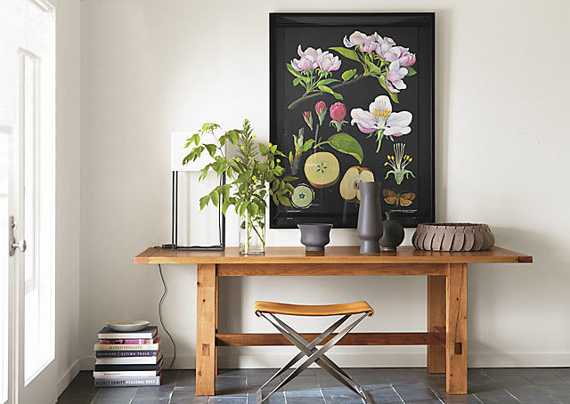
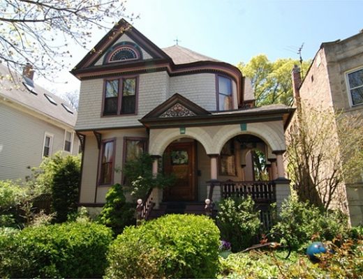
First of all, that particular table is a dining table. We have some space to work with, but not that much. That’s easy enough to remedy by substituting a sofa/console table, but the second reason it wouldn’t work is that while it looks great, a simple table is low on practicality. We need storage, and that setup offers none. Baskets could be added, over even one of the random old treasure chests that came with our house, but I’d like something with doors or drawers. Third, the paneling below our stairs is beautiful, but this is a very wood-heavy Victorian and more wood is probably the last thing the entry needs.
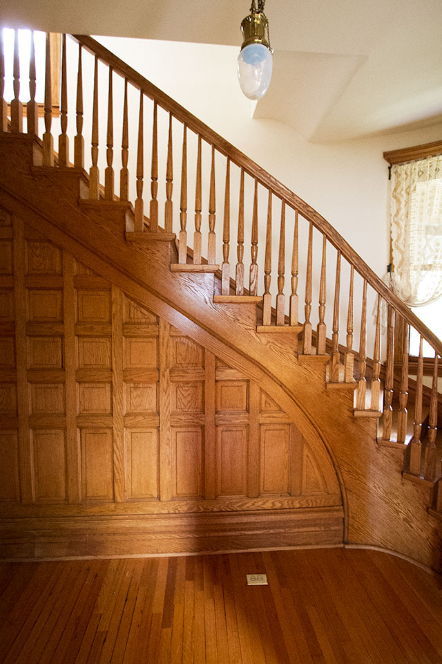
Mixing woods can be done, but it would have to be done carefully and I’d prefer to contrast the details of our woodwork with a more clean-lined, modern piece in a painted or lacquered finish.
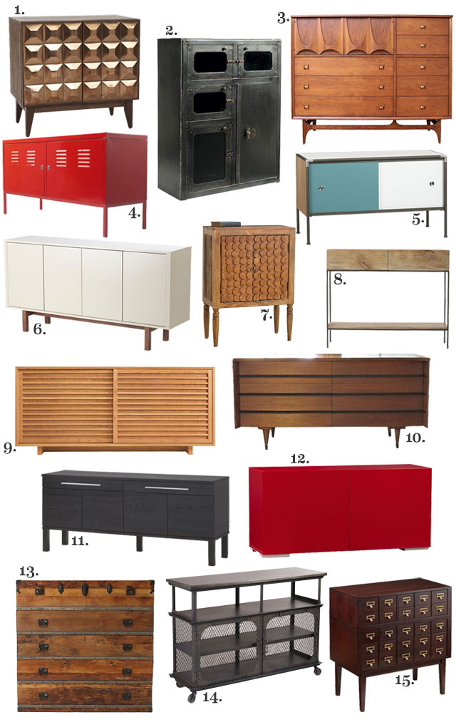
The feel of that entryway above though, that’s still good! There’s still plenty of inspiration to pull from it. As I mentioned above, I have a similar botanical print. It may not go in the entryway itself, but it will probably be on the first floor nearby somewhere. The other elements — a light, a pretty bowl, some decorative vases, books, and a place to sit — are just the result of good styling. Easy enough to incorporate with a different piece of furniture. So, speaking of, here are fifteen sideboards, buffets, bars, dressers, and credenzas that I’d considered, including the one that I bought. There were more options (!), but it was getting a bit ridiculous to present all 442 of them here.
-
Lubna Chowdhary Tiled Buffet, West Elm, $699
The metallic finish is nice, but the squares would compete with my paneling. -
Amsterdam Cabinet, Ballard Designs, $999
WANT WANT WANT. Just not for the entry. -
Broyhill Brasilia Dresser, Chairish, $2400
Mid-century doesn’t play so well in a Victorian, though this is beautiful. -
PS Cabinet, IKEA, $99
I had one of these little guys as a dining room buffet years ago in our apartment. LITTLE is the key word here. -
Dupla Credenza, CB2, $499
Cute, but probably too cute. -
STOCKHOLM Beige Sideboard, IKEA, $379
(It’s in stores but not the US site yet.) Kind of plain, but good proportions. -
Tree Rings Cabinet, Anthropologie, $398
I’m so into this little cabinet! Again though, too small. -
Rustic Raw Mango Storage Console, West Elm, $499
Nice, but not enough storage. -
Moro Dining Cabinet, Room & Board, $2299
This comes in five wood finishes, and I’m sure one of them would look fine in the entryway. I love it, but it’s pricey. -
Mid-Century Dresser, Chairish, $499
Another great vintage piece that would look fantastic… in a different house. -
BJURSTA Sideboard, IKEA, $249
I’m not feeling the blocky legs, but it isn’t bad. -
Fuel Red Credenza, CB2, $499
Super glossy with rad proportions, but a bit low to the ground. -
Traveler Chest, Anthropologie, $1698
This wouldn’t look right against my woodwork, but isn’t it interesting? -
Metal Bexley Bar, World Market, $529
Looks cool empty, but would look cluttered with the kids’ winter gear. -
Circulation Chest, The Land of Nod, $799
I’ve been crushing on this since it came out, but like the first option, those little squares would compete.
I’m going with number 6, the STOCKHOLM beige sideboard. I don’t want anything too precious, since it’s going to be used on a daily basis by the whole family, and I’m hoping the sideboard will hold up. It’s not my absolute favorite of the bunch (that would be a toss-up between numbers 2, 7, and 9), but the style, scale, and price are right. There’s potential for modification down the line with paint and/or beautiful hardware, but I think it will look great as-is once it’s in place and styled up a bit.
Which would you have chosen?


Sarah Jane
December 2, 2013 at 12:35 pmI loved the sideboard you chose and also have planned on using it at my house. Just FYI, it was on the US site when the Stockholm collection was first released and has since been taken down. I plan on getting it in the store in case they are phasing it out.
Meg
December 2, 2013 at 12:35 pmHa! I had #6 in my mind for you as I scrolled down…never thinking I’d be right. I think the white will lighten the wood paneling and break it up from the floor. Great choice!
jbhat
December 2, 2013 at 2:57 pmI loved that one for the space too, and then I was all “I won!” when I saw that you had chosen it. Now I can’t wait to see your styling, so now you must hurry up and put it together! :)
jbhat
yasmara
December 2, 2013 at 12:41 pmWe have bought a couple of things from the Stockholm line & it’s really a cut above the usual IKEA quality (and style). Apparently this line has been available overseas for a while, but only came to the States in August.
Kayla aka Kilo Bravo
December 2, 2013 at 12:49 pmI was crossing my fingers you would tell us you went with #6 as I scrolled through the post! I agree that while it might not be one with the most pizzazz – it will definitely get the job done and bring some lightness into that wall of wood! Can’t wait to see how you style it and inject it with personality.
Sarah @ 702 Park Project
December 2, 2013 at 1:05 pmI found a dresser identical to #10 at the Habitat ReStore for $40! I plan to paint the front of the drawers white and add gold ring pulls. It was a great find!
Jessica @ SundayLoves.com
December 2, 2013 at 1:13 pmOh, I like your choice. I think it’ll work really well!
Marcee ... ILLINOIS
December 6, 2013 at 2:48 pmBirch color re #11 has a fresh look. Very nice.
Everything @ R&B costs. Love most everything tho!
Moro cabinet = stunning. Solid maple w/shell stain is amazing. I need that for Christmas! Or anytime. Made in Vermont ….. a nice bonus.
Lesley
December 2, 2013 at 1:13 pm#6. It’s so very different to the wall so would be a lovely contrast…my next selection would be #10, simply because it’s lovely
Laura @ Rather Square
December 2, 2013 at 1:19 pmGood choice with #6! It won’t compete too much visually with the woodwork, and there should be a lot of storage inside. I’d probably have chosen the same one. My favorites were #7, #11, and #14 but I think the functionality of #6 wins out.
Onyana Rosa
December 2, 2013 at 1:40 pmI would chosen the red Ikea piece. Only because I’m in my first apartment and don’t want to spend too much money for furniture for a place I won’t call home for very long.
Ali Burtt
December 2, 2013 at 1:41 pmFor your house and your style? Totally the right choice.
If it were me though, I would be all, “Restoration Hardware! Steampunk! Brocade wallpaper! Paint all the walls black!” There’s something wrong with me.
Making it Lovely
December 2, 2013 at 1:47 pmWell, the black walls are coming, and I am pretty into this Industrial Tool Chest Console from RH.
Ali Burtt
December 3, 2013 at 2:06 pmSrsly? Okay, that’s just about the most exciting thing I’ve heard all week. And in your hands, I’m confident it will work. In mine, it might all get a little too Miss Havisham.
Holly
December 2, 2013 at 1:49 pmI’ve had my eye on that sideboard but noticed they took it off the site a short time after they unveiled the Stockholm collection. Is it in your local store?
Katie
December 2, 2013 at 1:49 pmI fell in love with #14 as soon as I saw it. I remember you saying that you wanted to throw a little industrial into this new house and I thought that some cool panels inside the doors could keep it from letting the “things” make it too busy. I especially loved the two levels of surface, one at grown up height and one at kid height.
I do think the Ikea one would let the gorgeous paneling shine though, and in a house with so much visual interest you can’t go wrong with something subtle and sweet.
Laurie
December 2, 2013 at 1:53 pmI think you are right, the white one is the way to go. You do need to counter-balance all that wood. That’s a challenge! I’ve been looking for a similar solution myself. I need to do something besides the basket by the front door. It looks cute (all my winter stuff is hand knit so having it on display isn’t a bad thing) but it is low enough for the dogs to pick up pieces and distribute them around the house. Because that is very fun apparantly.
jade
December 2, 2013 at 2:00 pmLOVE, love, love number 7! I’ve been eyeing that little piece myself. Does seem a tad pricey considering the size though. hm… I think you picked a good one, plus, like you said, a little hardware and that baby is good!
Brittany
December 2, 2013 at 2:29 pm3, 10, or 15 for my house lol. I love those!! I think your choice will work well. I just want 3, 10, or 15 for myself. Too bad I seem to have expensive taste. Dang.
Virginia (The Heartographer)
December 2, 2013 at 2:57 pmNicole, what are your thoughts about surface area to stash stuff like mail? We have a normal-depth console table near our front door, but I’m almost tempted to get something super shallow with only room for the pretty stuff, partly to force us to be better about dealing with mail and other walking-in-the-door clutter. But that could well backfire. :)
I’d love to know your plan for practical everyday usage, especially since we don’t yet have two kids like you but I like to shop big picture. Cheers!
Virginia (The Heartographer)
December 2, 2013 at 2:58 pmOh, the other thing is that I often have clients coming to see me at home, so I don’t necessarily want super personal mail like mortgage or paycheck or bank statement stuff to be sitting right there by the front door. I trust my clients, but it’s just weird, you know? Most bills are online nowadays but there’s always still something weirdly personal.
domesticallychallengedkate
December 2, 2013 at 3:56 pmHey! I just came across your blog and I love your style! I like # 2, 11 and 13 for my home. I really like how you used the space! Can’t wait to read more!
Katie
December 2, 2013 at 4:18 pmWe just bought Ikea’s Hermes sofa table for our entry and considered the one you chose! Mostly, we needed the cubbies for shoe storage. I can’t take the mounds of shoes hanging out by our front door.
Ellen
December 2, 2013 at 4:49 pmbefore I scrolled down I picked #6 too! great choice..all were cool
amyks
December 2, 2013 at 5:35 pmI picked no. 6 also before I even saw your choice,too funny. I can’t believe it is from IKEA! I love the white with the funky base and I can’t wait to see it in action in your entryway.
Sarah from a fine line
December 2, 2013 at 6:25 pmI would have picked the one you chose. I think it’ll brighten up all the wood in that space. I actually had my eye on that piece for my office. You could always modify with different legs to make it a bit more unique.
Amy
December 2, 2013 at 7:53 pmHa! I totally mentally picked out the same sideboard before I scrolled down and saw your choice! I think it does a great job for the space. You can’t beat that price either, nice bonus.
Deborah Baldizar
December 2, 2013 at 8:44 pmI love #12. That red is so striking. Your choice is nice as well.
emily
December 2, 2013 at 9:04 pm#6 is perfect…the perfect height and shape of the space. and, i just pinned that exact photo from the Room & Board site this morning! it’s so good.
Jessika
December 2, 2013 at 10:15 pmWe used the PS Cabinet as a litter box after it had served its function as a cabinet. I didn’t like the piece. It was so cold, so hollow-feeling. I also hated how you ALWAYS needed a key to open the cabinet doors. Great around small children, I suppose, but it made me feel like I was in a locker room.
Yvonne @ Dress This Nest
December 3, 2013 at 2:01 amAh! So many great (and varied) options! I love #1 & #14 myself and even those two are entirely different looks.
Chichi Furniture
December 3, 2013 at 7:36 amGreat choice, I agree that trying to match wood could be tricky so a contrast is a great idea. Hallways are such tricky rooms, mine is quite small and everything gets dumped there. Its the room that gives the first impression of your home so I like to style and dress it as I would any other room. Mirrors and consoles can look lovely and be real features, especially if the console is slender and maybe has some small drawers to tuck mail and keys away in. Another option is storage trunks/ottoman – great for storage and doubles up as a seat.
Mary
December 3, 2013 at 9:18 amI was immediately drawn to the Stockholm when you pinned it the other day. However, where did you locate one? I checked Bolingbrook and Schaumburg and it isn’t available. I want one too!!!
Making it Lovely
December 3, 2013 at 9:30 amBolingbrook has them! They had 9 left when I bought mine on Saturday.
Melissa @ HOUSEography
December 3, 2013 at 9:27 amWithout even looking at the manufacturers and prices, I chose the Ikea piece as well just based on the picture and the great contrast it would make with your woodwork. It won’t compete (or break the budget) – a great choice!
Karen @sugarspicelivin
December 3, 2013 at 12:01 pmOhhhh. Love #6. I also really love #5. Great choice!!
Aleks
December 4, 2013 at 3:23 amFirst of all, congratulations! Everything you touch just become beautiful and of couse, LOVELY!
About the choices, my personal favorite is the BRASILIA dresser. But for you space, I definitely would choose the same as you. The plain front, clean lines and light color are just perfect contrasting with the beautiful wood work.
Antonella
December 4, 2013 at 4:29 am6 and 12 I think are the best to make the wood pop! Good choice :-)
Maya
December 5, 2013 at 11:42 amHeads up: Number 3 is listed on Krrb for $1800 (located in San Jose, CA).
:)
Maya
December 5, 2013 at 11:43 amGreat options!
Heads up: Number 3 is listed on Krrb for $1800 (located in San Jose, CA).
:)
Marcee ... ILLINOIS
December 6, 2013 at 2:27 pmLove #9. Elegant. Not the best contrast though. #2 looks like refrigeration.
Very understandable re your #6 choice. It will serve as an important household purpose. Fun also trying new things out.
Always maddening to figure what to do with wet (or dry) winter things. We have the same situation here …. tons of gloves, scarfs, hats ….. everything.
The Entryway with its New Sideboard | Making it Lovely
December 9, 2013 at 1:27 pm[…] solid antiques and quirky pieces of furniture, but sometimes IKEA does the job (and does it well). The sideboard I chose is somewhat plain, but with the addition of some knobs and a vintage rug beneath, I really like it. […]
Wallography
April 9, 2014 at 6:10 amWe love your collection and the botanical print… We have lots mor you should take a look…
Neil
IKEA’s Stockholm Sideboard: A Review | Making it Lovely
November 19, 2015 at 4:11 pm[…] bought mine two years ago, shortly after moving in to our house, because I was looking for shoe storage in the entryway. I […]
IKEA Stockholm Sideboard Review | Making it Lovely
November 19, 2015 at 4:16 pm[…] bought mine two years ago, shortly after moving in to our house, because I was looking for shoe storage in the entryway. I […]