I’m working with Floor & Decor on a few posts for the blog around the three main things they carry: wood, tile, and stone. I’ve already shared my experience with wood (and bamboo), and for the other two posts, I thought it would be fun to put together a bunch of designs inspired by tile and stone. I went to my local Floor & Decor and picked up a whole bunch of my favorites, then came home and played around with paint swatches, wallpaper samples, and other design elements to create different designs.
Today I’m sharing looks inspired by ceramic and porcelain tiles, and in a future post, I’ll do the same for marble, slate, and travertine tiles.
And yes, I totally want to make all of these happen in real life now.
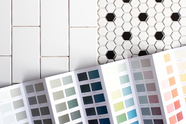
Subway and Hexagon Tile
Pick a color. Any color! Subway and hex tile are classics that go pretty much anywhere with pretty much everything, and they’re cheap to boot. We had both of these in our first house.
![]()
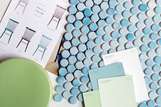
Penny Rounds
I imagine this in a cheery kitchen with vintage (or vintage-inspired) green appliances. A tulip table and colorful shaker chairs form a little breakfast nook, and retro/vintage accessories (bread bin, kitchen scale) in shades of green and blue dot the space.
![]()
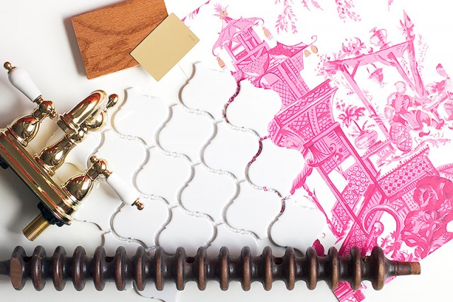
White Arabesque Tile
The tile is a classic decorative shape and it can take star billing if you keep everything else simple. If you want to have a little more fun with your decorating, it pairs up nicely with figurative wallpaper — especially when it’s hot pink. I’d love to see the two in a powder room with wood floors, brass fixtures, and a sink dropped into an old piece of furniture that’s been painted in a rich ochre. A vintage wooden stool with turned legs would make a fine stand for a plant or a stack of fresh towels.
![]()
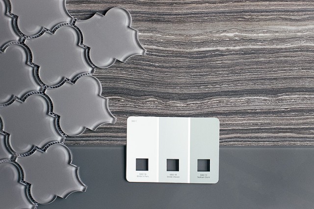
Gray Glass and Striated Tile
Here we’ve got that same tile shape again, but in a very different design. This time it’s sleek in glass, and I’d pair it with long horizontal glass tile in a shower enclosure. Tile with some depth to it (thanks to inkjet printing!) would counteract all of the glossy surfaces elsewhere, and paint or accessories in cool greenish blue shades would finish off the room.
![]()
Spanish Red Tile
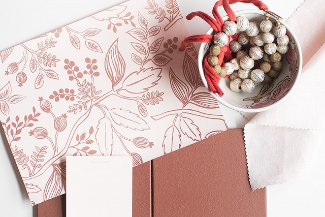
If you have inherited a house with this tile, you likely either love and embrace it or curse it and wish it gone. It goes rustic with warm, worn woods and creamy white tones, or you can take it boho with plants everywhere, natural textures and a smattering of jewel tones and gold embroidery. And if your taste runs like mine toward pink and feminine? Yep, that’ll work too. Peachy pinks like the paint and wallpaper below look fantastic with the earthy red of the tile.
![]()
Wood-Look Tile
I’m not a huge fan of faux-wood tile in large expanses because the grout lines look a little off (wood does not and should not have grout), but they can be great in basements and bathrooms. Our bathrooms have hardwood flooring, and they are not a good mix with kids that sometimes (often) splash water around and don’t clean up after themselves, leaving you to find puddles hours later. Not that we would know anything about that. *ahem*
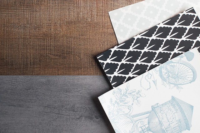
Anyway! I think the key to pulling off wood tile is to let the wood be in the background by pulling attention toward other design elements (either texture or pattern). Pair one of these plank styles with one of the wallpaper designs — your choice.
![]()
Of the designs above, do you have a favorite? How about any that you would do completely differently (a least favorite)?


Jennipher
August 31, 2015 at 2:45 pmI love the white arabesque tile in the powder room design. I wouldn’t have thought to pair that tile with that style wallpaper, but it looks great.
Ms. Peony and Grahams
August 31, 2015 at 8:02 pmAnything toile is gorgeous! I really like how you matched the tile. I am obsessed with the tile from our recent kitchen remodel. It is meant to look like watercolored hand painted subway tiles. http://www.peonyandgrahams.com/2015/08/a-tiny-kitchen-remodel-before-after.html
Making it Lovely
September 1, 2015 at 12:06 pmThe depth of color is beautiful! I love your lighting choices too.
Val
September 1, 2015 at 12:51 pmThat kitchen is seriously adorable!
Emily
August 31, 2015 at 8:48 pmInstead of just seeing bits and pieces of sponsored items photoshopped together, I’d like to see at least one of these applied to an actual room. At this point in the Victorian house, it’s pretty apparent that there’s a big difference between photoshopped theory and oak-library practice.
You used to have such spirit. I’m still hanging in there, but I’d really like you to *do* more. This whole post was five theoretical designs (all sponsored), but nothing “so-so” was “transformed” into something “lovely.” Nothing, in fact, was done at all.
Rooting for you.
Tanja
September 1, 2015 at 11:55 amReally, Emily? I think this was a life-changing – nay – momentous, earth-shattering experience.
You see – Nicole is smart, really smart (remeber this? https://makingitlovely.com/2012/05/04/my-mathematical-mind/). How else could you still make a living with half-assed blaablaag posts like these…
Making it Lovely
September 1, 2015 at 12:08 pmThanks, Emily. I loved working on this post (coming up with the different pairings was a fun creative exercise), but I am also eager to see some actual designs come to life. There are a few things in the works that I’m excited about!
Maya
September 3, 2015 at 5:10 amHi everyone, I really don’t understand the trend of people getting upset by the sponsored posts and the possibility for bloggers to make a living from their blog. I mean, this blog is free. If you go and buy any interior design magazine, you pay for it and still get plenty of advertisement in it (any good ID magazine has at least 1/3 of advertisement, more or less beautifully shot…). Does anyone complain about that? If you don’t like the magazine you stop buying it… I really don’t see a base for readers’ claims on a free blog. Maybe it is just the envy of someone actually being able to make some money with the blog… In that case maybe spending time doing (creating) something of your own would be less frustrating than reading the posts that don’t interest you.
I personally like Nicole’s stories on how they are renovating their house, I like reading about the personal connection to the place and the creative process, ups and downs of making it a home, including all the mistakes. For me that is a nice, relaxing read and I always learn something on how people relate and respond to space. I am an architect so I spend enough time as it is on designing, specs and similar, so I like to read about the ‘people connection’ – how the place is lived in. Whatever doesn’t ‘call out to me’ (or adds any value, to be more specific) I’ll just skip. I can still acknowledge that today’s post had some nice ideas, eventhough I only scanned through it. And it could inspire someone to create their own material boards that may help them with their own renovation process, especially cutting down on choice overload. I agree it would be good to see some references on how the materials were actually used and how they actually worked in a specific (real) space (I personally always like seeing those) if you can get or find such a reference. Good luck Nicole, it is good to see someone creating something of her own, especially beside being a mother of 3. Not everything has to be perfect, none of us are.
Peggi
September 1, 2015 at 6:10 amNice! I love the white arabesque scheme… although the gray glass arabesque looks so shiny and mesmerizing! I’ve never seen it before. I just used mini white subway in my 1940s Cape kitchen, so maybe I am dreaming of something a bit exotic!
Katy
September 1, 2015 at 11:22 amI love the gray- we just painted most of our house a gray that’s slightly softer than Winter In Paris and we LOVE it. I honestly love all of them though!
Kim
September 2, 2015 at 6:38 amLoved all of your examples! I wish I could incorporate them all in my home. The vastly differing styles really got the wheels turning. Thanks for this post!
Kelli
September 3, 2015 at 1:51 pmRight now, my husband and I are on the hunt for new tile for our fire place surround. Often times we feel trapped between Menards, Lowes, and Home Depot. Thanks for showing us some great products and other options. I don’t even know where to always search for options, and these are so much better than some of the standard stuff I find at the bigger stores! Thanks, too for pairing up the options with other textures. That helps me out! :)
Stephanie at DecoratorsBest
September 8, 2015 at 8:34 amThanks for linking to a few of our wallpaper patterns! Love those Schumacher designs.
Abigail
September 8, 2015 at 3:53 pmHi Nicole! The brief mention of faucets in this post has me thinking… We just moved to a new house, and I’d really like to swap out some of the existing faucets for something nicer. But I don’t even know how to get started thinking about something like that, and I wish I had some kind of a resource like your awesome guide to painting post from a few years ago. (I also tackled some painting projects for the first time using it as a guide, and it was SO helpful.) Any suggestions on how to choose and replace faucets etc.? It might be a nice post in the future!
merlin513
September 9, 2015 at 10:30 amI would dearly love to install that blue penny tile in the bathroom at my parent’s house. Up against the 50’s white steel/porcelain tub, it would look fabulous! Plus I would probably only need about 10-12 squares to do it… This is going in my wishlist folder for when I inherit the house…
Let’s Be Realistic, Here | Making it Lovely
September 10, 2015 at 12:41 pm[…] Then I went and did this little collection, and thought it wouldn’t be that hard to do in the bathroom. […]
Six Designs Inspired by Stone | Making it Lovely
October 29, 2015 at 3:29 pm[…] carry: wood, tile, and stone. I’ve already shared my experience with wood (and bamboo), and six designs inspired by ceramic and porcelain tiles. Today, I’m sharing another six designs, but this time inspired by tile and stone. I went to […]
A Look Back at 2015 | Making it Lovely
December 22, 2015 at 11:02 am[…] had fun adding drawing and painting into my posts, putting together some tips on designing with tile, and continuing to add to my Making it Yours series. I still love all of these clothes from a few […]
Cori George (@heyletsmakestuf)
September 27, 2016 at 2:06 pmLove this (and Floor & Decor!)! We just put the Arabesque tile in our kitchen and we are IN LOVE!
Quarter Sawn Oak Wood Plank Ceramic Tile – TonyWoodsArt
November 22, 2019 at 3:46 pm[…] Download Plan More @ makingitlovely.com […]