We’ve lived here long enough and made what we have work for long enough that it’s time to reevaluate and really hone in on some details. The corner fireplace in our living room is tricky (why the corner, old house old chum?), but it’s obviously a natural focal point and I haven’t fully given it the attention it deserves. ‘What do we have that’s large enough to hold its own up there? Big botanical print? Cool. Done.’
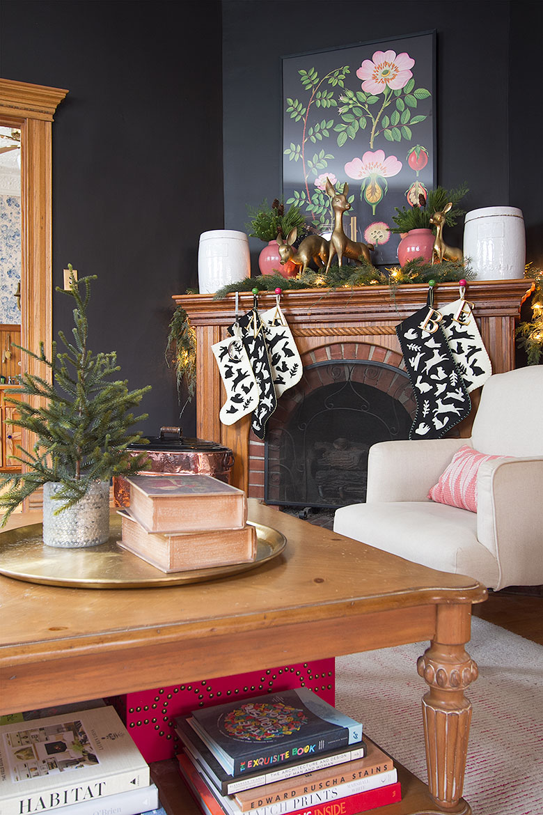
And really, not bad. But it could be better! The time has come to put a big gold mirror above the fireplace. It was inevitable. I have no choice in the matter guys, it has to be done.
Like so.
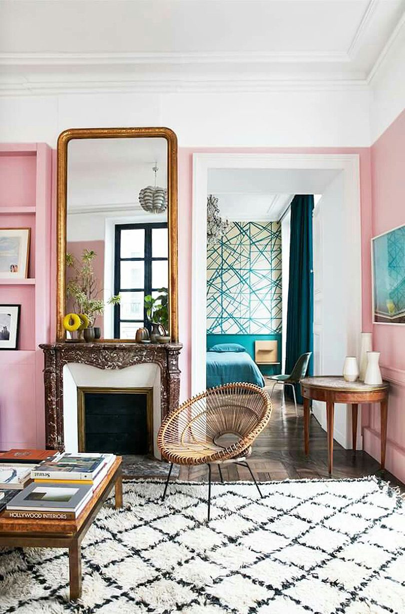
Image: Where I’d Stay
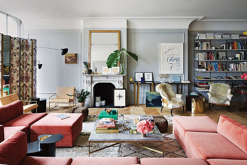
Image: Jenna Lyons’ Home in T Mag, photographed by Simon Watson
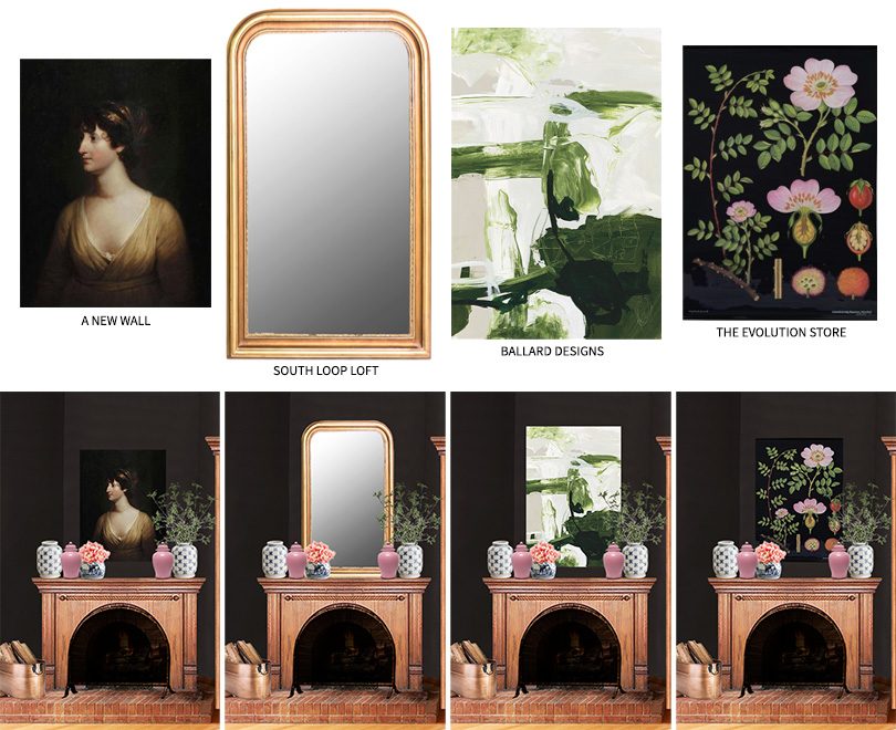
Oh, there were other options. The The Evolution Store’s ‘Dog Rose’ botanical poster could have continued to grace the living room but honestly I’m just ready for something different. Namely, the huge Louis-Philippe style gold mirror I’m going to pick up tomorrow from South Loop Loft! The other strong contenders though were ‘Essence’ from Ballard Designs and a reproduction vintage portrait, ‘Mary Countess,’ from A New Wall.
The sizes are scaled relative to each other. The mirror is 60″ tall!
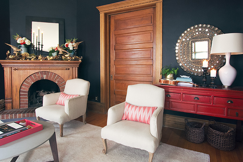
And if you give a mouse a cookie a room a new mirror, you’ll probably need to move the other one you have on the adjacent wall. It’s a problem I ran into when styling the fireplace for a shoot a few years back. Too many mirrors! That black one was too small, so it went and the peacock mirror stayed.
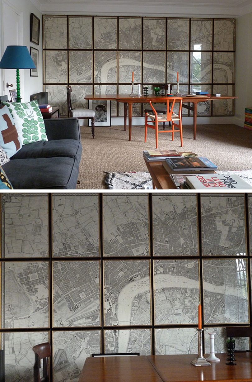
I’ve been wanting to do a wall of frames for a while now, and I think it’s the right solution for the wall above the red console. I’m thinking grid, not gallery. Ben Pentreath has the greatest example of all time.
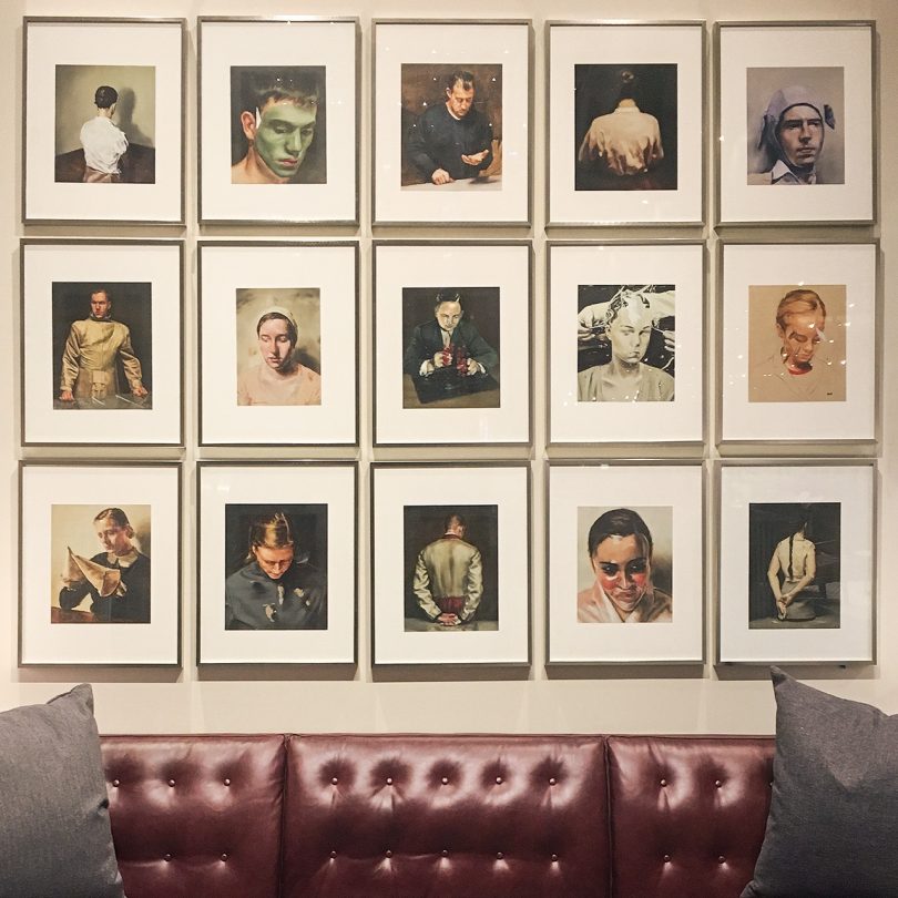
This wall from Room & Board’s Chicago showroom is inspiring me too. The prints are pages from Michaël Bohhremans’ book, As sweet as it gets.
Here’s where we are now, with the botanical poster above the fireplace and the peacock mirror above the red console. These mockups are to scale and I even stuck the dining room in there to represent the view through the doorway.
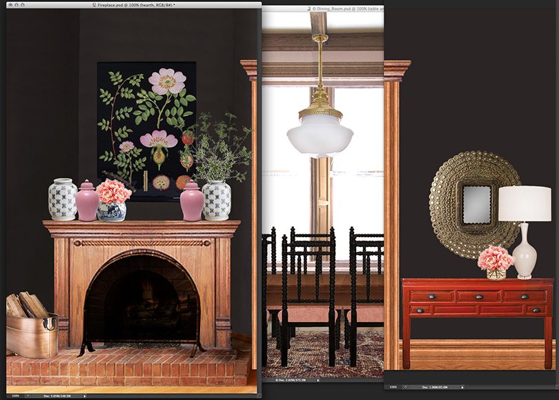
I could do a large piece of art above the console (and if you follow me on Instagram, you might have seen this in my Stories), but it feels like it’s trying to compete in scale with the mirror.
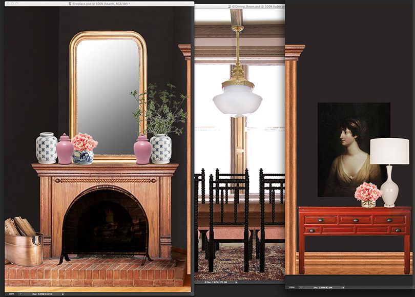
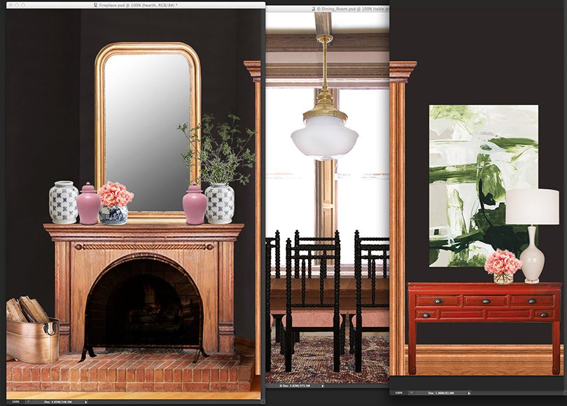
So here’s where the grid wall comes in. Getting the scale right is my biggest concern, so I’ve mocked up a few variations to test things out before I decide upon and order my frames. Here they are: small, medium, and large.
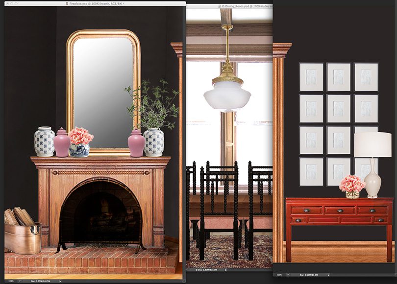
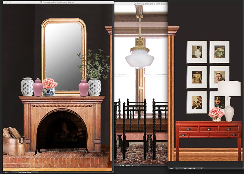
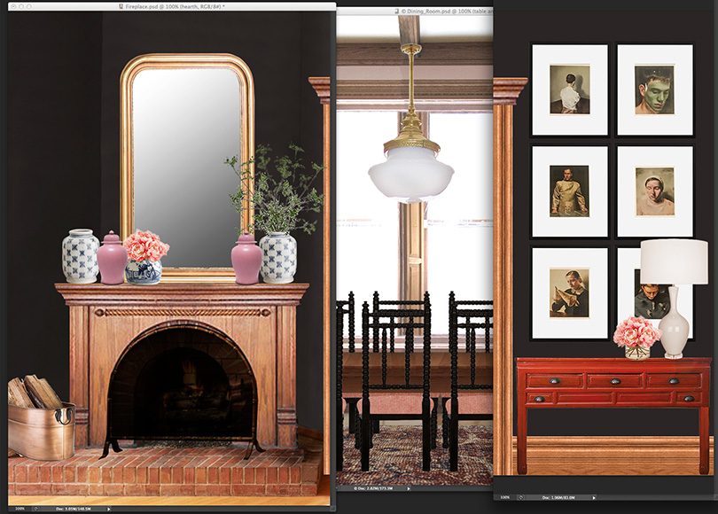
I’m leaning toward the first two because I think the large is too large, but I’d love to hear what you think.
And tell me too, do you enjoy this kind of ‘here’s what I’m thinking’ post? Or would you rather I hold it all back until I have the pretty after photos? I’m picking up the mirror tomorrow (yay!), but I haven’t ordered the frames or decided on what’s going in them, so it won’t be too long before I change things but it won’t be immediately either. I love to see this kind of stuff from others and for sure love to talk about it, but I also want to be sure I’m bringing you guys what you’re looking for. Let me know!



Heather
January 23, 2018 at 4:34 pmPicture 1, but part of me thinks the mats are too stark white. It may just be the mock-up though, I have no doubt it will be beautiful! Love the mirror choice and love the posts on your thought process.
Julie
January 23, 2018 at 4:43 pmYour thought process is super valuable! Love when you share ideas and explanations and mockups. It helps me think through similar challenges in my own home, even though our styles aren’t the same. And it helps me appreciate your lovely after pics even more.
Antonella
February 7, 2018 at 8:41 amWhat Julie said! And for me it’s option 2 (medium).
Lisa
January 23, 2018 at 5:10 pmI like the medium scale the best. I can’t wait to see the new mirror above the fireplace and I do enjoy this type of post a lot!
Maggie
January 23, 2018 at 5:22 pmI just wanted to chime in and say that I like these kinds of posts!
Mary
January 23, 2018 at 5:48 pmI love these type of posts. When you share what you’re thinking, you’re making me aware of all the things that need to be considered. In the past I’ve made purchases on impulse. I’m sure you can imagine how well that’s worked out.
As for the grid you’re considering, I love the frames very close without mats. But that probably won’t work with portraits.
Jessica Rhodes
January 23, 2018 at 5:50 pmI love these process posts! And it makes me really excited to see the final product/ feel more invested in the after photos!
Judy
January 23, 2018 at 5:51 pmI also enjoy these posts. I think the medium grid looks best. The small seems to emphasize the small drawers in the console and ends up looking too busy to me. I also think it can’t hold its own with the larger fireplace and mirror, but the medium prints are large enough to hold their own and maybe because there are fewer of them don’t look as busy with the drawers of the console.
Megan
January 23, 2018 at 6:42 pmI love “hear’s what I’m thinking” posts. I like to see the different ideas and how they evolve. I vote medium grid or the Ballard Designs abstract.
Geneviève Thiffault
January 23, 2018 at 7:05 pmTwo thumbs up for that kind of post, I like knowing about the “journey” as much as the result.
One more vote for the medium frames. :)
Jeannine
January 23, 2018 at 7:24 pmI love your mirror pick. I also love your process posts, I find them very helpful. For your grid wall. I really like the larger one. I had to study your pics a long time to put my finger on why I really didn’t like the medium one. The small and medium frames take up the same space on the wall as the mirror. The mirror is the closest to the ceiling, then your door frame, then the grid of frames. I don’t like the step down look as much as I like the more balanced look of the large frames coming up to a similar height as your mirror. I hope I’m making sense! I think it’s a far more elegant look. My second choice would be the small frames. I’m trying to visualize the look with a larger number of them so it matches the space on the wall that the larger frames take up. I’m excited to see what you pick!
Julia at Home on 129 Acres
January 23, 2018 at 7:35 pmI’ll add my vote to the like this type of post commenters. It’s helpful to see the process and what you’re thinking. Plus it gets me thinking about art and accessories and how I lay out my spaces, so it’s a good learning opportunity.
Heather Peterson
January 23, 2018 at 7:53 pmLove process posts, and like the grid with the smallest frames. Less because of frame scale more because I think a grid that is 3-wide is just more balanced than a 2-column grid. The mirror looks perfect!
Mudrick
January 23, 2018 at 8:02 pmI love these kinds of posts! I just went through the same Photoshop mock-up process for a grid of vintage botanicals I’ve been noodling for ages and finally hung. So helpful! https://www.instagram.com/p/BeTbCb3hFgv/?taken-by=hmudrick
swimfly100
January 23, 2018 at 8:03 pmI enjoy the process post. I’m wondering if the red table is proportionally too small (structure and height) and you need a larger piece to compensate for the solidity of the fireplace? I know this will change up the art installation a little bit but it would balance the fireplace and mirror.
Suzanne
January 23, 2018 at 8:07 pmI love these kinds of posts — it helps me learn about design, and puts ideas like “scale” into a visual format that is so helpful. For the grid art display, I’d vote for medium!
JCB
January 23, 2018 at 8:17 pmI like these kinds of posts and for the record I LOVE the large layout, while the mirror adds drama it still feels like negative space, the large frames feel more complete and I love the contrast of the lack of negative space versus the smaller looking console table.
Hannah
January 23, 2018 at 8:35 pmPlease continue with the in-progress posts!!
Marie Mut'
January 23, 2018 at 10:08 pmLoved the post, love to see how you process things, love to see how the room evolved over time. I really really like the middle scale option… I feel like all the litte frame are also trying to compete with the mirror.. but it might be different in reality. Very happy to find here the name of the artist you mentionned in your stories. Would you make a post about : my style before vs now that we have lived XX years in the victorian ? Like.. what major pieces made you evolve… or what major inspiration… Love your site anyways !
Kim Zepeda
January 23, 2018 at 10:22 pmI love these “here’s what I’m thinking” posts!
Peggi
January 24, 2018 at 5:54 amI love the process posts! I wish I had your photoshop skills because they’d really help my decision-making. The gold mirror was a must. I’m not sold on the grid, but it’s not a look that has called to me. I’ll be anxious to see yours, though!
Liz
January 24, 2018 at 6:17 amI like the medium frames best. Large is definitely too large. Love this process post!
Jen
January 24, 2018 at 7:43 amI’m a fan of the thought process posts. And I like picture number 3 – the color and the smaller frames stand out more to me.
Taylor
January 24, 2018 at 8:23 amI love these kinds of posts! I think they are more helpful for when I’m trying to make similar decisions in my own house.
Also, I like the first two grid layouts, where the frames don’t extend higher than the door frame. And love the new mirror!!
kisstheprince
January 24, 2018 at 8:51 amLove these posts too…keep them coming. My vote is the large, the medium size conflicts with the drawers of the table. Since you have high ceilings, go big. A previous comment about the mat color is a good one. The stark white is a bit bright, maybe millennial pink mats? Go with your gut.
Ashley Larkin
January 24, 2018 at 9:23 amI love “what I’m thinking” process posts. I like the medium. Beautiful eye you have.
Sarah
January 24, 2018 at 9:41 amI love your blog and your home! There’s a similar mirror for (I think) considerably cheaper than the option at South Loop Loft! Just so you know :-) I’m kind of digging the last picture a lot! I think the art makes an amazing statement!
Sarah
January 24, 2018 at 9:42 amSorry — the similar mirror is at wisteria! http://www.wisteria.com/French-Mirror/productinfo/W9047
revolvingdecor
January 24, 2018 at 9:49 amHi, I love the large. I think they create great symmetry on both sides of the door. The large size also draws your eye up to the high ceilings in the space.
Izabela
January 24, 2018 at 9:59 amI looove the process posts! They give me ideas what to pay attention to while working on my own place. I really like the grid art idea, and I like medium size best. Together they look similar in size to the mirror, which creates a sense of continuity and calmness to the space that has a lot of components. I would consider bringing them higher (top of the door molding?) to make them connect with the mirror even more.
Jeanne
January 24, 2018 at 11:12 amYour what I’m thinking posts are the best…I love to follow along and see what you see…my choice is the grid pattern (large) to counter-balance the large mirror and to pull the eye up to the high ceilings.
Katie
January 24, 2018 at 11:27 amFun to see your thought process for this change! I am curious about why the mirror is resting on the mantle and not hung 2-3 inches above it giving an outline of space between the two. It is obviously personal preference, but would be interested to hear your thoughts.
Thanks!
Laura
January 24, 2018 at 11:45 amI’m not a fan of the frames; they seem to compete with the mirror, the dining room and are altogether too busy. The Mary Countess print, on the other hand, complements the mirror and the console AND the dark walls. It’s a cleaner look, adds a bit of drama. I enjoy following your thought process, the various elements you choose, and why.
Rosie B
January 24, 2018 at 11:09 pmYes! I completely agree with Laura. While the grid is very cool, it competes too much. I love how the dark print grooves with the dark walls. And I’m all for the process posts as well. (And must confess that the Bohhremans prints sort of creep me out for some reason.)
GG
January 31, 2018 at 9:13 amI agree with Laura about the Countess print – the black background fades into the wall so that the silhouette stands out and the “squareness” of the frame does not compete with the mirrior, it complements it. I enjoy seeing the process posts. How did you ever get it to scale though?
Michelle @ And Then We Tried
January 24, 2018 at 12:29 pmI like the medium grid and love seeing your process!
charisse
January 24, 2018 at 1:02 pmI have to say I would stay with the Botanical above the fireplace. It’s unexpected, bold yet classy. For me, mirrors over a fireplace are too predictable. If filling more space because of the height of your walls, have you thought about a mantel like shelf or floating oak shelf or black floating shelf above the botanical and adding decorative items to tie in with the mantel decor? just a thought.
Lyndsey
January 24, 2018 at 1:07 pmI actually like what you currently have best, but I can understand being ready for a change. Of the new options, I like the big grid best.
Sherry
January 24, 2018 at 1:18 pmI like the medium, but starting a bit higher.
Btw love these kinds of posts!
Kim R
January 24, 2018 at 1:51 pmAbsolutely love this type of post! I would like to be more skilled at accessories and art and have learned much from you.
I would pick one of the first two galleries as well. Besides competing in size with the mirror, the large grouping overwhelms the console table in my opinion.
Gwenythe b. Harvey
January 24, 2018 at 2:10 pmGwenythe from Rose Cottage
What about going with silver if you are keeping the peacock mirror?Then gluing/nailing a bronze ormolu top almost the width of the mirror and rubbing silver into it. That will ‘jazz’ things up a bit.
Van Winkle Home
January 24, 2018 at 2:49 pmA) LOVE this kind of post! B) I like the medium scale frames the best- the biggest ones compete with the mirror and dwarf the table and the smallest ones feel busy C) that mirror!!! So glad you found one :D
nancy
January 24, 2018 at 3:08 pmI like the posts and I love what you have there now so I will save the pic for inspiration.
Linda Moore
January 24, 2018 at 3:49 pmI really like the large grid. It just seems to balance the other side so well.
Amy J.
January 24, 2018 at 5:05 pmWhile I like the frame guide, it’s feels, still, too similar in scale to mirror. I think it would be better to change the orientation of the art over the console…go with something in a landscape orientation and then stack smaller art of that or just other objects. I think it would be more interesting. You have a lot of vertical rectangle shapes in that one area.
Maria topper
January 24, 2018 at 8:11 pmVotes for medium grid and another row on top to line up the mirror and art. I like asymmetry but Bc the credenza is low I think you can take the art grid even hire. I also like th idea of one image broken into the smaller pieces to make a whole. And process posts are so fun!!! More content! Who can complain about that
celeste
January 24, 2018 at 10:39 pmAlso love process posts! It’s such a good peek into what’s happening and why it’s happening. That mirror is going to look GOOOD.
I’ll throw in my vote for small or medium frames. I love the variation the 12 small frames a lot.
Michelle
January 24, 2018 at 10:52 pmI like the large layout – I feel like it balances the scale of the mirror without looking like you were trying to match the size of the mirror. The small might work more if there were more of them. 4 x 5 maybe instead of 3 x 4?
S. Shaw
January 25, 2018 at 8:07 amI like the medium-sized frames and definitely enjoy reading your process posts.
Kimberly Westby
January 25, 2018 at 9:41 amFirstly, trust yourself, you have impeccable style.
But if you crave feedback, and loving the invitation to do so:
1. the gold mirror is awesome
2. medium frames, like she said’ a little higher’
3. how about gold frames to mirror- get it? the new mirror.
4. or if not gold, black frames?
5.love the portrait artwork, is there a spot elsewhere
6. what is the plan for in the frames- maybe architectoral- spelling?? type drawings[ from an old book maybe?]
7. lastly, thanks for exposing all your books, as a fellow – bookie[ rhymes with Wookie-lol], I am showing my books proud like!
Kelli U
January 25, 2018 at 10:37 amEcho everyone else that your process posts are very helpful for my own home! The mirror works perfect to highlight the tall ceilings, like the medium frames too.
Karen
January 25, 2018 at 10:55 amLOVE this kind of post! I vote for the medium size.
Angie
January 25, 2018 at 2:41 pmLove the mirror! I like the smaller frames with some darker art in them. Can’t say why, just looks best to me.
Kelly Potter
January 25, 2018 at 5:54 pmI like the small frames as a juxtaposition to the large mirror. It creates a nice balance and I like the interest there. I love these types of posts. The creative process is always fun!
Amy
January 26, 2018 at 9:51 pmThis is fun! I’m excited to see you execute your vision and find out where you land (Drama! Suspense!). I think I would go for the medium grid, the proportions feel right to me! That mirror is going to be so stunning!
Kate Sawyer
January 28, 2018 at 5:49 pmI really love the smaller 3×4 grid arrangement. It’s similar in total scale, while contrasting with the mirror.
Amanda Suzzi
January 28, 2018 at 9:24 pmI have 3 corner fireplaces in my 1850s house. Must have been in vogue.
I think you should tape a round picture on top of the mirror above the red console.
Stephanie
January 29, 2018 at 9:47 amFirst off, I dig your style. What a beautiful house you have! I agree, the gold mirror above the fireplace just has to happen. As for the frames above the red console, I’d go with the medium frames out of the options presented. The small ones are too busy, and the large ones are too overwhelming. However, I present an alternative option. I love the lady reproduction painting but think it does need more height to complement the mirror. Have you considered doing the lady portrait print, and then hang another landscape print above it – such as a classic landscape or something similar. So you’d have a large portrait with a smaller landscape (both layout and content) painting above it. I think it would go with the classic eclectic vibe you have going on. Fun decisions!
Stephanie
January 29, 2018 at 9:51 amMe again. Have you considered hanging the botanical print above the red console? Just a thought – it’s a lovely print and the right colors for the room.
Victoria
January 29, 2018 at 4:03 pmI liked the post because it wa a proper process post and not just cliffhanger for the sake of the blog.
First impression is the large, because it balances the red cabinet being so low compared to the height of the fireplace. I’m not a fan of the current botanical but it does suit your style. The large frames may feel overwhelming when you’re in the room though, I can’t tell from these pictures.
What is bugging me a bit is the earthy colour and texture of the wood mantle and brick fireplace. Earthy was the best way I could think to describe it as it isn’t really rustic but it feels a little out of place with how sophisticated and dark the rest of the room is. I know you’ve been avoiding painting the wood in the house but this feels like one area I would consider it in your place. I’m not sure if this would look naff in real life but I’m slightly tempted by the idea of painting the wood and brick the same colour as the walls then picking the rope design out in gold to match the new mirror.
Loved that frame wall inspiration image. I’m thinking that you could get a similar look from a wall mural with an overlay, kind of like fake leaded windows. Perhaps easier to achieve than hanging so many individual frames. What do you think?
Ann
January 30, 2018 at 7:36 amLove the way you talk through your process and show us some mockups – brave to invite all the opinions but super helpful and relatable!
Tom Field
February 2, 2018 at 8:55 amPlease don’t hold back for the ‘pretty after’ photos. Understanding the thought process beforehand really helps spark ideas and creativity from the readers, which we can then use in our own homes, which is tremendous for everyone. Great job.
Alison
February 10, 2018 at 4:35 pmOption 2! Or the lighter picture slightly higher
Christina
February 14, 2018 at 6:03 amLove the thinking it through posts! I’d suggest the medium size as it looks balanced with the mirror size.
Shayla
April 27, 2018 at 2:59 pmI love your work! I have a turn of the century home with loads of original wood trim & struggle with how to decorate- we’ve been here 2 years and Ive completed not even one room! 2 are partially done thanks to inspiration I’ve gotten from your site (pink dining room and black palor wall paint for the win) What is the design app or site you used above to configure/arrange your rooms? It would help me immensely to have a tool like that.
Making it Lovely
May 2, 2018 at 3:04 pmThank you! The mockups are done in Photoshop. I scale the pictures so that 10 pixels = 1 inch.
The Grid of Framed Tarot Card Art - Making it Lovely
October 16, 2018 at 2:18 pm[…] a mirror above the fireplace and a grid of frames above the red console back in (checks notes)… January!? Does it take that long to make a little change? Well, yep. I’m not rushing to fill a space, […]