The nursery is ready! Let’s take a look, shall we?
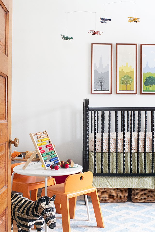
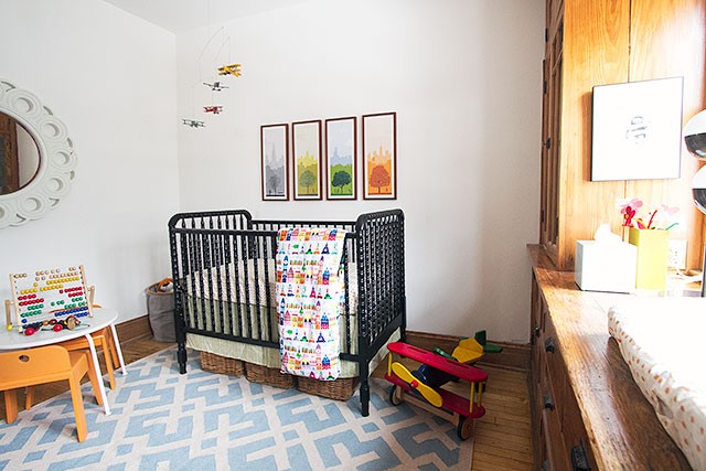
The white walls are perfect. They keep the room from feeling weighed down by all of the wood, but there’s still plenty of color in the art, rug, bedding, and toys.
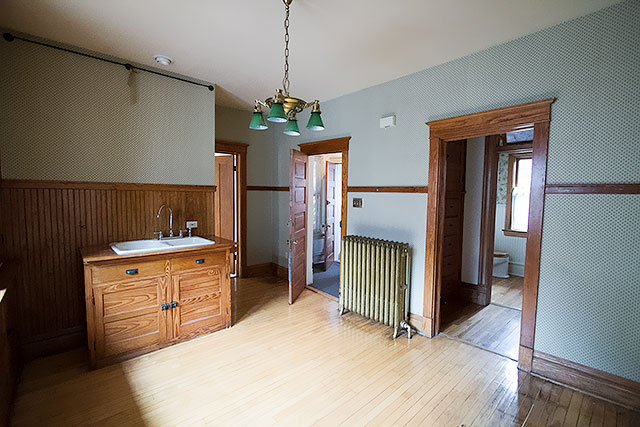
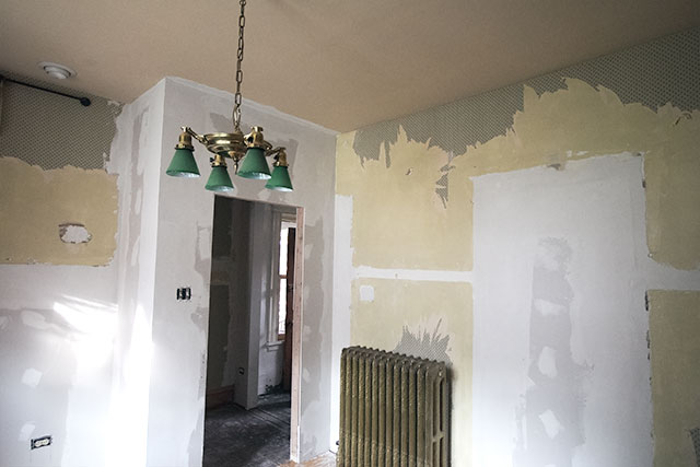
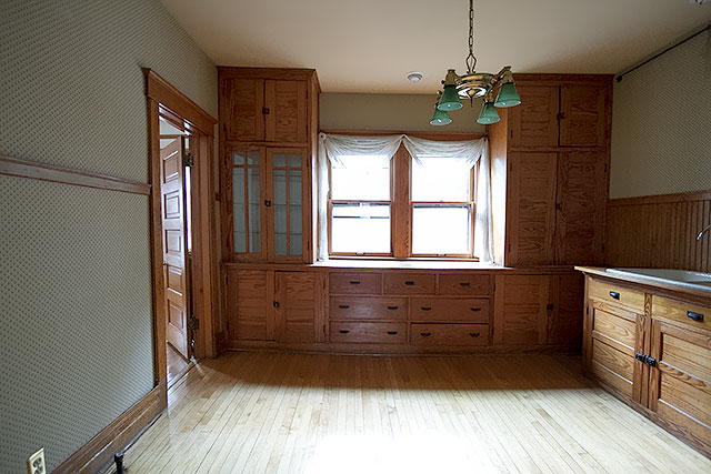
The nursery was once a kitchen, from when our house had been split up into apartments. We restored the hallway to its original layout, added walls, and both moved and removed doorways.
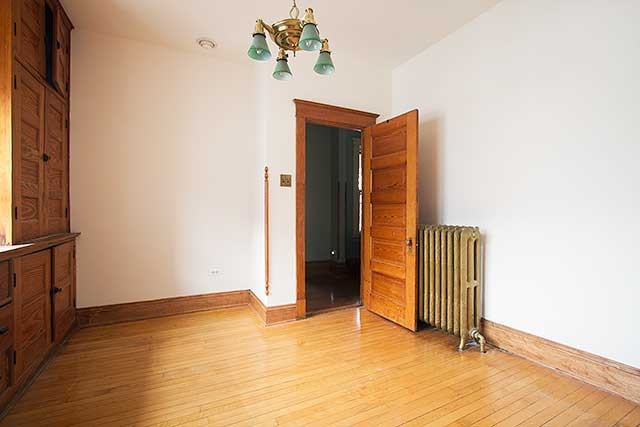
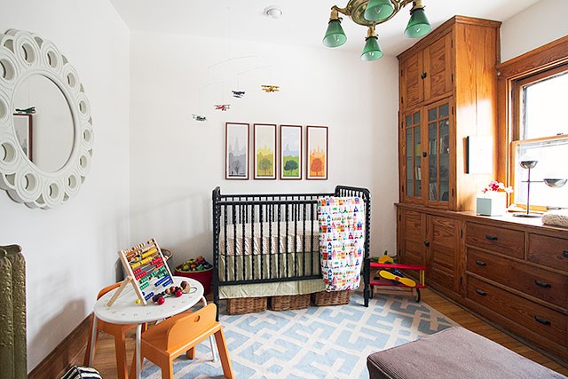
When we first started converting the space back into a bedroom, I was a little worried that the cabinetry would still feel kitchen-like, but now I’m so glad we kept them! I haven’t chosen shades yet for the windows, and I may make or buy a garland to hang over them, but even without those elements the built-ins add a lot of charm to the room.
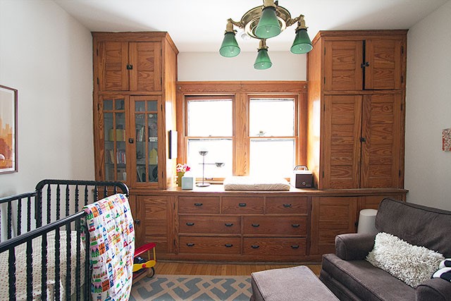
The changing pad is at counter-height (hello, former kitchen), and there’s plenty of room for everything I need within reach. The drawers below function as the dresser, a diaper pail and laundry basket are off to the right, and we have tons of storage. Board books, cute toys, and a few decorative pieces are displayed in the glass-front cabinet (which has a light inside, at the top).
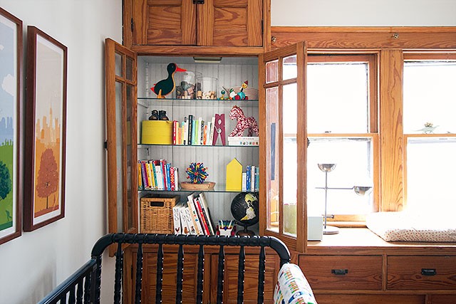
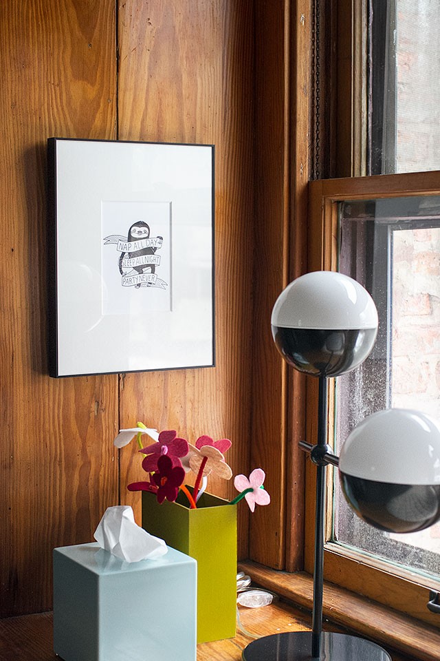
I wanted to be sure to include the the felt flowers that Eleanor made for Calvin, and my motto during pregnancy is in the nursery too. They’re to the left of the changing pad, by the lamp.
As much as I like the built-ins now though, they do take up full wall. The room is 10’x12′ but the floor space is only 10’x10′ because of them. A rectangular rug would have been OK in the room, but I was really hoping for something square and I found the 8’x8′ sky blue Eskimo rug at Lulu & Georgia, which they kindly provided for us. It isn’t super plush because it’s a flat weave, but it isn’t scratchy like some flat wool rugs can be, so it’s a nice surface to play on.
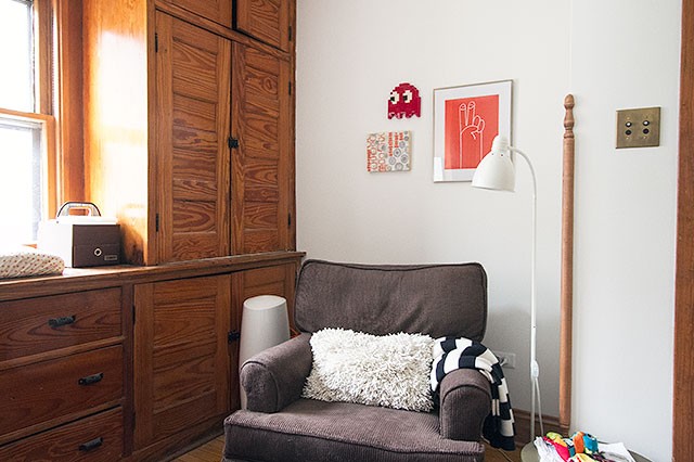
The glider and ottoman are tucked into the little nook between the doorway and the built-ins. I thought about moving the diaper pail for the photos, but it’s a necessary part of the room and that’s where it is, so it stayed. It’s close to where I sit with the baby, but there’s no odor other than when you open it briefly to throw something in.
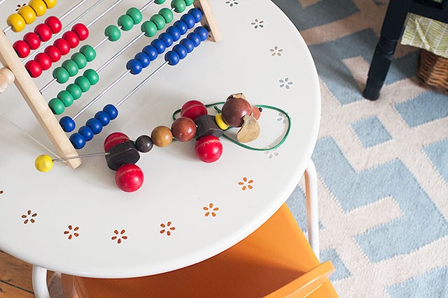
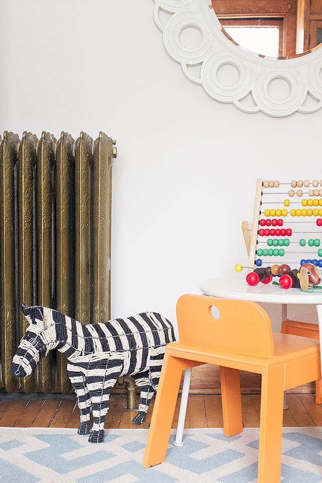
I had wanted to use the rectangular wooden play table that we’d had in Eleanor’s room at the old house, but it was too large so I grabbed the round one from the playroom upstairs. I know that it looks dangerously close to the radiator, but it’s fine. For whatever reason, that one doesn’t get as hot to the touch as the rest do (though the room stays comfortably warm). I had a bunch of art to choose from for that wall, and I thought about shelving too, but in the end I decided to hang that round mirror. It used to be in my office, in the old house, and I hadn’t found a good spot for it in this house until I tried it in the nursery. Also, I found the zebra on clearance and bought it as a nod to what the nursery could have looked like, had I gone with my original plan! (Which I still think would make for a very cute nursery.)
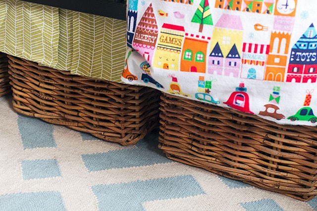
There are baskets to the left of and beneath the crib are for toys. The room is definitely not wanting for more storage, but I think it’s nice to have some toys out and within easy reach rather than hiding all of them behind closed doors. Calvin is just starting to play with them (mostly bringing everything he can get his hands on to his mouth), but he’ll be interested in everything soon enough. Eleanor and August have been coming in to check everything out too.
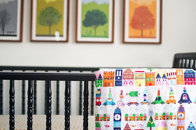
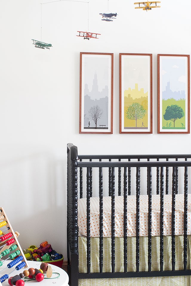
The crib is the same one that Eleanor and August both slept in, and I made that crib skirt when August was a baby. I bought the set of screenprints by Ryan Kapp five years ago at Renegade Craft Fair, and am glad I finally found just the right spot for them and had them framed.
So nice to have a sweet room of Calvin’s own, out of what was once a weird pass-through former kitchen. Yay!
![]()
A Discount from Lulu & Georgia
They would like to offer my readers 20% off their order, from now until February 18, with the code makingitlovely20. Thanks, Lulu & Georgia!



Anne
February 11, 2015 at 1:39 pmYou have done a great job! Could you remove some doors of the cabinatery to open things a bit up?
Making it Lovely
February 11, 2015 at 3:01 pmIt’s an option, but I’m not planning on it. The insides don’t match up with the glass-front cabinetry, so I wouldn’t take off the doors unless I was prepared to cut and install new shelves, beadboard, etc. Plus once those doors are off it would probably be a pain to put them back on and get them aligned. I don’t mind the look of the closed doors, and I think that once I have something on the windows, that will help break up all of the wood there!
Aoife
February 11, 2015 at 1:45 pmIt looks great! Love the white. So light and bright and a lovely neutral for all your colourful accents. Calvin is lucky to have such a sweet room.
Debbie
February 11, 2015 at 1:58 pmSo glad you went with white walls. I’m also glad you used things you had. Not every room design has to become a shopping spree. I really like how it turned out!
Making it Lovely
February 11, 2015 at 3:03 pmYes, the majority of the room came together with things we already had! So nice to see things reused from when Eleanor and August were babies, and things that were in other parts of the house too.
carolyn
February 11, 2015 at 2:05 pmAlways so jealous of those of you not in earthquake country who can hang art above beds. Such a beautiful luxury!
Making it Lovely
February 11, 2015 at 3:06 pmWe have had a handful of earthquakes in Chicago, but nothing that caused a lot of damage, obviously. (And I’ve always slept through them, so I’ve never felt one.) I should mention here that I did choose acrylic instead of glass, just in case Calvin ever pulls one down. Once he’s bigger though, I will drop the mattress down further and he shouldn’t be able to reach them — I tested the height with Eleanor. Oh, and Quakehold helps too, but I rely on it more to keep the frames from going crooked.
Jessica
February 11, 2015 at 2:13 pmI love your little nook for the glider. It looks perfect for nursing and reading. Lovely work.
mairi
February 11, 2015 at 2:23 pmHi! Love this! Where did you get the Orange chairs and table so cute!
Making it Lovely
February 11, 2015 at 3:08 pmThey’re Mojo chairs from The Land of Nod. They used to be in August’s nursery, at the old house.
The table was from IKEA, years ago, but they don’t sell it anymore.
Samjo
February 19, 2015 at 4:09 pmI have followed you since you had Eleanor! Fellow chicagoan here too :) I cannot stop looking at this nursery. Love all the details. I love that it is not cookie cutter, inviting and playful. My son would love that blanket as he’s into clock towers like Big Ben! Do you mind sharing where you got it from? Can’t wait to see more of your house. :)
Paige
February 11, 2015 at 2:34 pmLOVE LOVE LOVE how it turned out! I am so glad you kept the cabinets. They are awesome! Have you considered taking off the doors to make it look more like a bookshelf? Just a thought I thought I’d pass along. Great space for your little guy!
Making it Lovely
February 11, 2015 at 3:09 pmA couple of other people have suggested that too!
Kristen
February 11, 2015 at 2:51 pmSo cute and comfy and practical! I love that you kept the cabinetry because it really does seem to give the room a wonderful character. Sorry that sounds so cliche, but it’s true. It gives the house a sense of history, which is what awesome.
Laura @ Rather Square
February 11, 2015 at 2:55 pmIt’s got a nice casual-but-pulled-together vibe, and the built-ins really work with everything else. And I’m also liking the ceiling fixture – is that original to the house?
We gave up on our store-bought crib skirt because it kept getting bunched up under the mattress. Did you make yours from a pattern (and can you share it)? It’s a great length!
Making it Lovely
February 11, 2015 at 3:11 pmI don’t think the light is original, but the previous owners did like to find antiques for the house at flea markets. I’m not planning on keeping it long-term though. We’ll either install a ceiling fan or swap out the light for something else.
And the crib skirt — I winged it! I looked at a store-bought one that I had, and then modeled mine after it. It’s too wide, but I try not to let that bother me (too much).
Nicole L
February 11, 2015 at 2:58 pmWhat a sweet room! I adore the fabric on the blanket – those houses!
Megan C.
February 11, 2015 at 3:03 pmI really appreciate how sweet and unpretentious this nursery is. It’s not overly designed and has a great personality. The only thing I’m wondering is, if maybe the mirror wall could use a big and bold colorful wall decal instead? Maybe from Blik? What do you think?
Making it Lovely
February 11, 2015 at 3:13 pmI like that idea! I would have loved to bring in wallpaper, but I’m a little wary now of wallpaper in kids’ rooms. (Or at least, in MY kids’ rooms.) Decals could be cute though! I have a cutting machine, so I could make my own out of vinyl if I wanted to.
Laura
February 11, 2015 at 3:22 pmI would have loved to have had those built-ins when I had infants. I can see baby looking outside, watching light and shadow. And the storage is to die for, within arm’s reach of the changing station. You’ve done what most of us do with 2nd and 3rd children, used what you have. It’s a sweet, comfy room.
Gilly @ Colour Saturated Life
February 11, 2015 at 3:24 pmThis is just beautiful! I want this toom to be in my house! I just love the built in cabinets. Stunning!
Liv
February 11, 2015 at 3:37 pmThose prints and the mobile stood out to me immediately. The whole room is so lovely, but so kid-friendly and practical. I loved seeing it!
And I love that you’re okay with white walls. My home is mostly grey, but with lots of accents. When my FIL visited and was given the tour of the house and all the projects my husband has completed (lots of renovations!), his only comment was that colorful walls make kids smarter (WTF?!). Apparently, he missed all the pom poms, textiles, toys, books etc… that bring color into the kids’ rooms.
Melissa
February 11, 2015 at 4:19 pmSo cute! We have the same Kapp prints in our kitchen – love them!
Erin R.
February 11, 2015 at 4:21 pmLove it!!!!!!
Abigail
February 11, 2015 at 4:23 pmWhat a great space! Despite the cabinets, I would have never guessed that it was a kitchen just looking at it. And what a cool light! Is it original to the house?
Not to be creepy, but I saw that you mentioned shades for the windows. I’m the blogger liaison for Blinds.com, so my ears perked up. Whenever you’re ready to tackle that project, if you’d like a window covering partner we’d love to help!
Congrats on the adorable space!
Lindy
February 11, 2015 at 4:33 pmWhere did you get the cute accessories on the changing counter? Eleanor’s flowers are so cute, what a nice touch!
Jennifer
February 11, 2015 at 4:48 pmI love it! It works and it is very light and airy. Enjoy. Thanks for sharing.
Katharine
February 11, 2015 at 5:17 pmCalvin’s room is really cool.
Lauralou
February 11, 2015 at 5:22 pmI love it! I still remember you setting up the room that became the nursery in your bungalow. Every time you transform something, I just love it!
laurie at laurie jones home
February 11, 2015 at 5:39 pmI really like it a ton, it’s not over the top and doesn’t look like pinterest threw up over it! (: It’s classic, clean and very sweet!! It really looks great!!
Stephanie
February 11, 2015 at 6:22 pmI see that it has already been mentioned- but I’m in favor of removing the doors on the big cabinets to make them open shelving. It’s amazing the big difference between the closed door picture and the open one.
Regardless, it is a sweet nursery that came together very well! I love that it is not overly “baby” it can function and grow with Calvin. Well done!
Amy
February 11, 2015 at 7:48 pmIt looks so sweet! I think the cabinets make it look like a library not a kitchen – in the best way. They’re unique to your house which makes them so fun and awesome! Live the blanket pattern and the prints work so well! Very nice!
http://www.lifewithleroy.blogspot.com
Katie K
February 11, 2015 at 8:33 pmThat comforter hung over the crib is aforable!! Where did you find it?
qlkowa
February 12, 2015 at 2:45 amI love scandinavian interiors – so fresh and light and just perfect for me.
Observing changes in your house I’m still amazing how different it is.
Heidi
February 12, 2015 at 7:31 amI absolutely love the airplane mobile! Such a beautiful nursery in every detail.
http://jax-and-jewels.blogspot.com
Sarah @ 702 Park Project
February 12, 2015 at 8:00 amI love those built ins, and those windows let in so much light! Such a lovely nursery.
Shreya
February 12, 2015 at 8:46 amThe nursery looks lovely! Its playful, yet not too busy.
I adore that wooden plane by the crib. Where did you find it?
Thank you!
Molly
February 12, 2015 at 9:10 amLove what you’ve done! Apologies if you’ve mentioned it before, but would you mind sharing where you found Calvin’s airplane mobile? We tried a similar vintage plane mobile from RH for our little guy, but the scale was too large for our space. Yours is adorable!
Jenny B
February 12, 2015 at 10:27 amThird baby, I guess practice makes perfect. This is really one of my favorite nursery’s, calming yet stimulating too. Adorable. I think the built-ins are gorgeous, but agree with someone above who said that taking the doors off the two cabinets one either side of the changing table (so they both look like the picture with the doors open) could really lighten up that side of the room. Regardless, enjoy this lovely room with your sweet Calvin.
Kat
February 12, 2015 at 1:15 pmI love all of it and would not remove any cabinet doors. This is drool worthy.. Everything
judy
February 12, 2015 at 1:24 pmRe: the first comment-lots of followers may not comment for lots of reasons-time constraints, enjoyed the content but nothing to say and my reasons………..I have followed you for so many years and drooled over your lovely family and wonderful artistic skills and decorating prowess that I wonder if you don’t -think-oh- not her again- so I always read you but don’t comment as much. Still following after all these years!
Deitra
February 12, 2015 at 2:00 pmIs it crazy to think about removing the doors in the built in cabinetry to reveal the super cute baby things?
kelsey williams
February 12, 2015 at 2:17 pmDid you paint the crib, or purchase it black? We have a wooden one from my childhood that I am hoping to paint black and curious what kind of paint to use.
mary beth
February 12, 2015 at 3:39 pmHi, I noticed your comment. Is this your first baby? Sometimes when babies start to teethe, they chew on crib rail. not sure if you should paint a crib, unless you take it to a professional, like an automotive paint place where they guarantee it would not chip. Just a thought.
mary beth
February 12, 2015 at 3:37 pmI love it all and I love that the walls are light! There is not one thing I would change and I think you are awfully lucky to have those storage cabinets. Beats 100 baskets, I think. It costs a fortune to have built-ins made, you (calvin) are lucky. Beautiful.
carol
February 12, 2015 at 7:46 pmThe room is darling. What a perfect spot for the changing table.
.
Kim // Yellow Brick Home
February 13, 2015 at 7:55 amI just love the old light fixtures in your home. So dreamy.
Friday Finds | to london with love
February 13, 2015 at 12:50 pm[…] I love this nursery. […]
Emily, Our house now a home
February 14, 2015 at 3:44 pmThis is such a sweet bedroom. Subtle boy feel to it. I did my boy’s bedroom in transportation themed with lots of vintage pieces. They also have airplanes hanging from the ceiling, at 5 and 3 they have not outgrown their room at all yet. It is perfect for babies and big boys too. Love all of that storage in this room, that will come in handy big time!
Kylee
February 17, 2015 at 5:38 pmHello,
I’m wondering where you found the lamp on the builtins? I love it. BTW…you are my favorite design blogger. I love looking at your ideas and your beautiful house.
Megan W
February 19, 2015 at 3:03 pmWhat about painting the trim around the windows? I think that would help tremendously to breakup all the wood on that wall. It would make the built-in cabinetry feel like it’s own unit on a wall instead of a wall of cabinets. I think this goes along with your idea of things looking better when window coverings are added.
Honor Roll | Making it Lovely
February 20, 2015 at 12:55 pm[…] plan for a Scalamandré-inspired nursery. I didn’t use it for Calvin’s room, but somebody should. It would be so […]
One Room Challenge: Week 4 (Those Stairs, That Hall) – Making it Lovely
October 26, 2016 at 7:00 am[…] off in the process. A doorway was moved, the walls were fixed, and the former kitchen turned into a nursery. We also ripped up the damaged old flooring and replaced it with new hardwood. The hall was […]