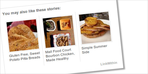
I’ve noticed a lot of people using LinkWithin to display related posts at the end of each entry. It looks great, but I had a few concerns about using it on Making it Lovely. The stats would get thrown off a bit when using the widget because all of the referring links are shown as coming from LinkWithin. I also wanted something self-hosted for more control (*ahem*), and something that could be cached to avoid slowing down the site.
I decided to go with Yet Another Related Posts Plugin.
Hooray, it’s self-hosted! And it doesn’t throw off my referring stats! And it caches and works well in conjunction with WP Super Cache! And it’s totally customizable! It even adds related posts to your RSS feed if you so choose. Nice.
The default display is simply an ordered list. That’s fine for the RSS feed, but I wanted a layout with thumbnail images similar to the standard LinkWithin widget. So then I started playing around with it to make it look nice…
I quickly realized that I’d have to enable the thumbnail feature that was introduced in WordPress 2.9x. And then go through each of my posts and set the thumbnail, which I had been doing manually. OK. It’s a lot of work, but I can do that. I’m thorough (and compulsive) enough.
Then I began working on a custom template, delving into the PHP.
I got the thumbnails to show up! Hmm, but they were lined up vertically. So then I had to create a table-style layout, using CSS.
The automatic placement stuck the related posts right at the end of each single post’s content, but I wanted to move it down a little. Fortunately, this was fairly easy. I just turned off the automatic placement and inserted a line of PHP into my single.php template of my theme.
OK, pretty good. But now let’s cut to approximately three months later when it is still bothering me that the text underneath each thumbnail does not play nicely with the layout when it’s too lengthy. #$@&!. Of course it’s been so long that I don’t remember all of the work I had already done up until this point, so I have to refamiliarize myself with the CSS syntax that I set up.
But I finally finished!

And you know what? Maybe you would have noticed or maybe not. Maybe I spent hours upon hours, spread out over months working on something that would only make me happy, but I’m fine with that. I’m glad that I was able to really tweak the whole thing to get it exactly to my liking, even if it did take forever. I love a good coding challenge.


Kelly | Glamour This
August 2, 2010 at 1:59 pmThanks for the tip… :) i love WP related posts
Grace Hester Designs
August 2, 2010 at 2:00 pmI kowtow to you! This is commitment and it’s paid off! Looks great and the stats won’t be off. :o)
Julie
August 2, 2010 at 2:06 pmThis is great! I love that you can open up your “related post” suggestions in a new tab and you don’t seem to be able to do that with blogs that use LinkWithin.
Camberley, The Bella Life
August 2, 2010 at 2:10 pmI am so jealous. I have related post envy! I’ve using YARPP and I am not a big fan of the ordered list. I want thumbnails! Looks like I need to pull out my CSS handbook and get crackin’.
Frank
August 2, 2010 at 2:14 pmNice feature – HOWEVER, I’m running Safari 5.01 on OS X 10.6.4 and mine looks more like the first one (two across than one) rather than the second (three across)….
Making it Lovely
August 2, 2010 at 2:15 pmHmm. Looks like I’ll have to check into that. I checked it on Safari (I usually use Firefox), but I have 5.0. Thanks for letting me know.
Frank
August 2, 2010 at 2:30 pmNo problem. Actually I just reloaded and it’s as you wanted it now – not sure why that happened, maybe just a glitch?
Making it Lovely
August 2, 2010 at 2:34 pmOh, good! I just updated and it still looks fine on my end. You might have been seeing a cached version.
Mrs Soup
August 2, 2010 at 2:30 pmOhhhh, the joys of coding. Something so wonderful about being able to work in something that is strictly logical. Manipulating code is just heavenly! Well, until you add or need a colon and you can’t figure out where it needs to go…and spend hours and hours trying to tweak a little thing….but otherwise, it’s wonderful!
Vanessa
August 2, 2010 at 2:30 pmOoo, looks lovely!
Danielle
August 2, 2010 at 2:44 pmwow! I’m in the very early stage of a CGT degree and I am beyond impressed!
Laurie
August 2, 2010 at 2:56 pmLooks good, although in google reader it was just the textual links, I clicked over to comment that it looks good there too, and while here I admired the full blown version.
:)
Emily @ The Happy Home
August 2, 2010 at 3:47 pmloving this! thanks for sharing. i, too, need to set some thumbnails, but it’s totally worth it!
sunny
August 2, 2010 at 4:03 pmGreat work! Love that you stuck with it to get it just how you wanted it.
I read your blog mostly on google reader and was happy to see the text links at the bottom of the entry.
I may try something similar on my blog. It’s typepad so may be a little different.
liz @ bon temps beignet
August 2, 2010 at 4:43 pmoh my gosh, it hurts my head just thinking about all the steps : /
You have more brain power and patience than I do.
Jillian
August 2, 2010 at 5:19 pmVery cool! I’m using Linked Within, but I don’t feel like it’s very robust. It seems to only be pulling from my most recent posts. I use WP, so I would definitely like something a little more customized. Setting the thumbnails seems like a ton of work, though.
MRG
August 2, 2010 at 6:20 pmYou lost my on this post. My head hurts just thinking about the tech jargon!
Arianne
August 3, 2010 at 1:37 amLooks great! We’ve had problems getting LinkWithin to work at all for some of our clients, so I’ll keep this plugin in mind for the next project!
Piper
August 3, 2010 at 3:40 amI love the way this looks. It flows with the site better than the link within does. Very purdy indeed!
Faith
August 3, 2010 at 9:23 amGood job! I’m a perfectionist too so I totally understand why you would take the time to change something that is bothering you. I don’t know anything about coding, etc. but my perfectionista eyes did notice at the bottom it says Teh Interwebs. Is it supposed to be “The” Interwebs? I’d hate for you to go to all the trouble to make it look pretty and aligned and then have your letters transposed! Or maybe that is just my ignorance and Teh is correct!
Either way, it looks great as usual!
Faith
August 3, 2010 at 4:07 pmI guess I did just show my own ignorance. Apparently this phrase is used as a mockery of less experienced internet users. Another GWB guffaw. We can’t get rid him!
nic
August 3, 2010 at 11:49 amNice work! I’d be lost if I tried anything like that amount of coding on my own. I always just make a frantic call and/or fire off an email to the “Nic Narrates” Help Desk (my boyfriend) who saves the day. Come to think of it, I hope we never break up….hmmmm….
Miss B
August 3, 2010 at 1:48 pmI love that you posted about this and for the record I DID notice that you started doing this and that it wasn’t a Linkedwithin widget and how good it looked. You are amazing!
Letty
August 3, 2010 at 3:51 pmRandom: I found this picture and thought this was your kind of bathroom :)
http://www.wunderweib.de/dekoundwohnen/einrichtenundrenovieren/vorhernachher/artikel-1022861-vorhernachher/Beauty-Kur-fuers-Bad.html
Clearly Composed
August 3, 2010 at 9:52 pmYour love of the details…and the control…*lol*…is what makes this such a lovely, lovely place to visit. Thanks for spoiling us all with your great style. :)
AP
August 4, 2010 at 1:15 amThanks for the tip! I’m new to blogging and have been trying to figure this out.
Jakki
August 4, 2010 at 9:13 amBravo for you! I would notice the very same issue and might be upset just as much…but I would have gotten NO WHERE in trying to change it.
alison
August 5, 2010 at 5:30 amGreat tip – I was thinking about this too!
Thanks for sharing.
Val
August 7, 2010 at 11:35 amThanks for this! I used your tips and installed it on my website and styled it in a breeze! Of course, now I have over 1,000 entries I have to add thumbnails to…