
Drawn to “The Ugly Colors”
I've been planning two more big DIY renovations for our home: the laundry room and the second floor bathroom. The…April 10, 2018
The Color Palette Inspiration
You've seen the built-ins starting to take shape, but what I'm really looking forward to is painting the front parlor…April 17, 2014
Testing Paint Colors for the Bedroom
The walls in our home (the ones that don't have wallpaper, that is) were all painted creamy white before the…October 30, 2013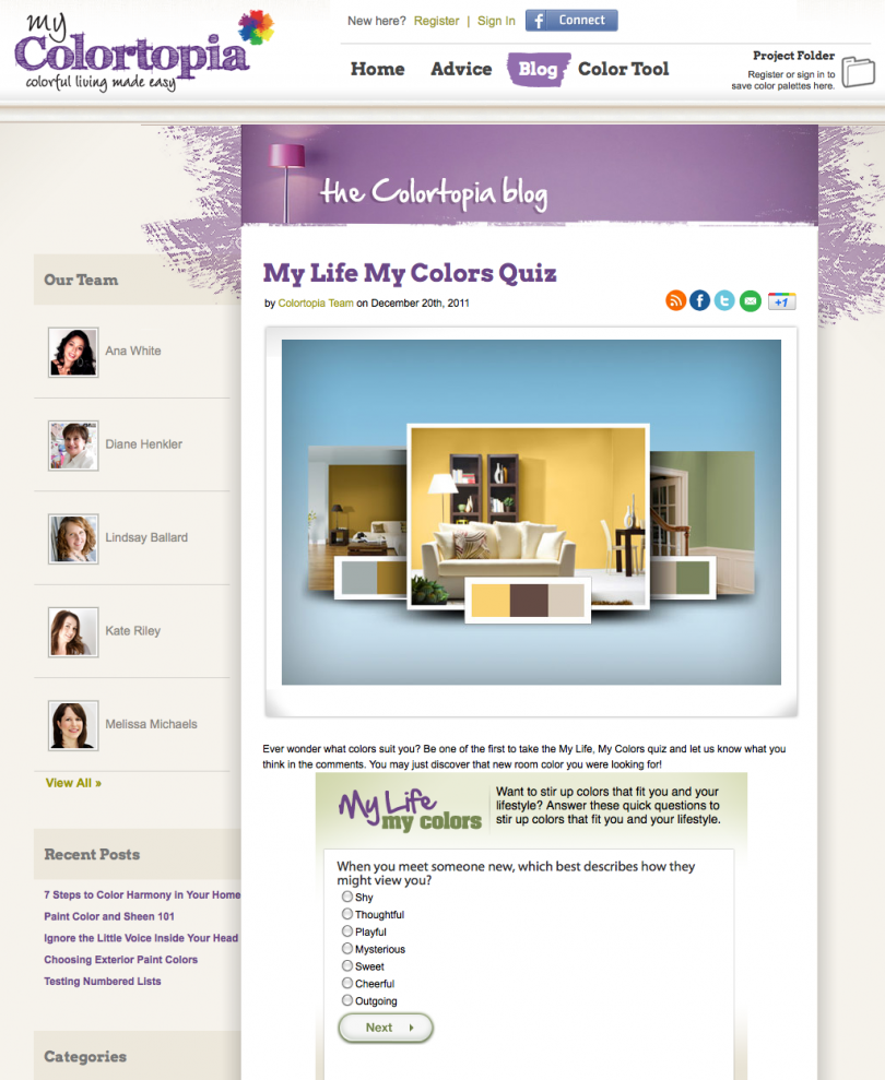
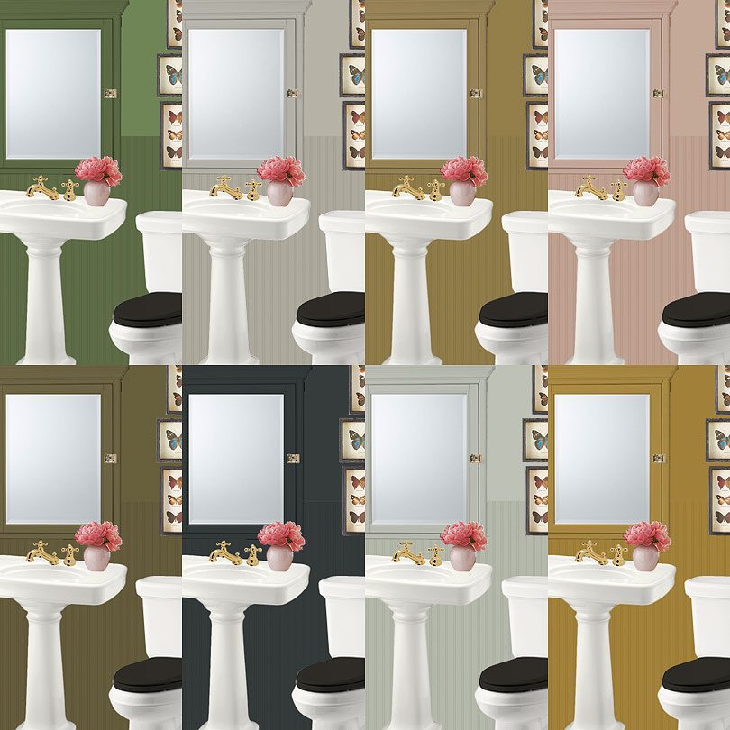
Color Quiz
How do you find color schemes for your home? I think it happens somewhat intuitively for me at this point,…January 26, 2012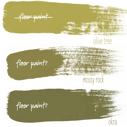
Basement Floor Paint
I'm having second thoughts about using Benjamin Moore's 'olive tree' for the floor paint. Maybe I should go a shade…January 25, 2011
Laundry Room Paint Color
And the winner is… pale blue! As I had mentioned, I'm not normally a fan of blue. I like certain…January 20, 2011
Drawn to “The Ugly Colors”
I’ve been planning two more big DIY renovations for our home: the laundry room and the second floor bathroom. The laundry room in the basement…
The Color Palette Inspiration
You’ve seen the built-ins starting to take shape, but what I’m really looking forward to is painting the front parlor and getting everything back in…
Testing Paint Colors for the Bedroom
The walls in our home (the ones that don’t have wallpaper, that is) were all painted creamy white before the house was put on the…
Color Quiz
How do you find color schemes for your home? I think it happens somewhat intuitively for me at this point, but I know I used…
Basement Floor Paint
I’m having second thoughts about using Benjamin Moore’s ‘olive tree’ for the floor paint. Maybe I should go a shade or two darker? Brandon said…
Laundry Room Paint Color
And the winner is… pale blue! As I had mentioned, I’m not normally a fan of blue. I like certain shades though, so I’m willing…