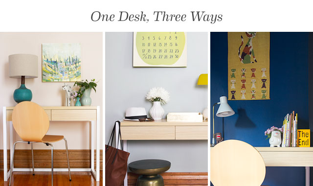
I shared a few of my favorites from Target’s revamped Room Essentials line a couple of weeks ago and today, I’m showing how their Wood & Metal White Desk can be styled three ways. It’s a little like my Making it Yours series in which I take a piece of furniture through three room designs, so this was a fun post to work on!

This post is sponsored by Target. Shop Room Essentials to make modern life easier.
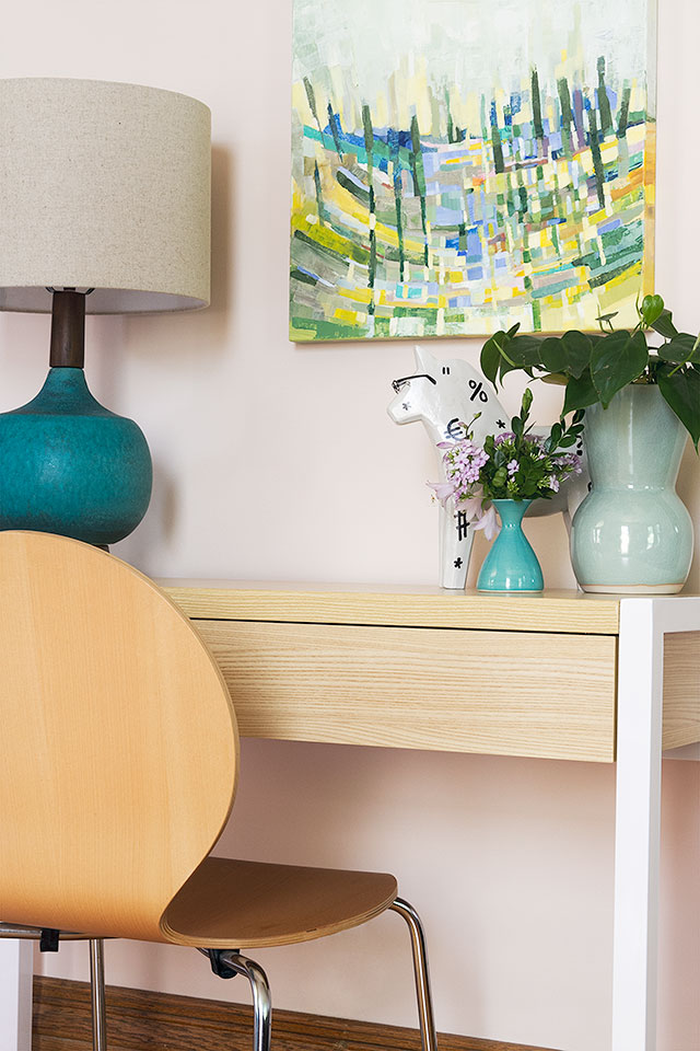
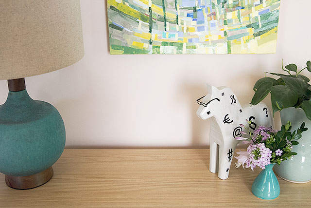
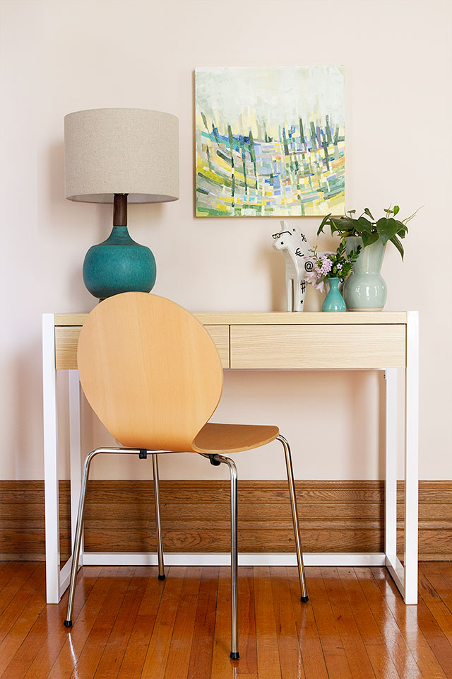
For Letter Writing, Bill Paying
You may not have need (or space) for a full home office, but many of us could still benefit from a place to sit and respond to mail or work from our laptop. With a cute lamp and some artwork above, this desk would look great in an underused portion of a living room or bedroom.
![]()
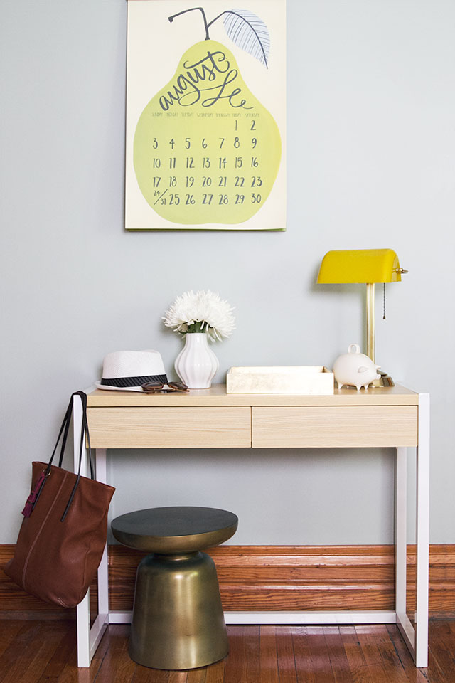
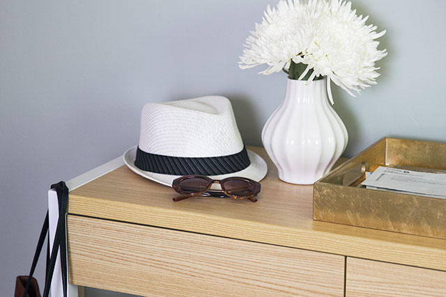
As an Entryway Console
The desk is small in scale, so it would be great in an entryway with just a little room to spare. A stool can be tucked in beneath, a tray on top collects mail, and I like having a piggy bank there to collect loose change too. Drawers are handy for storing anything you may need near the entryway but that isn’t all that pretty to look at.
![]()
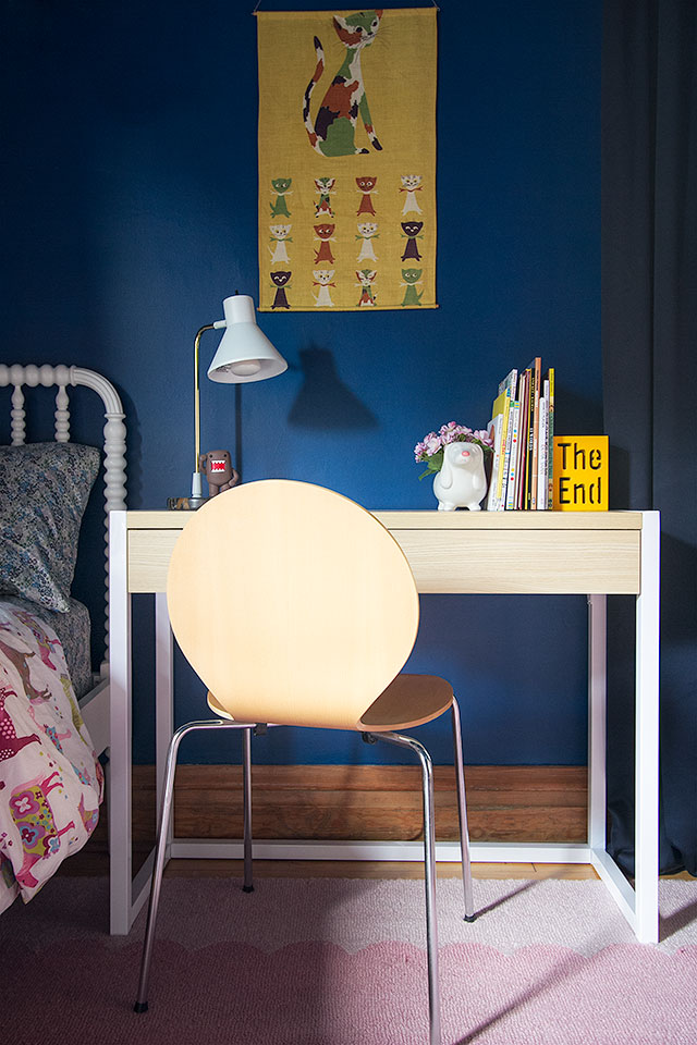
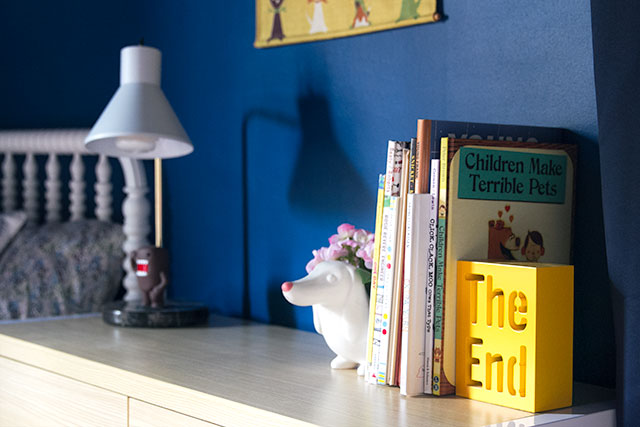
In a Kid’s Room
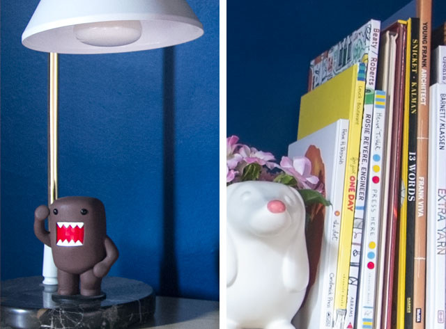
This would make a great desk for kids, too! Next to a bed, it can also serve as a nightstand; just swivel that light over for reading a bedtime story.
![]()
The desk is available now, in stores, and it’s a great piece that takes on the personality of what you pair with it. Do you have a favorite look from the three above?
This post is sponsored by Target. Shop Room Essentials to make modern life easier.


kristin
August 5, 2014 at 8:38 amlove, love, love that desk!
Elena
August 5, 2014 at 8:48 amNicole, the desk is very cute, but do you know the name/type of calendar with the pear? I must have it.
Making it Lovely
August 5, 2014 at 10:38 amIt’s by One Canoe Two. Looks like they’ll have another the same size for 2015, but the art is a somewhat different style, and all flowers.
Margie
August 5, 2014 at 8:51 amGreat desk. This is going to work perfect in my entry way! I want the stool too. Where is it from?
Making it Lovely
August 5, 2014 at 10:39 amIt’s the Martini side table from west elm. (It works as a stool, too.)
Sara
August 5, 2014 at 10:27 amI’m sure you’ve shared before, but can you remind me of the color on the wall in the entryway photo? Thanks!
Making it Lovely
August 5, 2014 at 10:40 amI set that up in my bedroom! It’s ‘Comfort Gray’ from Sherwin-Williams.
Katia
August 5, 2014 at 10:43 amI saw an ecuadorian Panamam hat. Right?
Making it Lovely
August 5, 2014 at 11:35 amYes, and it’s actually Brandon’s (though it looks unisex or girly the way I styled it there!).
Christina
August 5, 2014 at 11:28 amI love the blue lamp in the first iteration… Can you tell me the source?
Making it Lovely
August 5, 2014 at 11:34 amIt’s West Elm’s Modernist Table Lamp.
Sayeh, The Office Stylist
August 5, 2014 at 11:38 amSuch a versatile piece of furniture. I love how you styled it as the entryway console. That pear calendar is adorable too!
Emily
August 5, 2014 at 12:22 pmI love this!! Can you share the art and chair source from your first way to style the desk? Thanks!!
Making it Lovely
August 5, 2014 at 12:28 pmThe painting is by Jenny Vorwaller, and we’ve had those chairs forever. Here they are in 2008, in our first house and before that, in our old apartment. I keep meaning to sell them off on Craigslist (we have 8!), but they stack and have been easy to store, so we’ve still got ’em.
Staci @ My Friend Staci
August 5, 2014 at 12:42 pmCute, cute, cute. Love your simple (not over the top) styling. I have the nesting side table on my patio (under an overhang). We will see how it holds up in the long run, being outside and all. Love the clean lines and simple white and wood-look color scheme though :)
Melanie
August 5, 2014 at 5:53 pmLove the white Dala horse. Where did you get it? Too cute!
Kristen
August 5, 2014 at 8:06 pmOh my word. The ways you’ve styled these are amazing. I LOVE what you’ve done with each desk. I want it now, and I want it each way!!!
emily
August 5, 2014 at 9:04 pmthe desk as a side table is my favorite! my daughter has a similar set-up in her bedroom…it works perfectly in real life. plus, the contrast with the blue wall really makes the desk look much more expensive than it is!
Kerry
August 7, 2014 at 1:21 pmSeriously Nicole, the height of your floor moulding is AMAZING. Off topic, but just had to say!
Jessica
August 7, 2014 at 2:11 pmI want this! Not quite sure where to put it thought … wait maybe I do know!
What is the pait colour in your first treatment of the desk. Loving that too!
Thanks Nicole!
Making it Lovely
August 7, 2014 at 2:20 pmThat’s in our library — it’s ‘Pink Ground’ from Farrow & Ball.