I often see my old photos pop up on Pinterest, and I’m amazed at how much my photography has improved. I still have a lot to learn, but I’m pretty comfortable with my camera now — manual settings and all.
Here’s a shot of my library from 2007, about six months after I started this blog, and then a recent shot of the same space.
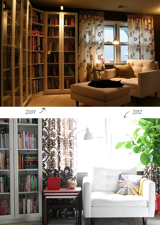
I remember having trouble with that first photo way back then, but I did my best and I thought it looked all right. I still see some problems with the newer one, but it’s clearly an improvement. The first one needed a lot of help from Photoshop to even get it to an acceptable level, and the second had just a little tweak for brightness and contrast.
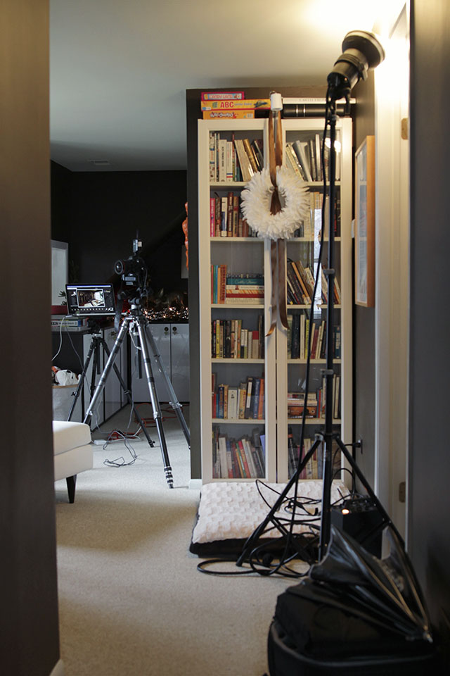
I’d love to learn more about lighting. There was a professional photographer here yesterday (shooting my house for a magazine’s Christmas issue to come out next year), and the contrast between myself and him was stark. He took his time, perfecting every shot and getting the lighting just right. I usually come in, set up my tripod, take a few shots, and move on. I was easily five times faster than him, but I’m sure his photos will be five times better than mine.
This was a quick snap — one that isn’t very good — but look at all that gear. I wouldn’t know how to use a lighting umbrella, or where to shine a spotlight at the ceiling to better illuminate the area behind it.
Having a blog for the last five years has pushed me to better my photography, and the constant practice has paid off, but I’m curious about what my photos will look like in another five years.



sarah locascio
December 19, 2012 at 2:01 pmJust wanted to say I am very inspired by this post. I recently started my blog and struggle immensely with the photography. Great photos are what makes a great blog and I hope that mine might someday come close to the improvement that you have achieved. This gave me hope! Thanks!
Sarah
Making it Lovely
December 19, 2012 at 2:26 pmI struggled for so long with my photos! I’m still not where I’d like to be, but I can tell that I have improved. You’ll get there too with practice, I’m sure.
Erin
December 19, 2012 at 2:07 pmI picked up photography when my son was born in feb ’11. It’s crazy to see how far I’ve come since then, but even crazier to realize that the more I learn, the more I critique and see wrong with my photos. Back in the day I thought I was hot stuff! ;) Now…Oh boy, I still have so much more to learn. Like you, I am looking forward to what my pictures will look like in five years. I am hoping to see much improvement!
Allison
December 19, 2012 at 2:10 pmStrange as it may seem, I actually prefer the first photo. It has a warm, cozy feel missing in the stark, bright second one, and it shows the space more effectively. Sure, it has a visible ceiling vent vs the overall prettier composition of the second photo, but I find the first more helpful in terms of being inspired for how to create a library corner. I guess what I’m saying is that it depends on what your photos are trying to convey to your readers and for me, I read blogs like this for ideas and in this particular case, I find the prettier picture less revealing and more “flat”. The earlier photo makes me want to curl up in that chair with a cozy quilt and a book. So don’t be too harsh on your earlier efforts.
Amber @ Pooch and Puddy
December 19, 2012 at 3:14 pmI came here to say just this! I think the first picture looks much warmer, friendlier, and cosier than the second.
Making it Lovely
December 19, 2012 at 3:41 pmInteresting! I did take the photos for different reasons, and I think that’s part of what you’ve picked up on. The first photo was from when I’d finished the library, and I was trying to show the whole space. The newer one was to show the nesting tables that I’d painted, so I wasn’t concerned about showing the wider view of the room. And there is something cozier about curling up with a book when it’s dark out, with the lights on around you.
mandy @ this girl's life
December 19, 2012 at 2:12 pmThe difference is amazing! I still have A LOT to learn…I am still in awe of the difference a DSLR camera can make period, but need to play around with all of the settings and also Photoshop to make mine better.
Making it Lovely
December 19, 2012 at 8:27 pmI used a DSLR both times. The difference isn’t in the camera, it’s in knowing how to use it.
Marie-Pier
December 19, 2012 at 2:15 pmI feel the exact same way as Sarah. Thanks Nicole for this inspirational post. :)
Brianna
December 19, 2012 at 2:18 pmNicole, can you recommend a good digital SLR. I want to get one since we’re having a baby soon and I’d like to take better pictures for my Etsy shop. I’ve taken photography classes, so I know a little bit.
Making it Lovely
December 19, 2012 at 8:32 pmI like my 7D, and wrote about upgrading from my old Canon Rebel here. The 6D has come out since then though, and I don’t know much about it other than it is an entry-level full-frame camera, so that seems like a possible good choice.
Megan @ Rappsody in Rooms
December 19, 2012 at 2:22 pmWow! Look at all that equipment! I definitely struggle with my photography too. It is hard to get that perfect lighting…and my patience level isn’t always there. I know I need to take more time with my shots. It makes me feel better that professional photographers take a long time.
Making it Lovely
December 19, 2012 at 3:44 pmThey take a really long time. I’ve never spent an hour trying to get a single photo of a space.
Ceci Bean
December 19, 2012 at 2:25 pmThis was such a relevant post for me. I’m still at the very beginning, trying to figure out how to achieve the look I have in my head. Did you find trial and error was your best teacher or was there a book or blog that helped you figure things out?
How exciting to have super pros shooting your house though!
Making it Lovely
December 19, 2012 at 8:33 pmI took a class online that helped a lot! I wrote about it here.
Jill
December 19, 2012 at 4:12 pmI just love the first picture but then I prefer a subdued look in almost everything. The second one is nice but the feeling is more fluorescent, less inviting. I too could happily curl up in the chair in the first photo.
Katie
December 19, 2012 at 4:22 pmI agree with liking the first image better. It’s a better exposure too, balancing the indoor light with the outdoor light. The current trend in interiors photography probably leans more towards the second shot. My aim with the second shot would to avoid having the top of the chair blown out.
Making it Lovely
December 19, 2012 at 8:35 pmI know — that’s what I was referring to when I said that there are still things I’d like to improve in the second photo.
Tristan B.
December 19, 2012 at 4:37 pmI always thought you took great shots:) You have a naturally good eye, but it’s always fun to see improvement.
Kristen
December 19, 2012 at 5:19 pmAs someone that is also striving towards better photos and better understanding her camera, I really appreciate this post (and posts like this); thank you, Nicole! One question: how do you shoot those that you are working on a project? Do you have help or do you just set up a tripod?
Making it Lovely
December 19, 2012 at 8:36 pmI shoot it all myself with a tripod and a remote.
Monika / MB Captured
December 19, 2012 at 6:07 pmWow, the difference is great. You have really grown. I started my blog just over a year ago and seeing VAST differences in my skills. (the whole reason i started blogging really – to make an effort with photography)
All of that equipment does remind me that mine is just a hobby!
annemarie
December 19, 2012 at 8:40 pmMy uncle is a grand master photographer. He takes AGES to set up his shots, and then takes one picture, and rarely does any post processing. The print he gave me as a wedding present is one of my favourite things in the world.
Rosemary
December 19, 2012 at 9:19 pmWow! Such an improvement! I’m still learning, but as a magazine editor, I work with professional photographers daily. I’m always so impressed with their ability to light a space (or especially – a person) and completely change the tone and feel of the photo. The right lighting can make a snapshot true art.
Kathryn
December 19, 2012 at 10:57 pmWow! This is so inspiring. I have been trying to improve my photography skills, and I am getting better, but I have a lot farther to go. I hope that one day, I’ll be able to take photos as lovely as yours. Like you, I want to learn more about lighting. I live in rainy Seattle and some of the rooms in my house have very small windows. The combination of grey skies and small windows means I get almost no natural light. This makes it challenging to take good photos.
Preciously Me
December 20, 2012 at 4:04 amI started a blog a few months ago and it’s true that when I have to take pictures it’s always so complicated because of the lights and many other things. There are so many things I did like recipes and DIY that I never just because I hated the pictures I took, and I now that beautiful pics make the difference on a great blog!
So thank you so much for this post, now I only have to cross the fingers to be like you in 5 years :)
Emma
December 20, 2012 at 7:53 amThat’s so impressive! Would you be able to pinpoint a few things that you changed/improved between the first and second picture? (Change in camera? Change in lighting – natural vs. lamps? Change in Photoshopping?)
Thanks, and I love your blog!!
susan
December 20, 2012 at 7:56 amI actually love the first photo more. It has a lovely moody quality to it that I really respond to.
jackie jade
December 20, 2012 at 10:35 ami’m new to blogging and hence new to attempting to take half decent photos. i hope to keep improving and love being inspired by how much others have seen their skills improve too!
cateyecreations
December 20, 2012 at 10:57 amWow! This was an awesome post! It really opened my eyes about a lot
Christmas Decorations (Part 1: Upstairs) | Making it Lovely
December 20, 2012 at 4:40 pm[…] know — it’s a little late in the game to finally be sharing our Christmas decorations! The house was photographed this year for the Christmas issue of a magazine (to come out next year, obviously), so I was focused on […]
Valerie
December 21, 2012 at 9:19 pmLove all the photos with pink and the items that provide a happy trip down memory lane.
Christmas Decorations (Part 2: Downstairs) | Making it Lovely
December 22, 2012 at 12:56 pm[…] a poinsettia (poisonous! [oops, they're not]) and my Eames bird (sharp little spike feet!) for the photo shoot, but those are both now safely out of reach. The kids play on the coffee table everyday, so I […]
Bonnie
December 28, 2012 at 10:25 amGreat improvement! Please share with us what you’ve learned and how to do it. Thank you!
Julie Paradise — #3
January 3, 2013 at 5:02 pm[…] Balch von Making it Lovely zeigt ihre Fortschritte beim Fotografieren für ihr Blog. Hmm, da habe ich auch noch viel zu […]
IKEA KIVIK vs. KARLSTAD | Making it Lovely
February 20, 2014 at 4:11 pm[…] rolled arms (not the prettiest, but so comfortable) side by side with our boxy mid-century-inspired white Petrie armchair. It worked, but… not […]