Thank you to Linda at Calling it Home for inviting me to take part in the One Room Challenge again, and thank you to my sponsors (whose products I’ve noted with asterisks) for making this all possible. I’m grateful for them, and for you, too! Thank you for following along.
I’m going to be honest here and tell you that I’m a little worried about finishing this whole thing in time. The front entry, back entry, a total of four flights of stairs, the second and third floor halls… it’s all happening in real time over these six weeks, and it’s going to be a scramble at the end. Let’s get into the design plan today, shall we?
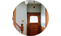
Front Entry
This should be easy enough. I’ve already started, a lot of what’s already there is staying, and I’d say there’s only about three days of work left. I want the entry to make a good first impression when guests come over, but it also needs to function well for our family of five (and all of the coats, shoes, and backpacks that end up in the space everyday).
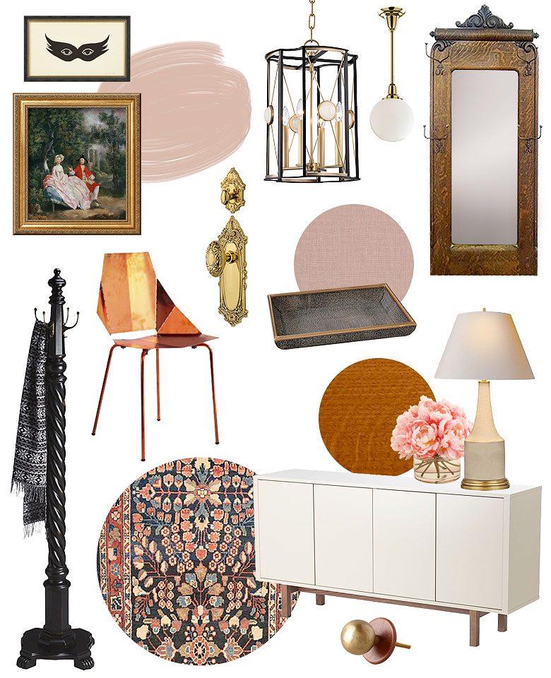
I’ve been wanting this “Mask” print by Jennifer Ament for ages now. I like it juxtaposed above something very traditional, like this lovely print of a Thomas Gainsborough painting, and that mix is something I’m going for throughout the house. I still love the IKEA Stockholm Sideboard that holds all of our shoes (see my review here) with its leather and brass knobs. I’ll be topping it with a pair of lamps by Alexa Hampton* and a faux shagreen tray*.
The little light over the door is getting replaced with a similar brass downrod with a simple globe, and the gaslight-style fixture (that I think is facing the wrong way) will be replaced with a modern lantern*. This peacock blue velvet chair would look amazing in the entry, referencing the color of our sofa in the other room and the geometric lines of the lantern, but it’s not available until December. Instead, our copper chair will be just fine — with the added bonus of improving with abuse from the kids.
The front and back doors are getting matching Victorian oval knobs and back plates* (available here) and matching deadbolts* (here). The antique hall tree is staying, but realistically, we do better with additional room for coats and bags, so there will also be a separate coat rack*. The walls will be painted pink — possibly Amber Wood*, but I’m still deciding. There is a window at the top and bottom of the stairs, and both will get pink roman shades*. The semi-antique Persian rug will stay, the wood trim is staying as-is, and of course I’ll bring in flowers and whatever other finishing touches that are needed.
The Back Entry
The reason I’m doing all of these spaces as my “one” room for the One Room Challenge, is that they’re all getting variations of the same design. Colors will carry through. Hardware and lighting, while not an exact match throughout, will all work together.
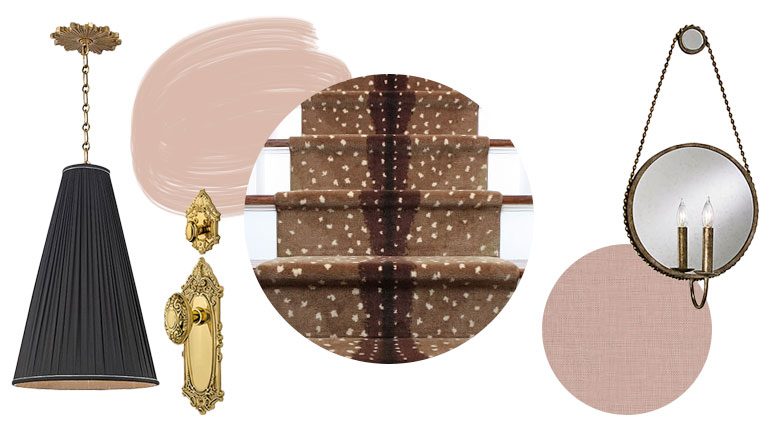
The same door hardware* as the front door — keyed alike so we can use one key for both. The windows at the top and bottom of the stairs will get the same pink roman shades* as the front entry. I’m leaning toward pink paint again, but I may switch to the same creamy white I’ll be using in the third floor — what do you think? The main thing I’m excited about in this space, is the antelope stair runner*. It’s going to look amazing! Although I have to say, the pleated pendant* (I’m getting my pleats!) and mirrored sconce* are not to be overlooked.
I would love to skim coat the walls (especially since we basically have a drop cloth down with the old carpeting there), but I’m not sure if it’s going to happen. Paint would do wonders, and while we are going to hire out the carpet installation, we will be ripping all of the old stuff out, repairing and replacing damaged treads beneath (it’s pretty obvious that there are some problems), and then sanding, priming, and painting the stairs. I don’t think we can devote enough time to do the walls in this space right now when there’s so much else going on.
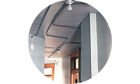
Second Floor Hallway
Black doors, white trim, drywall, cadillac. Yeah, the hall’s a time bomb. The ceiling needs to be framed for drywall, then that drywall needs to be hung, taped, and mudded — all of which is getting started tomorrow. This is the other big thing that we’re hiring out but how long’s it going to take, I can’t say exactly. Two weeks?
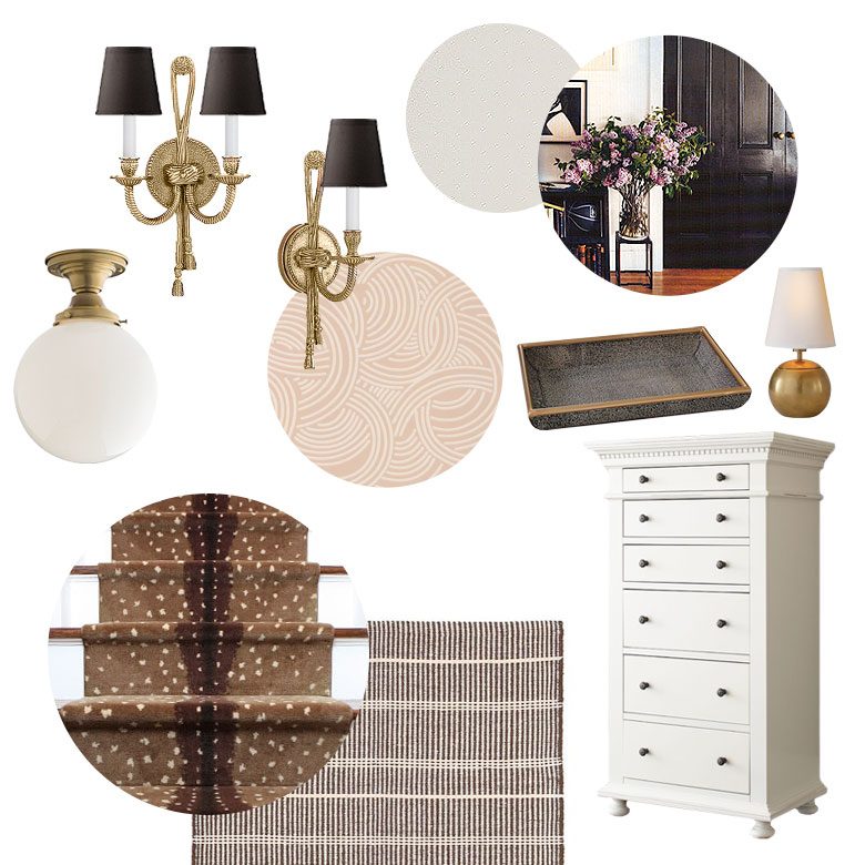
We can’t do anything in the hall until the drywall is done, but after that, we can sand, prime, and paint the doors and trim, prime the walls and ceiling, paint the ceiling, hang wallpaper, and install new lighting. It’s not the worst list of work to be done, but it’s slow-going stuff that’s going to take time to execute. We are having all of the stairs in the house done with the same antelope carpet* except for the ones in front from the first to second floor. The hall will also have a couple of runner rugs, but I haven’t decided 100% on the pattern/color yet. Maybe this one*? A solid color could be nice too.
The hallway will get a mix of single* and double rope and tassel sconces* with black shades. (You know I love a good tassel sconce.) Four brass flush mount fixtures with milk glass globes* will line the ceiling, and I’m thinking pink Tourbillon wallpaper* will line the walls. I’m all for pink.
The vintage armoire we’ve been using in the hall for storage is not holding up so well, so it’s being replaced with a new dresser*. On top will be the teeniest little brass lamp* and maybe another faux shagreen tray*. I need art above the dresser, and possibly throughout the hall, but I haven’t made any decisions there yet. I feel like there’s always room for vintage portraits* somewhere, and a vase* of fresh flowers, too. There is a window at the end of the hall (which used to be blocked off before we remodeled the second floor) that’s going to get another roman shade*, but in white. With polka dots. CUTE.
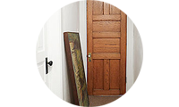
Third Floor Hallway
No problem, compared the other hall! The first two floors have similar proportions with the same 10″ tall molding, original Victorian hardware and details, and high ceilings. The third floor isn’t as grand. The trim is half as big, with little detail. None of the hardware matches each other, let alone the rest of the house, and the ceilings are a standard 8′ high.
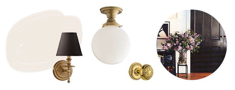
The walls are textured again, but skim coating up there is not a priority. I’m also leaving the wall-to-wall carpet that’s in the hall and two rooms (meh). Still, paint is going to work wonders. I’ll be using a creamy white paint — I’ll share the exact shade once I’m sure. The doors will be black and the trim white, for continuity with the second floor. Something I’m pretty excited about is the new hardware* that’s going on those doors! Brass, to match the originals throughout the rest of the house, with period-appropriate details, but modernized a bit with rope rosettes instead of long, skinny Victorian back plates.
I’ve already chiseled out space for the new, larger mortise locks to fit and repaired the doors with wood putty as needed. All six doors up there are in progress, then it’s time to paint everything and change a couple more lights. The ceiling fixture will match the brass mounts with globes* on the second floor, and I bought more classic sconces and black shades for the whole top floor (three of them in all).
There’s only about 3-1/2 weeks left to do everything, because I need at least a couple of days to take and edit photos at the end. Um, not that I’m stressing about it or anything. (Yikes!)
Follow along with the One Room Challenge participants!
 • Jana Bek • Chris Loves Julia • Shannon Claire • Coco.Kelley • The Curated House • Driven by Décor • The English Room • From the Right Bank • Sherry Hart • Hi Sugarplum • House of Jade • Hunted Interior • The Makerista • Making it Lovely • Marcus Design • Pencil & Paper Co. • Megan Pflug • Place of My Taste • Suburban B’s • Waiting on Martha • Media Partner House Beautiful • TM by CIH
My One Room Challenge Sponsors
Thank you to the following sponsors for generously providing product.
• AllModern • ATG • Bellacor • Chairish • Crystorama • Dash & Albert • Dutch Boy • Farrow & Ball • Jill Rosenweld • Joss & Main • Karastan • Lamps Plus • Nostalgic Warehouse and House of Antique Hardware • Schoolhouse Electric • The Shade Store
* Individual products provided have been noted above with asterisks.
My One Room Challenge Posts
Follow along from the beginning!
• Week 1: The Before Shots • Week 2: The Design Plan • Week 3: Work Very Much in Progress • Week 4: Those Stairs, That Hall • Week 5: When it Rains, it Pours • Weed 6: Final Reveal!


sue
October 12, 2016 at 9:50 amthis is ambitious, but pretty damned fabulous… loving the antelope carpet & you’ve used my most favourite hallway reference image ever (black doors, massive base of lilacs)… just wondering, what is the thinking behind the change of colours on the top floor? i always love to know people’s thought processes when pulling a scheme together!
Making it Lovely
October 12, 2016 at 10:44 amThe lack of light in the hallway on the third floor, the lower ceilings, the textured walls, skimpy moldings, and the funny angles at one end were all factors in choosing a different color. The white trim and black doors with brass hardware will link the space to the rest of the house, but a creamy white color on the walls and ceiling will keep it from being overwhelming with a lot of color!
Rebecca
October 12, 2016 at 10:09 amOhmygosh! I love everything but the antelope carpet, even though it’s clearly faux, still seems too grim to me but everything else looks amazing! Very excited to see the spaces finished
Pia
October 14, 2016 at 6:42 amTotally agree. The carpet is just terrible to the other nice things.
AzureSong
October 17, 2016 at 7:01 pmIt’s not actually made of antelope! Are you really saying that we can’t copy patterns we see in nature? No antelopes because it reminds us of dead antelopes? No faux leather because it reminds us of real leather? Come on, this is craziness. There’s nothing wrong with animal prints.
Erin
October 12, 2016 at 11:48 amWell this is going to be amazing!!! I love how the spaces flow and I love the mix you’re putting together.
Kelsey
October 12, 2016 at 12:00 pmI can not wait to see how this turns out, I have a feeling it is going to be stunning. That antelope stair runner is amazing.
Dee
October 12, 2016 at 12:03 pmI love the antelope. Also your Time Bomb reference made me actually laugh out loud.
Making it Lovely
October 12, 2016 at 1:21 pm:)
Celeste
October 12, 2016 at 1:05 pmThis is going to be stunning! The continuity makes me sooo happy and I love seeing all the choices you’ve made side-by-side. Lots of work but man, you’re going to love walking through your house instead of slightly closing your eyes before landing in finished rooms. ha!
meganpflug
October 12, 2016 at 2:42 pmGO NICOLE! You got this!!! Also the designs looks amazing, I’m forever a fan of that antelope runner.
Casey @ House by the BayCasey
October 12, 2016 at 3:15 pmI love your design! Now my stairs feel so boring because I don’t have a runner like that one lol
lauralou
October 12, 2016 at 3:35 pmCan’t wait to see it all come together!
shannon
October 12, 2016 at 3:35 pmRegarding painting: my first instinct is to say do everything that gentle, creamy white and then bring in additional pink accents (shades, flowers, accessories). That would be safer/more neutral and is probably what I would personally choose. But, since you love pink so much, go for it! Both could look great, just a different feel with the white vs. the pink.
Gloria
October 12, 2016 at 7:18 pmOh good lord, this make me weak in the knees. I would sincerely like 7 minutes in heaven locked in some closet with this mood board, okay, wow, are there kids reading this blog? I’ll stop.
I have full confidence in you! It’s gonna be great!
kaitieteeKaitie Tee
October 12, 2016 at 9:41 pmOn the website, it looks like the Stockholm sideboard only comes in veneer. Were you able to find it in white still?
Karen Simon Peterson
October 13, 2016 at 12:36 amSuper ambitious, but, in the end, it will look fabulous! I love your ideas, love the pink and the leopard runner. Good luck!
Sherry
October 13, 2016 at 4:21 amExciting choices!! Love, love the front hall lantern, the antelope stair runner, and the sweet hall dresser. I think, with the high ceilings you can pull off the pink. Look forward to seeing the results!
Aniko@PlaceOfMyTaste
October 13, 2016 at 8:24 amWow! Your plans are amazing! Can’t wait to see what you have in store for next week!
doodletllc
October 13, 2016 at 10:49 amLove your color palette, the mix of antique with contemporary and that antelope runner…just the best… But the Gainsborough with the mask mix – genius! So fun.
Linda
October 15, 2016 at 11:59 amYou won’t have any house left after this. Wow, this is super ambitious, but I understand how this tumbles like dominoes. The plan is solid and beautiful. I adore the pink and can’t wait to see more.
Gwen, The Makerista
October 15, 2016 at 2:32 pmDefinitely a lot to take on but gosh, it’s all so pretty! The hardware and lights are all soo good. Can’t wait to see it come together!
sherry hart
October 16, 2016 at 5:01 pmBoy…big job but you are right to get it all done at the same time…plus the deadline is a good way to push you forward:) I almost used that same Karastan rug but changed my mind at the last minute….now rethinking my decision cause I really love it!….!
One Room Challenge: Week 2: Sources and Ceilings - The Makerista
October 17, 2016 at 10:28 am[…] Hi Sugarplum | House of Jade | Hunted Interior | The Makerista | Making it Lovely […]
Rosanna Bassford
October 17, 2016 at 8:36 pmLove the color palette and all the gold finishes! Beautiful and can’t wait to see it all go in!
One Room Challenge Week Two :: Layouts & Problem Areas - coco kelley coco kelley
October 18, 2016 at 10:47 am[…] Hi Sugarplum | House of Jade | Hunted Interior | The Makerista | Making it Lovely […]
Christa Pirl
October 18, 2016 at 4:13 pmI just adore your antique and modern mix! Cannot wait to see the end result! I am hoping to create a similar mix with my office design for the One Room Challenge as well!
One Room Challenge: Week 3 (Work Very Much in Progress) – Making it Lovely
October 19, 2016 at 8:12 am[…] Blech. Don’t judge that back stairway too harshly — it’s what we inherited when we bought the house. So glad to finally be giving it some attention! Picture the walls all smoothed out and painted a creamy white, black stairs with white risers, white trim, and that antelope print runner. […]
cassie {hi sugarplum}
October 19, 2016 at 8:13 amSuch a gorgeous plan!!! Can’t wait to see it all come together! I’m getting a little panicky myself…but that’s par for Week 3. :/
Naomi
October 25, 2016 at 9:47 amThat Antelope stairs runner took my breath away!!!
One Room Challenge: Week 4 (Those Stairs, That Hall) – Making it Lovely
October 26, 2016 at 8:43 am[…] working on the front and back entryways, four flights of stairs, and two hallways, but I think the biggest impact for us will be in the second floor hall. We are remodeling this home […]
One Room Challenge: Week 5 (When it Rains, it Pours) – Making it Lovely
November 2, 2016 at 8:34 am[…] from the beginning! • Week 1: The Before Shots • Week 2: The Design Plan • Week 3: Work Very Much in Progress • Week 4: Those Stairs, That […]
One Room Challenge: Week 6 (Front and Back Entry, Stairs, and Hallways – Final Reveal!) – Making it Lovely
November 9, 2016 at 1:53 pm[…] along from the beginning! • Week 1: The Before Shots • Week 2: The Design Plan • Week 3: Work Very Much in Progress • Week 4: Those Stairs, That […]
One Room Challenge- Week 2- Moldings & Trim - House of Jade Interiors Blog
November 13, 2016 at 11:07 pm[…] Hi Sugarplum | House of Jade | Hunted Interior | The Makerista | Making it Lovely […]
Choosing Window Treatments for Our Hall and Both Entryways – Making it Lovely
November 14, 2016 at 1:20 pm[…] had considered pretty seriously. I had actually mentioned that I would be using them when I showed the design plan in week 2, but I changed my mind when I went to place my order. Polka dots are very cute, but I had kind of […]
Planning Our Paint Color Palette with the Simply Yours Tool – Making it Lovely
December 29, 2016 at 4:18 pm[…] I paired them up together with the Simply Yours Tool one last time. I referenced it while creating design boards and choosing fabrics, furnishings, and accessories. The brown (Olde Metal, 414-7DB) is there to […]
liviaip
February 16, 2017 at 6:18 pmWhere are the leather and brass knobs on your Ikea Stockholm from?
Making it Lovely
February 17, 2017 at 8:13 amThey were from Anthropologie.
One Room Challenge: Week 1 (the Before Shots) – Making it Lovely
July 18, 2017 at 1:55 pm[…] One Room Challenge: Week 2 (The Design Plan) – Making it Lovely […]
One Room Challenge: Week 2 | DIY Built-In Bunkbeds for Around $700 - My Hub List
August 31, 2021 at 3:46 am[…] Hi Sugarplum | House of Jade | Hunted Interior | The Makerista | Making it Lovely […]