Oh hey, remember when I was going to make over my dining room because I was inspired by a moth? I did it!
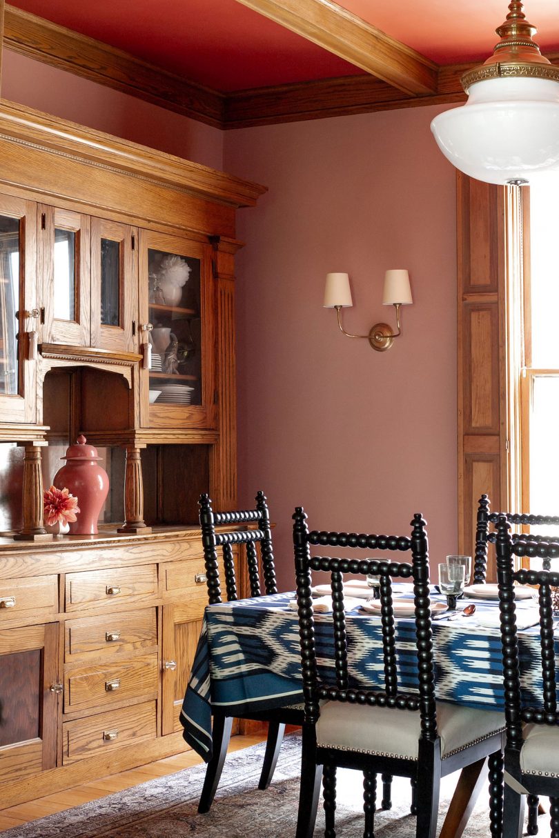
I need some art in there still, but I’m waiting to find just the right thing, rather than rush out to fill blank wall space. And I’m not letting that stop me from taking photos of what is a 92% completed room. I saw a post about the life-sized papier-mâché octopus from the 1893 World’s Fair here in Chicago, and I thought to myself ‘I should make things out of paper mâché.’ It hasn’t happened yet, but in my head I know it would be great. Moths for the dining room! Maybe not. But then I do want to make mushrooms that look like they’re growing out of the walls to line the hallway on the third floor, making you feel like you’re a little itty bitty thing in a fairy forest. Normal decorating stuff.
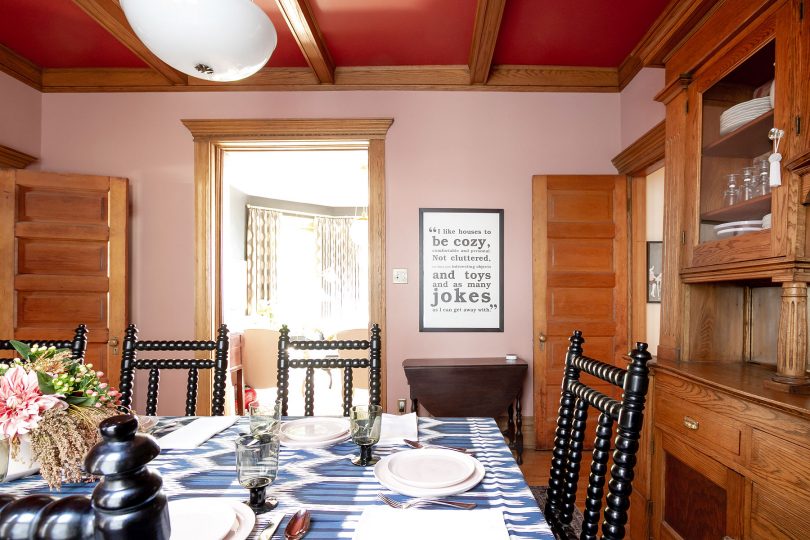
The room looks pretty much exactly like the mock-up. I’ve gotten good at doing renderings in Photoshop and SketchUp, honing my skills first for fun and for the blog, now just as often for clients to show what their spaces will look like. It’s a weird thing because I can see it in my head coming together just fine, but then I like to make it happen digitally to show others, and then I have to actually DO the work to make it happen. Like, I’ve already done the work of designing it, now I have to do all this other stuff? Blah, fine. I’ll paint for four days.
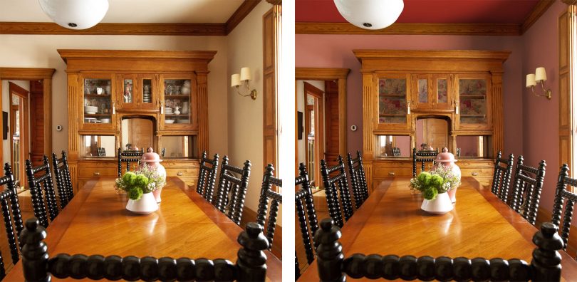
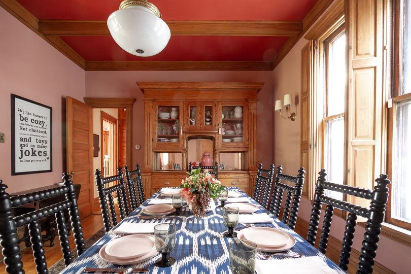
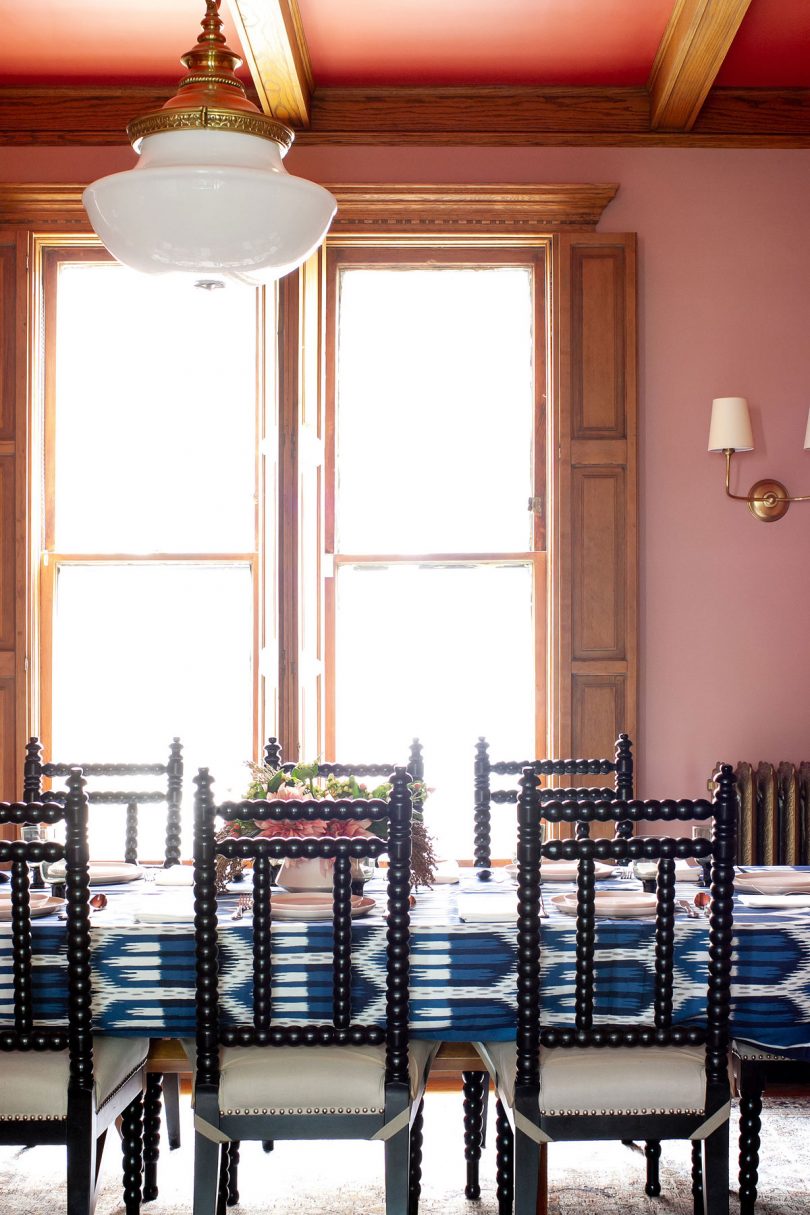
There’s some unwanted bokeh I don’t know how to avoid (is it dust, or the aperture being open too wide?), and yes that light is centered length-wise on the room but not width-wise. The junction box is in a faux wood beam and it seems like more hassle than it’s worth to move it. It’s probably because I don’t sit at that end, but it bothers me far more in photos than in real life. There are always more pressing/exciting things to do around here than to move that light.
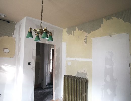
Another before, rendering, and after. Pretty spot-on!

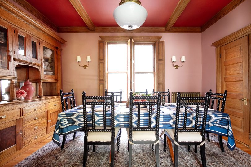
We have always been able to do the amount of work we do because I do so much of the manual labor, but that doesn’t mean I always want to. We hired out painting a handful of times and it was a dream. Snap your fingers (and spend some money) and it’s done! Voila. I wish it happened more often, but money saved on painters is money spent on an electrician to add sconces where before there were none.
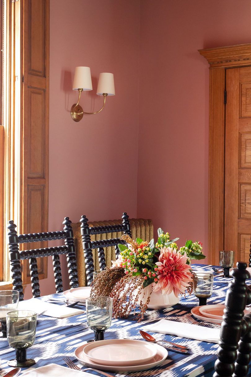
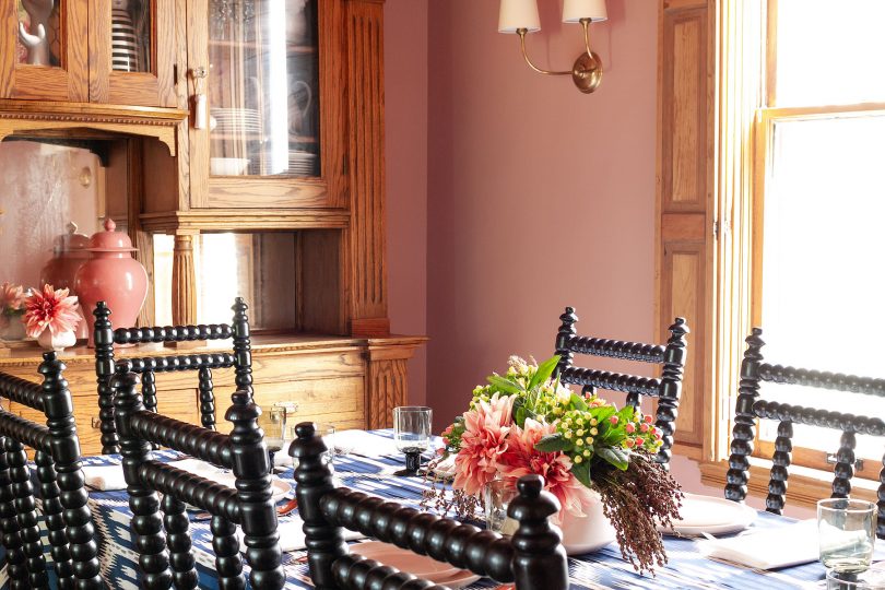
The sconces are Vendome, by Visual Comfort. A modern classic. Note the delicate arc of the arms, subtle details, and pretty finishes. If those details are less important to you, you can get a very similar look for a lot less with this sconce.
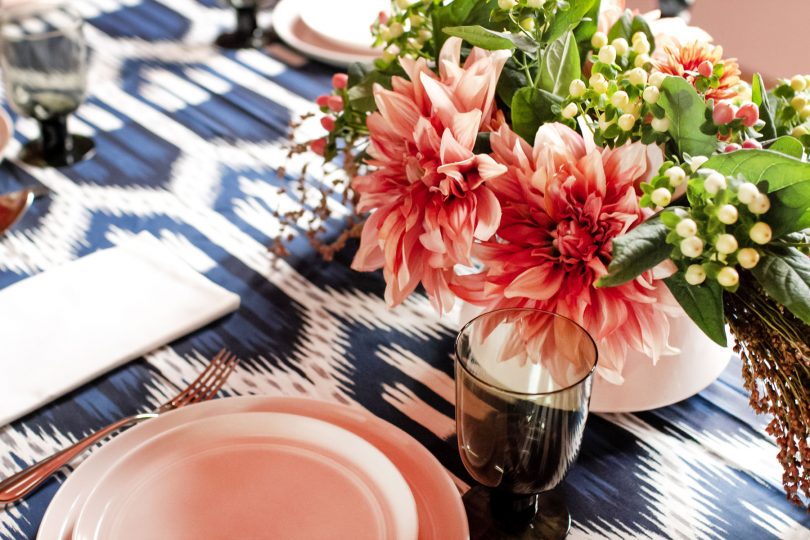
The tablecloth was from the Schumacher collection for Williams-Sonoma (sold out, but some of the other items are still available). You can buy the same Bukhara Ikat pattern in their cotton sateen fabric, but I wouldn’t recommend it for a tablecloth.
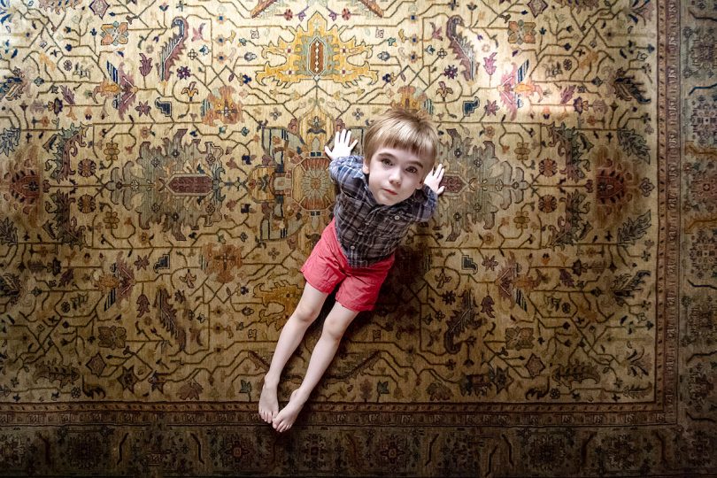
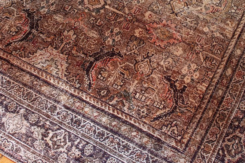
I found and put in the room very briefly a rug I bought off of Facebook Marketplace. It was pretty, but too plush for a dining room, so I rolled it up and sold it for the same price I bought it for. Hello Calvin, my little model, and thank you for so cutely rocking the haircut I gave you! (I’m getting better at them as I go — I think we’re on round three of at-home haircuts by now.)
The rug we ended up with was me giving up on sourcing vintage rugs solely online during a pandemic and just wanting to be done with that task. Done! It looks great in photos and in person, but be aware that it is printed. I’ll usually opt to invest in something a little nicer, new or old, but in this case an inexpensive rug that’s super easy to vacuum (the flat texture means no food can get trapped in the weave) was exactly what we needed. This is the Loloi Layla rug in olive and charcoal.
I talked a lot about the process of this room coming together on Instagram Stories. Did you see the wallpaper I was considering for a client that I ended up falling in love with? And not getting?
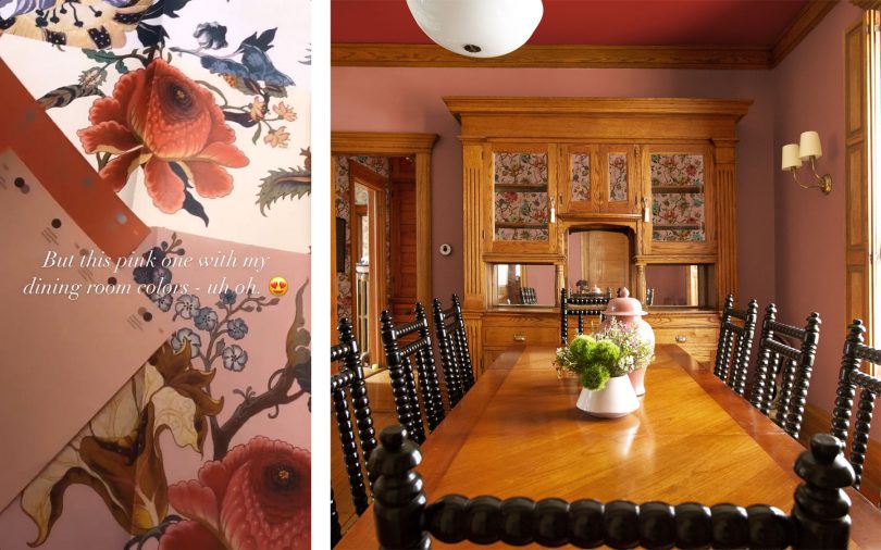
I would have loved to paper the little hall between the dining room, kitchen, and bathroom, and also use it to line the back of the hutch. It would look amazing! But I had rolls of Ralph Lauren paper in the basement left from the previous owners (the pattern in the snug) that matched pretty well. I don’t love the pattern nearly as much, but I like it a lot and it was free.
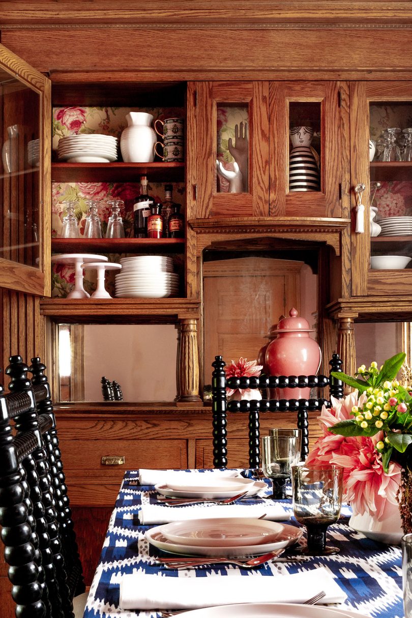
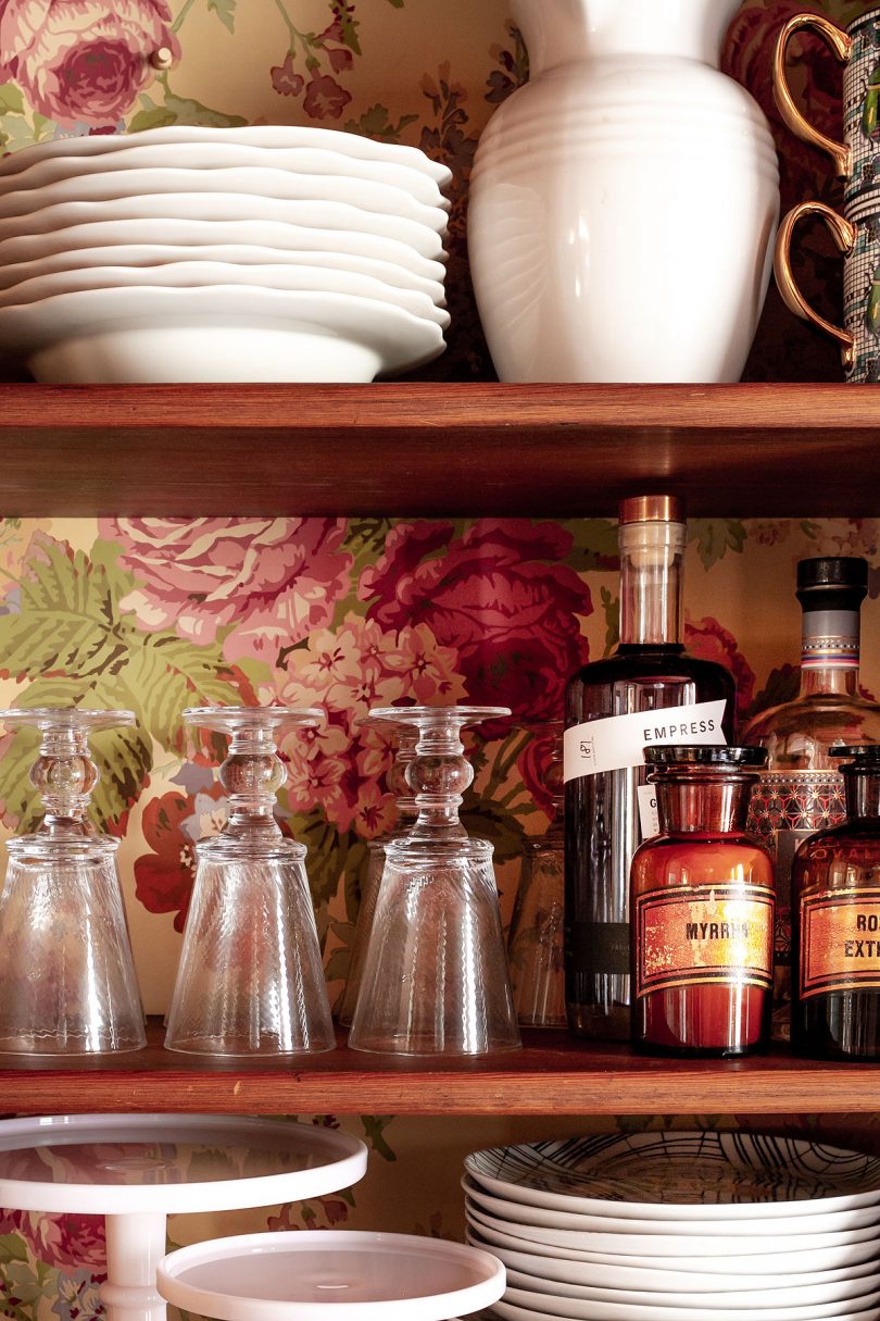
Saving that expense (about $1000) let me put that money toward snake wallpaper for the bathroom which is equally exciting! Oh boy, there’s so much going on here that I need to put into blog form. Good stuff.
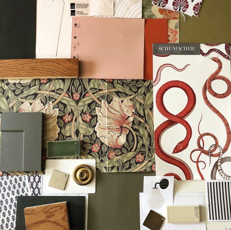
I’m feeling creative and motivated to work on the house again after doing this dining room update. It’s a good feeling! And woe is me for complaining about painting a ceiling, because I’m stripping wallpaper that was applied to bare drywall now and that has proven to be the far more laborious task. Oh, house. You don’t make it easy sometimes! It’s a good thing I love you as much as I do. We’ll get that bathroom looking amazing soon enough. And maybe a kitchen update to follow, hmm?




Korin B
December 16, 2020 at 4:45 pmOh it is lovely and so fun thank you for sharing the before-mock-after too. Might I ask what you used to hone your photoshop skills? Tutorials. A class. Trial and error?
Making it Lovely
December 17, 2020 at 11:12 pmThank you! I’ve been using Photoshop for decades, so it was all trial and error in the beginning but I’m pretty well set now. I’m sure there are so many tutorials on YouTube or places like Lynda.com that would be great for learning though!
Mia Tenille
December 16, 2020 at 4:46 pmWow, this room is so great! I actually love the pink- it matches really well with that vintage look. What hue of pink is it? I am considering painting an accent wall that color as long as it matches well with my recently refinishing kitchen cabinets and hutch in my dining room!
E
December 16, 2020 at 6:23 pmI’d also love to know what the pink paint is. Our kitchen cabinets are a similar tone to your wood, and our walls are currently painted a brownish purplish pinkish (liver-ish…) color. I thought I’d really dislike it, but I don’t want something that contrasts more with the cabinets. So I’m thinking a less-brown pink, and yours looks like it might work really well.
Now to convince my partner that ceilings don’t have to be white… :)
Making it Lovely
December 17, 2020 at 11:14 pmWhat a ROOKIE mistake. A makeover that relies heavily on paint, and then forgetting to include the paint names! They’re Palmetto Pink (1188) and Spiced Pumpkin (034), both Benjamin Moore.
E
December 18, 2020 at 9:20 amThank you!
Jenny
December 16, 2020 at 7:39 pmOh I love the walls and ceiling together, they look so beautiful!!
Brenda
December 17, 2020 at 8:35 amYour color choices are an inspiration! Keep inspiring, please!
Bethany Kerns
December 17, 2020 at 9:27 amThank you for a beautiful post to brighten these pandemic days <3
Kristin
December 17, 2020 at 9:46 amI feel a deep affection for your dining room chairs!
Veronica
December 17, 2020 at 1:17 pmI always l enjoy seeing the results of your work, and what you’re doing with Photoshop is so good. Iadore your ceiling but don’t even like your wall color. I’d add a lot of white to it, maybe 75%. But that’s just me.
Danielle
December 17, 2020 at 7:06 pmLove the deeper colors! So pretty!
Lynn R
December 18, 2020 at 9:27 amSo charming! Tell me about the figurine (vase?) peeking out of the built-in door…
Making it Lovely
December 21, 2020 at 8:48 amWith the black and white stripes? It’s a pitcher from West Elm a few years back.
Kari
December 19, 2020 at 11:25 pmEarly Christmas present!, a post from Nicole- thank you, your moth inspired dining room is great. Looking forward to the bathroom and a moth-y installation on the dining room wall.
Erika Gimbel
December 21, 2020 at 11:56 amIt looks amazing!!! And that moth totally inspired me too. I keep looking at it and thinking of how I can use that color scheme too.
Shelly
December 22, 2020 at 6:00 pmHow amazing this room is! Truth be told I am not a Pink person but this is lovely, the two colors are perfect and what it does to the wood is unbelievable. I think I am going to change my mind about Pink.
zurn company
December 31, 2020 at 2:09 amI love the ceiling and walls..it looks so beautiful
William Morley
January 24, 2021 at 1:58 amI must say I love the dining table especially the chairs, it’s like made of abacus. All in all it’s perfect
Camille
March 10, 2021 at 9:22 pmThe pink + red are great! But the chairs… kinda ruin it. They look like anal beads. I’m sorry, once you see it, it cannot be unseen… In a dining room no less, it’s such a turn-off!
Making it Lovely
March 11, 2021 at 8:14 amI mean, I guess I can see it if your mind goes there? I have to wonder if you see children’s classic Jenny Lind style beds and think the same thing!
Bathroom Design Plans - Making it Lovely
March 11, 2021 at 12:35 pm[…] easy. Our dining room is pink with a red ceiling. The kitchen and it’s little hallway/storage area will be, […]