
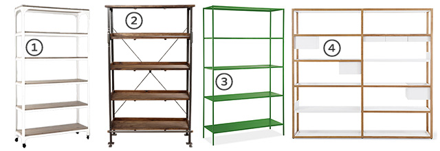
Shelving it
Every day (or nearly), I sit in my home office across from my Expedit shelves. Truthfully, I'm kind of over…October 16, 2012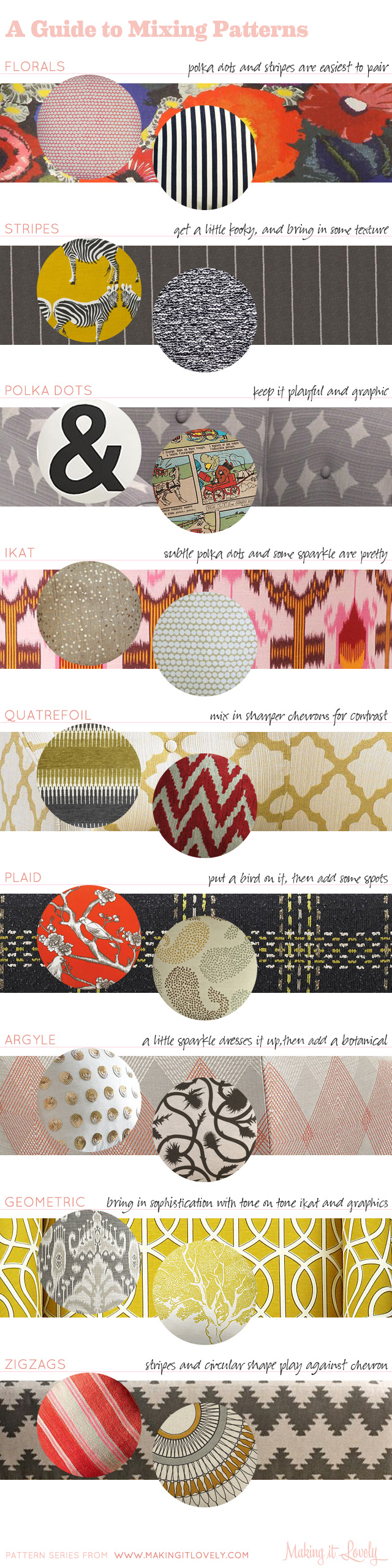
A Guide to Mixing Patterns in Your Home
Mixing patterns in fashion happens all the time (I'm always a fan of stripes and florals), but people seem to…July 24, 2012
Look Hoo I Found
I've had a vintage owl cookie jar for a few years, and I move it around the house from time…July 19, 2012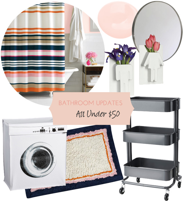
Some Affordable Bathroom Update Ideas
I've been sort of planning a little redo for our main bathroom. Not in any real, concrete way, mind you.…May 10, 2012
The Lighting Guide: How to Put it All Together
A reader had asked me a seemingly simple question about how to choose lighting fixtures that work well from room…April 18, 2012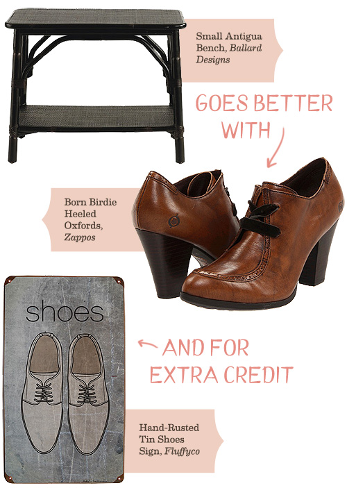
A Little Bench Goes Better With…
This little bench (which comes in larger size and in three colors) would make the perfect perch to sit and…January 25, 2012
Shelving it
Every day (or nearly), I sit in my home office across from my Expedit shelves. Truthfully, I’m kind of over them. More truthfully though? They…
A Guide to Mixing Patterns in Your Home
Mixing patterns in fashion happens all the time (I’m always a fan of stripes and florals), but people seem to shy away from doing it…
Look Hoo I Found
I’ve had a vintage owl cookie jar for a few years, and I move it around the house from time to time. Sometimes it’s in…
Some Affordable Bathroom Update Ideas
I’ve been sort of planning a little redo for our main bathroom. Not in any real, concrete way, mind you. More of a “gee, we’ve…
The Lighting Guide: How to Put it All Together
A reader had asked me a seemingly simple question about how to choose lighting fixtures that work well from room to room, and I was…
A Little Bench Goes Better With…
This little bench (which comes in larger size and in three colors) would make the perfect perch to sit and take off your shoes. Bonus…